
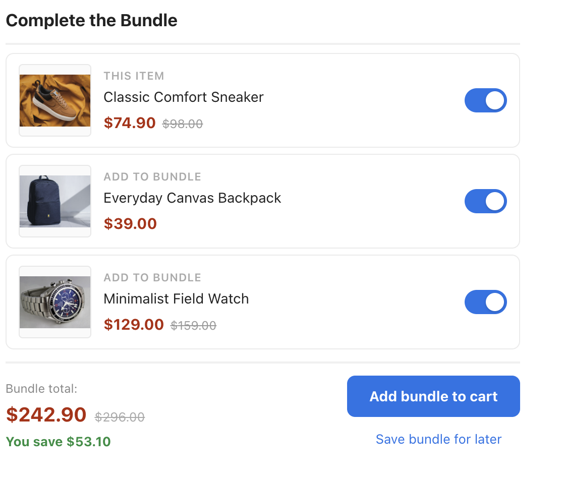
A “Frequently Bought Together” bundle builder with live totals: the current product is shown as the anchor (“This item”) alongside recommended add-ons, each with its own on/off toggle. Every toggle instantly updates the bundle total, the original crossed-out price, the green You save line, and the optional N of M items selected counter — then one click adds the whole selection to the cart.
How this template works
- Three layouts. The Layout setting switches between vertical (a stacked list with toggle switches — the default), horizontal (a product row joined by plus signs that sizes itself to its cards), and compact (a mini strip with small photos, names, and prices — social proof and info lines stay hidden there to save space, while the current product keeps its “This item” label). In the compact strip, Title Position (Strip Layout) places the heading either inline to the left of the products (the default) or on a full line above them. On narrow screens the horizontal row converts to a clean stacked list automatically.
- Style accents and look presets. One Style accent select (light, gold, bold, ocean) recolors toggles, buttons, totals, savings, and cards together. On top of that: Title Style Preset (plain, caps, serif, underline, boxed), Button preset (solid, pill, outline, dark, square), Font preset (system, serif, rounded, condensed), and Card Info Order (standard, price-first, info-top, name-first). Every color and font remains individually overridable in its own style field.
- Live totals engine. The footer shows the bundle total, the original total with a strikethrough when discounts apply, a You save line computed from the difference, and an optional selected-items counter. The total can pulse briefly on every change (Animate Total on Change, on by default).
- How many recommendations. The template asks for up to eight recommendations (Recommendations to show in the recommendation’s Output card; up to 12), but only Max Items Shown (default 2) are visible. The rest sit behind a + N more link; revealed items appear toggled off, so the total only ever includes products the visitor actually saw and chose. Clicking the link again (Show Less Text) collapses them back.
- Default selection. Choose whether the bundle starts with all items on, none of the recommendations, or only the anchor product selected. The include control’s style, position, color, and visibility are separate settings.
- Confirmation style. After adding to cart, the shopper sees a confirmation. Confirmation Style offers modern (a dark rounded toast with a check icon — the default), system (the built-in Personyze notification), or custom (run your own JavaScript from the On Success and On Error fields under Quick add to cart).
- Live demo mode. While designing, demo products appear automatically with working toggles and totals — site visitors never see them.
Bundle price and discount
Every price in the widget — each item, the bundle total, the crossed-out original total and the You save line — comes from your product catalog, through the price columns mapped in Catalog Fields. Personyze only displays the bundle; it does not change what your cart charges.
The add-ons themselves come from the recommendation’s algorithm — for example Cross-Sells (items bought together, learned automatically) or Managed Cross-Sells (pairs you upload yourself). See Recommendation Algorithms.
Best practices
- Offer one or two partners. One strong pairing usually beats a wall of choices — Max Items Shown already defaults to 2.
- Test the discount depth. A 10% bundle discount can earn more than 25% if it converts at a similar rate.
- Place it under the main product image. On the product page, close to the add-to-cart decision.
- Measure against a holdout. Give the widget less than 100% of the traffic, so the rest of your visitors see the Site original, and compare the two on the campaign’s Performance step — see A/B Testing.
Changing settings in the editor
Every setting lives in the sidebar on the left of the action editor, grouped by topic; click a group to expand it, and the preview updates instantly. Two examples:
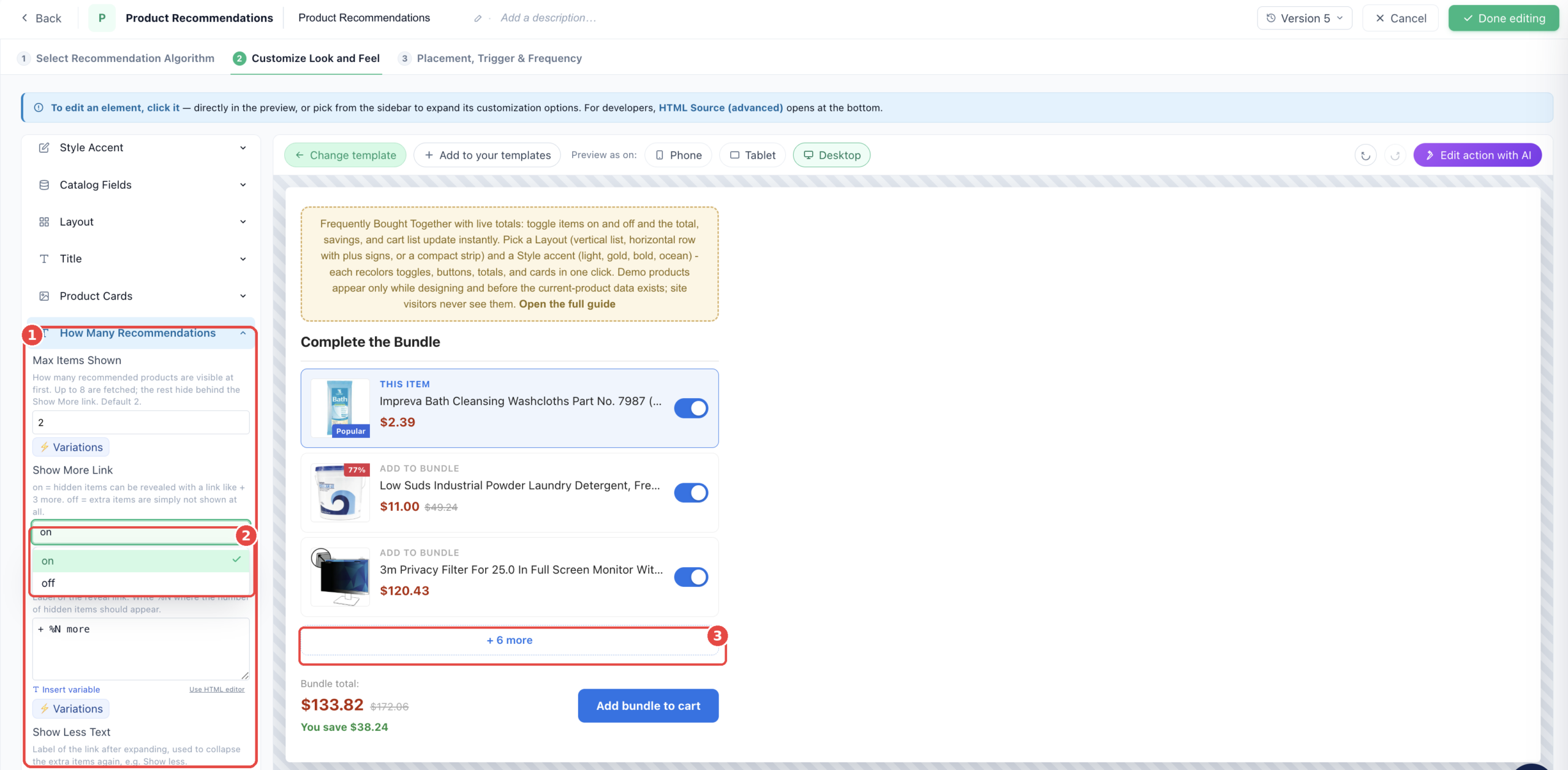
(1) The How Many Recommendations group holds Max Items Shown (default 2) and the reveal-link texts. (2) Show More Link switches between revealing hidden items with a link or simply not rendering them. (3) The resulting + N more link in the vertical list — clicking it in the preview works exactly as it will on the site.
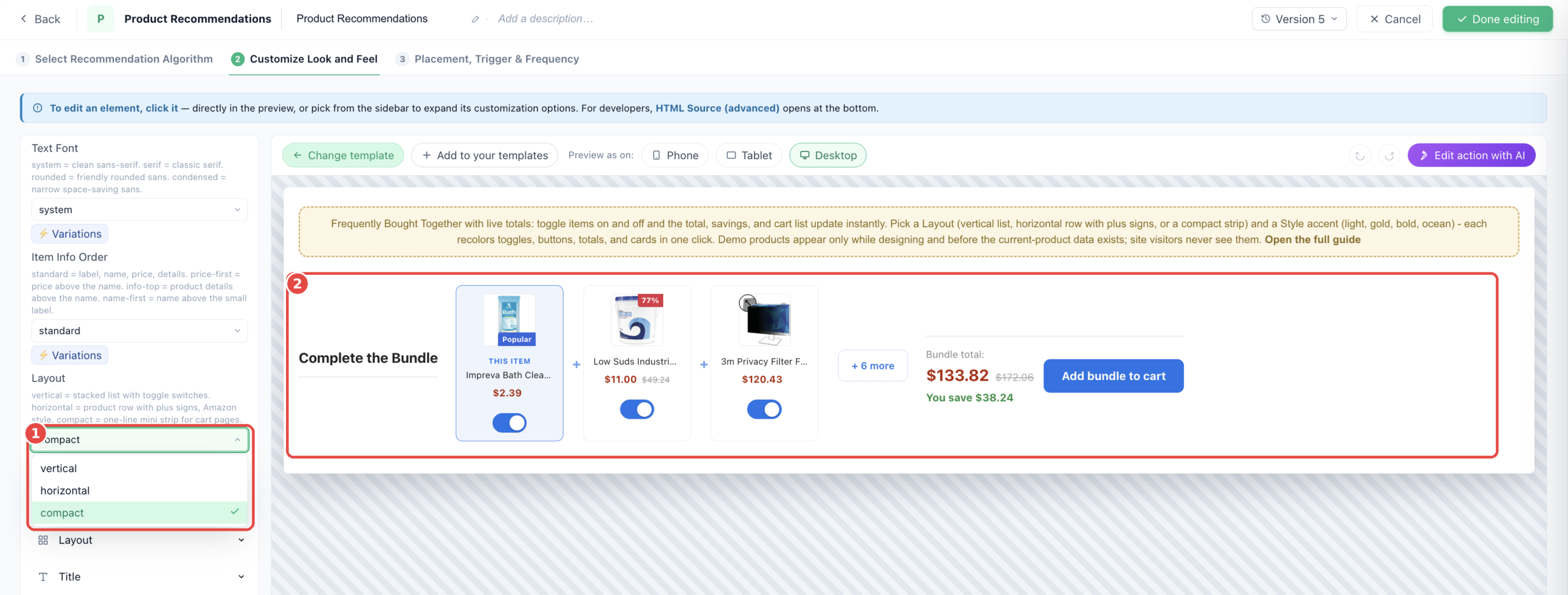
(1) The Layout select switches the whole widget between vertical, horizontal, and compact in one click. (2) Here the compact strip: title inline to the left (movable above the products via Title Position), uniform mini cards joined by plus signs, the + N more chip, and the total with the cart button — all on one line.
Badges, social proof, and product info
- Badges with sensible defaults. Discount percent (hidden when the discount is 0), NEW (products added in the last 14 days), Popular and Bestseller (top 5% by views or purchases), and low-stock, which shows the live remaining count followed by editable text like “left in stock” (triggers at 5 or fewer units) — each threshold, text, and style is editable.
- Social proof lines. Per-card “viewed today” and “bought today” counts, with a scope setting for all cards, only the anchor, or only recommendations.
- Product info lines. Extra catalog fields (brand, custom columns) under the product name, with the same scope control.
Loading, popups, and stability
- Loading skeleton. Shimmer placeholder rows (on by default) show until recommendations arrive, so the widget never pops in abruptly.
- Smooth Reveal. The widget stays invisible for a moment until its size and position settle, then fades in — no visible jumping while the page loads. On by default, with a safety fallback that always reveals within about three seconds.
- Stale-data protection. On navigation the product-view event and the recommendations request race each other; if the widget would render with the previous page’s product as “This item”, it hides itself for that pageview instead. The check is built in (Require Current-Page View, on by default): the current-product card must link to the page being viewed. This also keeps the widget off non-product pages automatically — no audience rule needed.
- Popup Hugs Widget. When the widget runs inside a popup much wider than itself, it shrinks the popup frame to fit. Turn this off for intentional full-width banner popups.
All settings
Every setting lives in the sidebar of the action editor, grouped exactly as below. Click a group to expand its list. Settings marked (CSS) take raw CSS; the rest are text, numbers, or simple selects.
Style Accent — One-click color preset and the overall arrangement.
- Style accent — light = clean blue. gold = dark premium. bold = red. ocean = deep blue. Recolors toggles, buttons, totals, links, and cards together.
- Font preset — system = clean sans-serif. serif = classic serif. rounded = friendly rounded sans. condensed = narrow space-saving sans.
- Card Info Order — standard = label, name, price, details. price-first = price above the name. info-top = product details above the name. name-first = name above the small label.
- Layout — vertical = stacked list with toggle switches. horizontal = product row with plus signs, Amazon style. compact = one-line mini strip for cart pages.
Catalog Fields — Which catalog columns feed the current product and the recommendations. Set once per site.
- Product Title — Catalog/interaction column for the product name.
- Product Title (long) — Product name, longer form for tooltips.
- Product Title (short) — Product name, short form for display.
- Sale / Final Price — Column for the sale/final price. Used in the total.
- Original Price — Column for the product price.
- Recommended — Original Price — Catalog column for the original pre-discount price (recommendations).
- Recommended — Discount Percent — Catalog column for the discount percentage (recommendations). Used by the Discount Badge.
- Recommended — Stock Level — Catalog column for inventory (recommendations). Used by the Stock Badge.
- Current — Product Image — Column for the viewed product image shown on the current-product card.
- Recommended — Product Image — Catalog column for the recommended product image URL.
- Product Page URL — Column for the product page link.
- Product Brand — Catalog column for the brand/manufacturer. Used by Product Info.
- Custom Attribute 1 — Any catalog column you want to display (e.g. color, size, material). Used by Product Info.
- Custom Attribute 2 — A second catalog column to display. Used by Product Info.
Layout — How the parts are arranged
- Container Style (CSS) — Overall widget container: width, padding, margin, font and background.
- Separator Character — The symbol shown between products in horizontal and compact layouts. Usually a plus sign.
- Separator Style (CSS) — Extra CSS for the + separator: color, size, etc.
- Loading Skeleton — Gray shimmering placeholder rows shown for a moment while the recommendations load, then replaced by the real cards. on by default.
- Smooth Reveal — Keep the widget invisible for a moment until its size and position settle, then fade it in. Prevents visible jumping while the page loads.
- Popup Hugs Widget — When the widget runs inside a popup that is much wider than the widget, shrink the popup frame to fit the widget. Turn off for full-width banner popups.
Title — The heading text and its styling
- Title Style Preset — plain = as designed. caps = uppercase with letter spacing. serif = elegant serif. underline = accent underline. boxed = tinted pill behind the title.
- Widget titles — The heading above the bundle. When the recommendation has fallbacks, each algorithm can carry its own title instead of the main one.
- Title Position (Strip Layout) — Where the heading sits in the compact strip: side = inline to the left of the products, the current look. top = full line above the products.
- Title Icon — none = no icon. library = pick a built-in icon. image = use your own uploaded image.
- Icon (from library) — Pick an icon from the built-in library. Shown when Title Icon is set to library.
- Library Icon Style (CSS) — Size, color and spacing of the library icon.
- Icon Image — Your own image, shown when Title Icon is set to image.
- Icon Image Style (CSS) — Size and spacing of the image icon.
- Title Text Style (CSS) — Font size, weight and color of the title.
Product Cards — Card layout and what each shows
- Recommended Item Label — Small label shown above each recommended product name, e.g. Add to bundle.
- Open Links In — Where product name links open: same tab (_self) or new tab (_blank).
- Card Box Style (Height, Corners, Image Fit) (CSS) — Padding, margin, background and border of each product card row.
- Image Fit & Background (CSS) — Size, border and background of the product thumbnail inside each card.
- Product Name Style (CSS) — Font, size and color of the product name.
- Item Label Style (CSS) — Style of the small label above each name (This item / Add to bundle).
- Price Area Style (CSS) — Font, size and color of the price.
- Original Price Style (strikethrough) (CSS) — Style of the crossed-out original price.
How Many Recommendations — Cap how many recommendations are visible, with the rest behind a Show More link.
- Max Items Shown — How many recommended products are visible at first. Up to 8 are fetched; the rest hide behind the Show More link. Default 2.
- Show More Link — on = hidden items can be revealed with a link like + 3 more. off = extra items are simply not shown at all.
- Show More Text — Label of the reveal link. Write %N where the number of hidden items should appear.
- Show Less Text — Label of the link after expanding, used to collapse the extra items again, e.g. Show less.
- Show More Link Style (CSS) — Style of the reveal link.
Current Product (This Item) — The product the visitor is currently viewing, shown as the first card.
- Current Product Label — Small label shown above the current product name, e.g. This item.
- Emphasize Current Product — Make the current card stand out. off = no emphasis. tint = soft accent background. ring = accent border with glow. bar = accent stripe on the left. badge = little accent tag on top.
- Require Current-Page View — on by default: the widget only shows when the current-product card links to the page being viewed; on other pages, or when the data still belongs to the previous page, the whole widget hides instead of showing a stale bundle. Turn it off to always show whatever the datasource returns — for example if you prefer to control this at the audience level instead, by targeting visitors whose last interaction is a product view.
- Current Product Badge Text — Text for the little tag when Emphasize is set to badge, e.g. Your item.
- Current Product Card Style (CSS) — Extra CSS applied only to the current product card (on top of the normal card style).
Selection & Toggles — How shoppers include or exclude items, and which start selected.
- Default Selection — Which items start checked. all = every item selected (highest bundle value). anchor = only the current product. none = recommendations start off, only the current product is checked.
- Show Include Toggle — Show the on/off control that lets shoppers include or exclude each item. Turn off to always include every shown item.
- Include Control Style — switch = sliding toggle. checkbox = classic checkbox with a checkmark.
- Include Control Position — Where the toggle/checkbox sits on each card: right (default), left, center, or outside-left (in the margin left of the card).
- Toggle / Checkbox Color — Color of the control when an item is selected. Leave as is to follow the Style accent automatically, or pick a specific color to override it.
Prices — Price, discount and currency
- Show Prices — Toggle price display on or off on each card.
- Currency Symbol Before Price — Symbol shown before the price, e.g. $ or EUR.
- Currency Symbol After Price — Symbol shown after the price, e.g. USD.
- Price Format — standard = 1,234.56. european = 1.234,56. rounded = 1,235 with no decimals. rounded-european = 1.235. Applies everywhere prices show, including totals and savings.
- Label for Free Items — Text shown instead of a price when the product is free, e.g. FREE.
Total Price Display — The running total and its look
- Total Label Text — Label shown above the total price, e.g. Bundle total:
- Total Label Style (CSS) — Font size and color of the total label.
- Total Amount Style (CSS) — Style of the total price amount.
- Original Price Style (strikethrough) (CSS) — Style for the original total shown crossed-out when a discount applies.
- Animate Total on Change — Subtle pop animation on the total amount each time an item is toggled on or off.
- Show Savings Line — Show a savings line under the total, like: You save 401.00, whenever the selected bundle is cheaper than the original prices.
- Savings Label — Text before the saved amount, e.g. You save.
- Savings Line Style (CSS) — Font, size and color of the savings line. Green and bold by default.
- Show Selected Counter — Show a line under the total like: 3 of 5 items selected. Off by default.
- Counter Text — Counter wording. Write %N where the selected count goes and %M where the total shown items count goes.
- Counter Style (CSS) — Font, size and color of the counter line.
Quick add to cart — The Add bundle to cart button and what it runs.
- Button preset — solid = filled rectangle. pill = fully rounded. outline = transparent with accent border. dark = near-black fill. square = sharp corners.
- Button Text — Label on the add-to-cart button, e.g. Add bundle to cart.
- Extra add_to_cart Argument — Optional value handed to your Quick add to cart code as its second argument (
arg). - Button Normal Style (CSS) — Default appearance of the button.
- Button Hover Style (CSS) — Button appearance on mouse hover.
- Quick Add to Cart — On Success — Custom JavaScript — Advanced: replace the entire success handler with custom JavaScript. Leave blank to use the default success message.
- Quick Add to Cart — On Error — Custom JavaScript — Advanced: replace the entire error handler with custom JavaScript. Leave blank to use the default error message.
Cart Messages — The little banners shown after adding to cart succeeds or fails.
- Confirmation Style — modern = dark rounded toast bubble with a check icon, matching the wishlist confirmation. system = the built-in Personyze notification. custom = run your own JS from the Success and Error Action fields.
- Success Message Text — Shown after items are added to cart. Default: Bundle added to cart.
- Success Message Style (CSS) — Style of the success banner.
- Error Message Text — Shown when adding to cart fails. Default: Cannot add to cart.
- Error Message Style (CSS) — Style of the error banner.
Product Info — Show extra catalog attributes (brand or any custom column) on the cards.
- Show Product Info On — Which cards show these attributes. all = current product and recommendations. main = only the current product. recommended = only the recommendations.
- Show Brand — Show the product brand/manufacturer.
- Brand Label — Optional text before the brand, e.g. "Brand: ". Leave blank for none.
- Show Custom Attribute 1 — Show the first custom attribute (mapped in Catalog Fields).
- Custom Attribute 1 Label — Optional text before attribute 1, e.g. "Color: ".
- Show Custom Attribute 2 — Show the second custom attribute.
- Custom Attribute 2 Label — Optional text before attribute 2.
- Product Info Style (CSS) — Font size and color of the product-info line.
Social Proof Text — Live viewed / bought / low-stock lines under products, driven by your stats. On by default.
- Show Social Proof On — Which cards show the social-proof lines. all = current product and recommendations. main = only the current product. recommended = only the recommendations.
- Timeframe — today = last 24 hours. week = last 7 days.
- Show Views — Show how many people viewed the product.
- Show Purchases — Show how many people bought the product.
- Show Low Stock — Show a low-stock line when inventory is at or below the threshold (recommendations only; needs an inventory column).
- Minimum Views to Show — Only show the views line when the count is at least this. Default 30.
- Minimum Purchases to Show — Only show the purchases line when the count is at least this. Default 3.
- Low Stock Threshold — Show the low-stock line when inventory is at or below this. Default 10.
- Views Label (today) — Text after the view count, e.g. viewed today.
- Views Label (week) — Text after the view count, e.g. viewed this week.
- Purchases Label (today) — Text after the purchase count, e.g. bought today.
- Purchases Label (week) — Text after the purchase count, e.g. bought this week.
- Low Stock Text — Text after the stock number, e.g. left in stock.
- Views Icon — Icon next to the views line.
- Purchases Icon — Icon next to the purchases line.
- Low Stock Icon — Icon next to the low-stock line.
- Social Proof Text Style (CSS) — Font size and color of the social-proof lines.
- Views Line Style (CSS) — Style for the views line specifically (overrides the shared style).
- Purchases Line Style (CSS) — Style for the purchases line specifically.
- Low Stock Line Style (CSS) — Style for the low-stock line specifically.
- Views Icon Style (CSS) — Size and color of the views icon.
- Purchases Icon Style (CSS) — Size and color of the purchases icon.
Popular Badge — Show a Popular badge on products that are in the top N% most viewed.
- With popular badge — Toggle the Popular badge on or off.
- Time Frame — Measure popularity over the past week or just today.
- Threshold % (top N%) — Badge appears on products in the top N% most viewed. e.g. 5 = top 5%.
- Badge Text — Label shown on the badge. Default: Popular
- Badge style (CSS) — Position, background color and shape of the Popular badge.
- Badge text style (CSS) — Font size and weight of the Popular badge label.
Best Seller Badge — Show a Best Seller badge on products in the top N% by purchases.
- With best seller badge — Toggle the Best Seller badge on or off.
- Time Frame — Measure sales over the past week or just today.
- Threshold % (top N%) — Badge appears on products in the top N% by purchase count. e.g. 5 = top 5%.
- Badge Text — Label shown on the badge. Default: Best Seller
- Badge style (CSS) — Position, background color and shape of the Best Seller badge.
- Badge text style (CSS) — Font size and weight of the Best Seller badge label.
Discount Badge — Show a discount percentage badge on discounted products.
- Show Discount Badge — Toggle the discount percentage badge on or off.
- Minimum Discount to Show Badge (%) — Badge only appears when the discount is at least this percentage.
- Badge Extra Label — Optional text appended after the percentage. e.g. OFF produces: 20% OFF
- Discount — Badge Style (CSS) — Position, background and shape of the discount badge.
- Discount — Badge Text Style (CSS) — Font size and weight of the discount percentage text.
New Badge — Highlight recently added products with a New badge.
- Show New Badge — Toggle the New badge on or off.
- New Badge Duration — Products added within this time period receive the badge.
- New — Badge Label — Label shown on the badge. Default: NEW
- New — Badge Style (CSS) — Position, background and shape of the New badge.
- New — Badge Text Style (CSS) — Font size and weight of the New badge label.
- Show Back-in-Stock Badge — For an item that was sold out and has returned. The catalogue records WHEN stock crossed back, so the badge needs nothing typed in and disappears on its own once the window passes. An item that has gone out of stock again is never badged.
- Back in Stock — Counts As Back For — How long after the return the badge keeps showing. A rolling window: it never becomes a fixed date.
- Back in Stock — Badge Label — Text on the badge, e.g. "BACK IN STOCK" or "Restocked".
- Back in Stock — Badge Style (CSS) — Background, position and shape of the badge.
- Back in Stock — Badge Text Style (CSS) — Font size and weight of the label.
Stock Badge — Show a low-stock warning badge when inventory drops below a set number.
- Show Low Stock Badge — Toggle the stock level badge on or off.
- Low Stock — Stock Threshold — Badge appears when inventory is at or below this number.
- Low Stock — Badge Text Template — Text after the stock count. e.g. left produces: 3 left
- Low Stock — Badge Style (CSS) — Position, background and shape of the stock badge.
- Low Stock — Badge Text Style (CSS) — Font size and weight of the stock badge text.
Wishlist Button — The optional Save bundle for later button (off by default).
- Show Wishlist Button — Toggle the Save Bundle for Later button on or off.
- Button Text — Label on the wishlist button, e.g. Save bundle for later.
- Confirmation Message After Adding — Message shown after products are added to the wishlist.
- Confirmation Toast Style (CSS) — Extra CSS for the dark confirmation bubble shown after saving to wishlist, e.g. background or font size.
- Button Normal Style (CSS) — Default appearance of the wishlist button.
- Button Hover Style (CSS) — Wishlist button appearance on mouse hover.
Close Button — The dismiss X and where it sits
- Close Button Style / Behavior — Toggle the close/dismiss button on or off. Label or icon for the close button.
- Close Button Position (CSS) — Style of the close button element.
Editor Notes — Editor-only demo bundle and design note.
- Demo Bundle (Preview Only) — Sample products with working toggles and totals, shown only in the editor and on preview links while no real data renders. Visitors never see them.
- Editor tips banner — Show or hide the editor-only design note. Visitors never see it.
Good to know
- The widget hides itself off product pages and on stale data. Require Current-Page View (on by default) keeps the bundle from ever showing the previous page’s product or appearing on the homepage. Prefer handling this yourself? Switch it off and add an audience rule targeting visitors whose last interaction is a product view.
- The savings line only appears when there is something to save. If no selected item has a discount, the strikethrough total and You save line hide themselves.
- Add bundle to cart sends all selected items in one call to your account’s Quick add to cart code, with any catalog fields you added there; until that code is saved, the button shows its error message. A secondary Save bundle for later button is off by default and can be enabled with one click; both are fully restylable.
- Central pricing. One Price Format select and one pair of currency-symbol fields apply everywhere prices appear, including totals and savings.
- Style-proof rendering. The template’s styles are engineered to survive aggressive site CSS, while per-element customizations made in the editor still take priority over the template’s defaults.
- Saved template cards freeze their code. If you keep your own copy in My Templates, actions created from it use the code as it was when saved — re-save the card after major updates.
Related
- Bought Together — Classic Strip — the same engine in the classic look: photo strip on top, total price box, checkbox list below.
- Quick Add to Cart Button — the code the Add bundle to cart button runs.
- Auto-Apply Coupon Code at Checkout — carry the bundle’s coupon to checkout.
- Vertical Product List — a list-style recommendations layout without bundle logic.
- Templates — the full template library overview.