
A template is a finished design you can put on your site today and edit in place —
colours, wording, images, behaviour — without writing HTML. There are 31 of them, grouped below
by what they do.
Pick one from the gallery when you add content to a campaign. Nothing here is a cage: open a template in the
Canvas Builder or the WYSIWYG editor and it is yours.
Personyze can also apply your own brand — colours, fonts and language — to any of them.
targeted and capped is the same for all of them:
where content shows and
frequency caps.
Popups & modals
Interruptive by design — use them where the message is worth the interruption.
Bars & announcements
Always visible, never in the way.
Forms & lead capture
Ask for something, and say what they get for it.
Countdown & urgency
A real deadline, counted down.
Progress & status
“You are $65 away from free shipping.” Fed by a live value on the visitor’s profile.
- Free Shipping Status Bar Template
- Status Card Template
- Tiered Status Bar Template
- Tiered Status Card Template
- Event Progress Countdown Templates
Gamification
A reward the visitor has to do something to get.
- Spin Wheel Templates (Stacked & Side-by-Side / Full Screen)
- Gated Spin Wheel Template (Form-Locked Spin)
- Recommendation Quiz Template
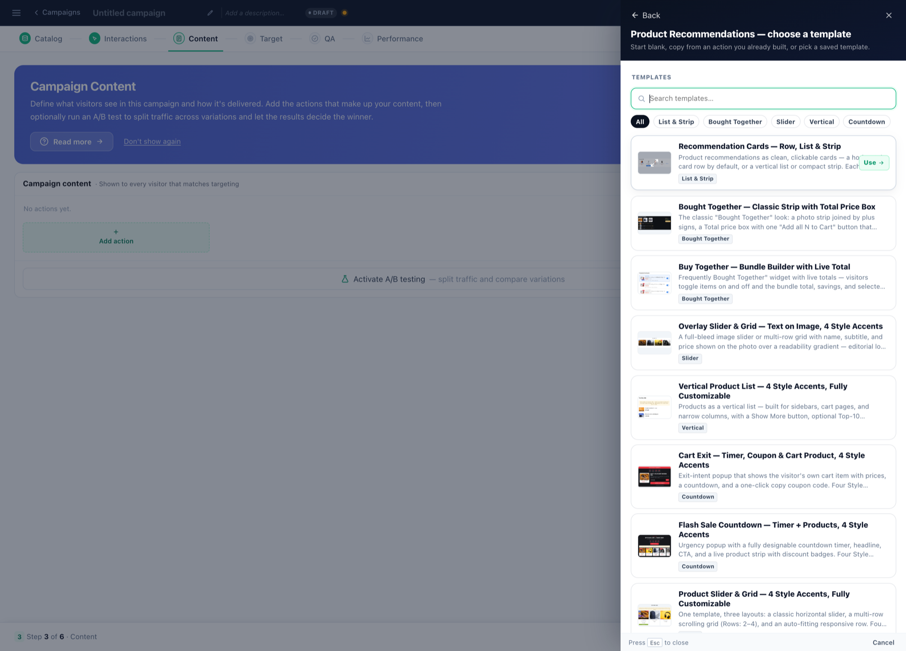
Product recommendations
Layouts for the product widget. Same engine, different shape.
- Recommendation Cards — Row, List & Strip
- Product Slider & Grid — 4 Style Accents, Fully Customizable
- Vertical Product List — Photo-Left or Stacked, 4 Style Accents
- Overlay Slider & Grid — Text on Image, 4 Style Accents
Buy together & bundles
Add-ons beside the product, with a live total.
Content recommendations
Articles rather than products.
- Content Recommendations — Slider, Row or List
- Continue Reading — Next Article Panel
- Article Paging Template — Prev/Next or Stepper (coming soon)
Related
- Content & Design — the action types these designs go into.
- Canvas Builder — build one from elements instead of starting from a template.
- Split cases — two versions of the same design, tested against each other.