
Overlay Card Recommendations Slider
Action type: Product Recommendations. Configured from: the action menu — no code required.
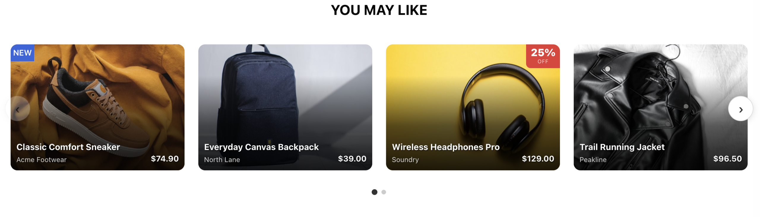
The Overlay Card slider shows product recommendations as image cards with the product name, brand, and price overlaid on the photo. It scrolls with native swipe on touch screens and with arrows, dots, drag, or autoplay on desktop, and it adapts the number of visible cards to the visitor’s screen size.
Quick Start
- Add the action to your campaign and choose the Overlay Card Recommendations Slider template.
- Open Card Image Style and confirm the Main Product Image Column points at the image field of your catalog. If no catalog is connected yet, the widget shows built-in demo products in the editor so you can keep designing (see Demo Products).
- Set how many cards visitors see at once in Slider & Items Per View — desktop, tablet, and mobile each have their own count.
- Pick an arrow look in Slider Arrows → Arrow Style, or leave it on
noneto let your site’s own button styling apply. - Preview on Phone, Tablet, and Desktop, then publish.
How the Slider Sizes Cards
Card width is not set directly — it is calculated from how many items you want visible, so layouts always come out exact:
card width = (row width − gaps) ÷ items visible- Items Visible — Desktop / Tablet / Mobile — the number of cards shown at once at each screen size. Defaults: 4 / 3 / 1. Decimals work:
1.15on mobile shows a sliver of the next card as a swipe hint. - Tablet / Mobile Breakpoint (px) — the screen widths where the tablet and mobile counts take over. Defaults: 1024 / 640.
- Minimum Card Width — a safety floor (default 200px). If the row is too narrow to fit the chosen count above this width, cards hold the minimum and the row scrolls instead. This prevents collapsed cards inside constrained containers.
- Space Between Cards — the gap between cards. Use a plain length such as
24px. This value is applied at first paint, before responsive processing runs, sosel()is not supported here; if you need a different mobile gap, add a media query in Container Style. - Card height, corner radius, and how the photo fills the card are set in Card Image Style → Card Box Style — e.g.
height: sel(220px, 180px)for different desktop and mobile heights.
Navigation
Scroll Behavior — x mandatory always settles on a card edge; x proximity snaps only when stopping near an edge; none scrolls freely with momentum.
Items Scrolled Per Click — how far each arrow click and autoplay step moves: 1–4 cards, or full, which advances exactly the visible set (2 items visible scrolls 2, 4 scrolls 4 — it follows the breakpoint automatically).
Arrows
Two independent sets that can run separately or together:
- Arrows on Sides (Classic) — large arrows vertically centered on the row’s edges. The Offset option moves them outside the row (negative values) or over the cards (positive).
- Arrows in Title Bar — compact ‹ › buttons at the right end of the widget title.
Arrow Style presets: circle (light), dark, pill, outline, soft — each a complete look with its own hover, rendered identically on every site. Choose none to hand styling to your site theme so the arrows blend with the site’s own buttons; note that with none, the editor preview shows plain fallback buttons, because the theme only exists on the live site. Fine-tune any preset in Side Arrow Custom Style — when a preset is active, add !important to each property you override.
Two behaviors apply to all arrows: Fade Arrows at Row Ends dims the back arrow at the start and the forward arrow at the end, and Hide Arrows on Touch Devices removes them where swiping is natural. Both default on.
Other Controls
- Pagination Dots — clickable dots below the row showing scroll position. They appear only when there is more than one page to scroll and rebuild automatically on resize. Container, dot, and active-dot styles are each editable.
- Scrollbar — an optional slim scrollbar under the cards, off by default. Thumb and track colors apply in all browsers; the height setting applies in Safari (Chrome and Firefox use their fixed thin size).
- Drag to Scroll with Mouse — lets desktop visitors grab the row and pull it like a touchscreen. A drag is never mistaken for a product click. On by default.
- Autoplay — set an interval in milliseconds (e.g.
4000) to auto-advance. It pauses while the visitor hovers or touches the slider, and Autoplay: Loop to Start controls what happens at the last card: jump back to the first (on) or stop (off).
Badges
Badges live in a corner-slot system so they never overlap:
- The Badge Stack holds Popular, Best Seller, New, Time-based, and Custom (DB) badges. Any combination stacks neatly in one corner, newest first in template order. Badge Stack Corner moves the whole stack to any of the four corners in one pick; Stack Custom Style adds margins or switches to a horizontal row.
- Three badges keep dedicated corners of their own: Discount (top-right), Price Drop (bottom-right), and Low Stock (bottom-left). The Wishlist heart sits top-right. If you move the stack onto one of these corners, restyle that badge or turn it off.
Each badge has its own thresholds (e.g. minimum discount percent, stock level, top-N% popularity) and text/style options in its menu section.
Card Content
The card itself is the product photo with a darkening Gradient Overlay and the Text Overlay at the bottom: product name (clamped to two lines), a subtitle field (brand by default), and the price with automatic strikethrough original price when a discount exists. Clicking anywhere on the card opens the product page (Product Click Target sets the URL column and same-tab/new-tab).
Below the image, optional blocks can be enabled: product title, full pricing block, star ratings, description, custom catalog column, options link, link button, Add to Cart (with animated reveal on hover), installment payment text, live view/purchase statistics, and the social proof ticker. All are off by default so the card stays clean until you opt in.
Demo Products — How the Default Set Works
The widget ships with six built-in sample products so an account can design and preview the widget before any product catalog is connected.
The logic, exactly:
- Demo cards render only in preview contexts. The widget detects the Personyze editor (including its preview frame) and preview links carrying the
_S_T=parameter. Regular visitors on a live site never match, so demo products — and their sample prices — can never appear to real shoppers. A live site with no catalog simply shows an empty widget. - In a preview context, demos replace the editor’s placeholder. When no catalog is connected, the editor renders a single “Image from Catalog” placeholder card. The widget counts the real cards produced by the product loop: one or fewer means placeholder, so it is hidden and the six demo cards show in its place.
- Real products always win. The moment the loop returns more than one real product — i.e. an actual catalog is connected — the demo cards stay hidden and real products render, in the editor and everywhere else.
- The whole behavior is one toggle: Widget Layout → Demo Products (Preview Only). It is safe to leave on permanently; turning it off only affects previews.
To change the demo products themselves (images, names, prices), edit the demo card block in the template source — the six cards are plain HTML mirroring the real card design, marked with the pz-demo class.
Styling Architecture and Site-Theme Interplay
Three layers style the widget, in the order they apply:
- Critical layout is inline on the slider and cards, applied by the browser the instant the HTML renders — this is why the slider never flashes as a stack of full-width cards on a cold first load.
- Responsive and decorative rules (breakpoint overrides, dots, arrow presets, hovers) live in the template stylesheet.
- Your site’s CSS can reach anything not explicitly locked. This is deliberate: with Arrow Style
none, the site theme fully dresses the arrows; with any preset selected, the preset locks its geometry and colors with!importantso it renders identically on every site.
The practical rule for customizing: if your change doesn’t stick, the property is locked by a preset or protected against theme conflicts — add !important to your declaration in the relevant Custom Style field and it takes precedence.
Data Source
Products come from the catalog via the template’s product query — by default the newest products, blended with the visitor’s recently viewed items, limited to 12. The recommendation logic (best sellers, viewed-together, cart-based, and so on) is set in the action’s audience and data-source configuration like any Personyze recommendation, independent of this widget’s design options.
See Setting the Product Feed and Product Recommendation Algorithms.
FAQ
The arrows look different on my site than in the editor.
With Arrow Style none, that’s by design — the site theme styles them, and the editor has no theme. Pick any preset for a pixel-identical look in both.
The dots aren’t showing.
Dots appear only when there is more than one page to scroll. With few products or a high Minimum Card Width on a wide screen, everything fits on one page and the dots hide.
The back arrow looks disabled.
At the start of the row there is nothing to scroll back to, so Fade Arrows at Row Ends dims it. It activates the moment the row moves. Turn the fade off if you prefer always-solid arrows.
I updated the template and some settings look wrong.
Fields you previously saved keep their saved values and override new template defaults. Reset a field to pick up the current default.
Autoplay stops on its own.
Autoplay: Loop to Start is off, so it stops at the last card as configured. Turn it on to cycle continuously. Autoplay also pauses while the visitor hovers or touches the slider — that’s intentional.
Can visitors on desktop drag the row with the mouse?
Yes — Drag to Scroll is on by default. They can also use the arrows, dots, trackpad, or shift + mouse wheel.
Why can’t I use sel() in Space Between Cards?
The gap is applied at first paint, before responsive processing runs, to guarantee a stable layout from the first frame. Use a plain length; handle a different mobile gap with a media query in Container Style if needed.
Do the demo products ever show to real visitors?
No. They render only in the Personyze editor and on _S_T= preview links, and only while the catalog returns at most one product.