
The Canvas Builder is Personyze’s free-form design surface. Instead of starting from a
finished template and editing its text, you assemble a popup, banner or inline block out of elements
— a headline, a photo, a countdown, a form, a recommendation strip — and arrange them how you like.
On personyze.com: Pop-ups and banners →
Watch the 1:33 walkthrough: starting from a template, building a popup out of blocks, and previewing it on your own site.
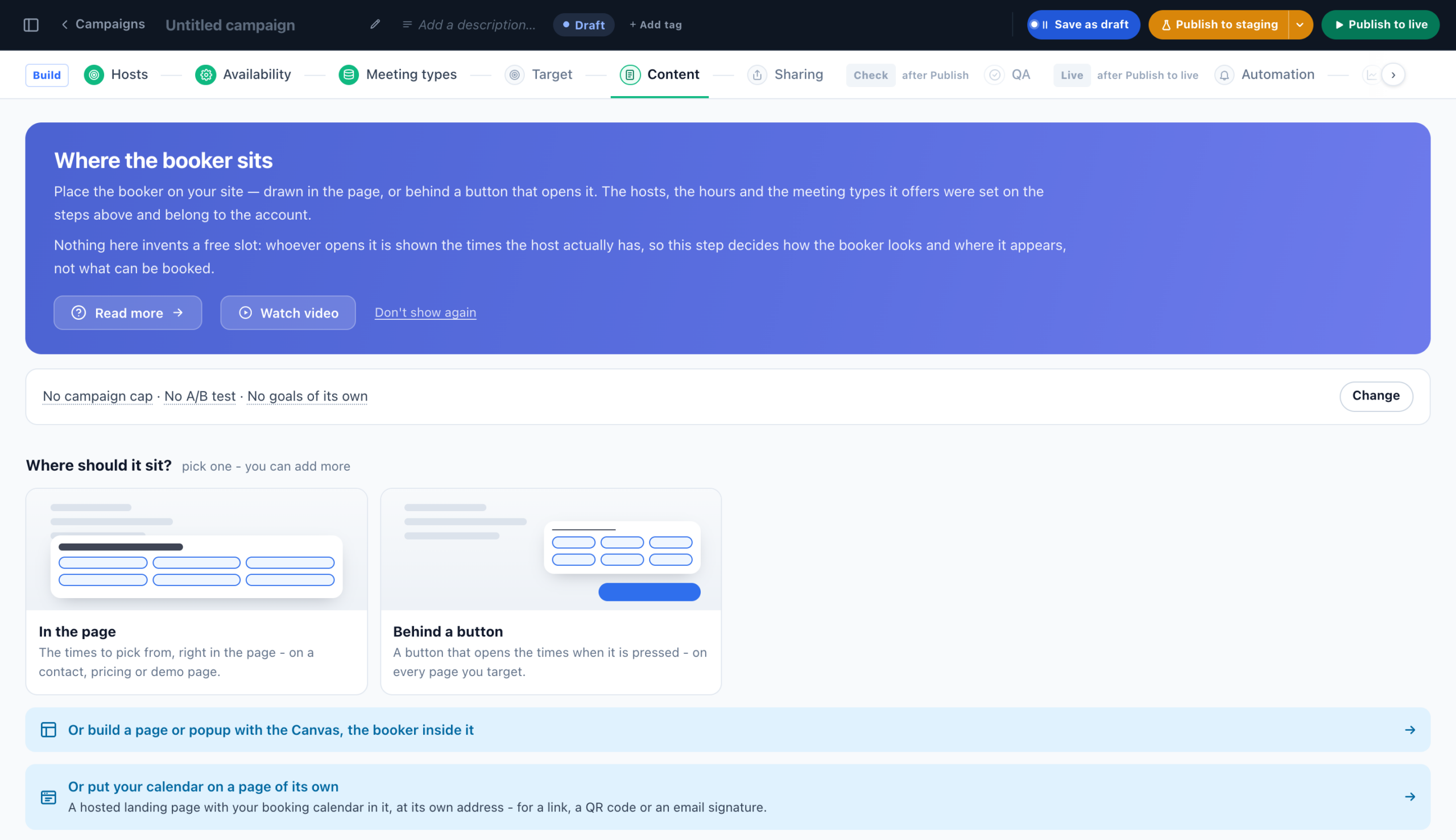
Add it like any other action: on a campaign’s Content step choose Canvas Builder.
It has three steps: Design Your Banner or Popup, Where the data goes (only when your
design contains a Form), and Set Display Rules & Placement.
That last step is where you choose where it appears and when it opens — including exit intent on both desktop and phones. The triggers are the same for every popup action and are documented in Triggers — when the popup opens.
The Canvas in Meetings, Reviews, Feedback and Surveys campaigns
Campaigns that start from designs of their own offer the Canvas too, for a page or popup of your own:
- Meetings & Booking — an empty campaign shows Or build a page or popup with the Canvas, the booker inside it under its booker pictures. Put the Book a meeting element in the design: a booking made through it is credited to the campaign and to the visitor, as one made through the Book a meeting action.
- Reviews & Testimonials, Feedback & NPS and Surveys — Or build a page or popup of your own with the Canvas, under the design pictures. A Surveys campaign says what differs: “It shows on your site’s pages, not on the survey page, and answers to a form in it go to Forms, not to this survey’s results.”
Each line opens the template picker of the Canvas Builder. In all four, Add action also lists the Canvas Builder, after the campaign’s own types.
Canvas Builder or Popup, Banner & HTML Builder?
Both actions produce the same kinds of content and share everything after the design step — placement, display
rules, containers and reporting are identical. They differ only in how you design.
| Canvas Builder | Popup, Banner & HTML Builder | |
|---|---|---|
| You build by | Adding and arranging elements | Picking a template and filling it in |
| Best when | You want a specific layout — split photo, countdown, wheel, recommendations, per-device rules | You want a finished look fast, or you are pasting and maintaining raw HTML |
| Template library | 15 starting designs | Hundreds of classic templates |
| Editable in the legacy panel | No | Yes |
legacy interface, an action built here will not open there.
Start from a design, or from nothing
A new action opens on Start from a design. There are 15, including Showcase (the whole
toolbox in one card), First-visit welcome, Coupon code, Sale announcement,
Personalized greeting, Announcement bar, Exit-intent save, Minimizable teaser,
Recommended for you, Picture beside the pitch, Full-screen takeover, Social proof,
Latest articles and Blank. Every one is a normal design once inserted — nothing is locked.
The element library
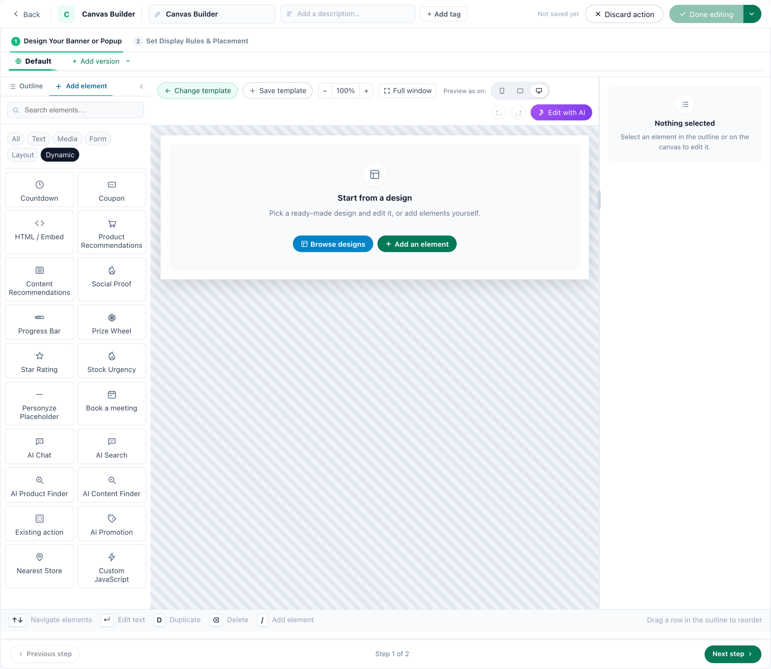
Elements are grouped Text · Media · Form · Layout · Dynamic in the Add element rail. Click
to append, or drag onto the canvas — drop on the right edge of an element to place the two side
by side.
Text
- Chip / Pill — a small badge line, e.g. “★ Special Offer”.
- Headline & Subtitle — the main headline plus an optional supporting line.
- Paragraph — a block of body text.
- Checklist — a titled list of benefits with coloured bullets.
- Rotating Text — cycles messages one at a time, cross-fade or slide-up.
- FAQ / Accordion — a question-and-answer list that expands in place. Built on the browser’s own disclosure element, so it still opens with JavaScript switched off.
- Numbered Steps — a “how it works” sequence with auto-numbered circles, as a row or a column.
- Testimonials — quoted customer testimonials.
Media
- Image — a picture with max-height, radius and alignment.
- Icon — a single icon, sized and coloured.
- Video — embeds a YouTube or Vimeo watch link.
- Image Slider — a swipeable carousel; a second slide brings arrows.
- Logo Row — a row of customer or partner logos.
Form
- CTA Button — the call to action.
- Form — fields that save into visitor-profile columns, stacked or side by side, with a
thank-you message that replaces the fields on success.
Layout
- Divider — a horizontal rule.
- Close (×) button — a dismiss control you can position anywhere, separate from the popup’s own corner ×. Its look comes from the close-button gallery — see The close button.
- Media + Text — picture one side, words the other, with an adjustable split.
- Menu — a navigation list, as a row or a column, optionally behind a ☰ icon.
- Comparison Table — a two-column “us versus them” table; cells you fill with yes or no render as a tick or a cross.
- Minimize tab — collapses the whole popup to a labelled tab (see below).
Dynamic
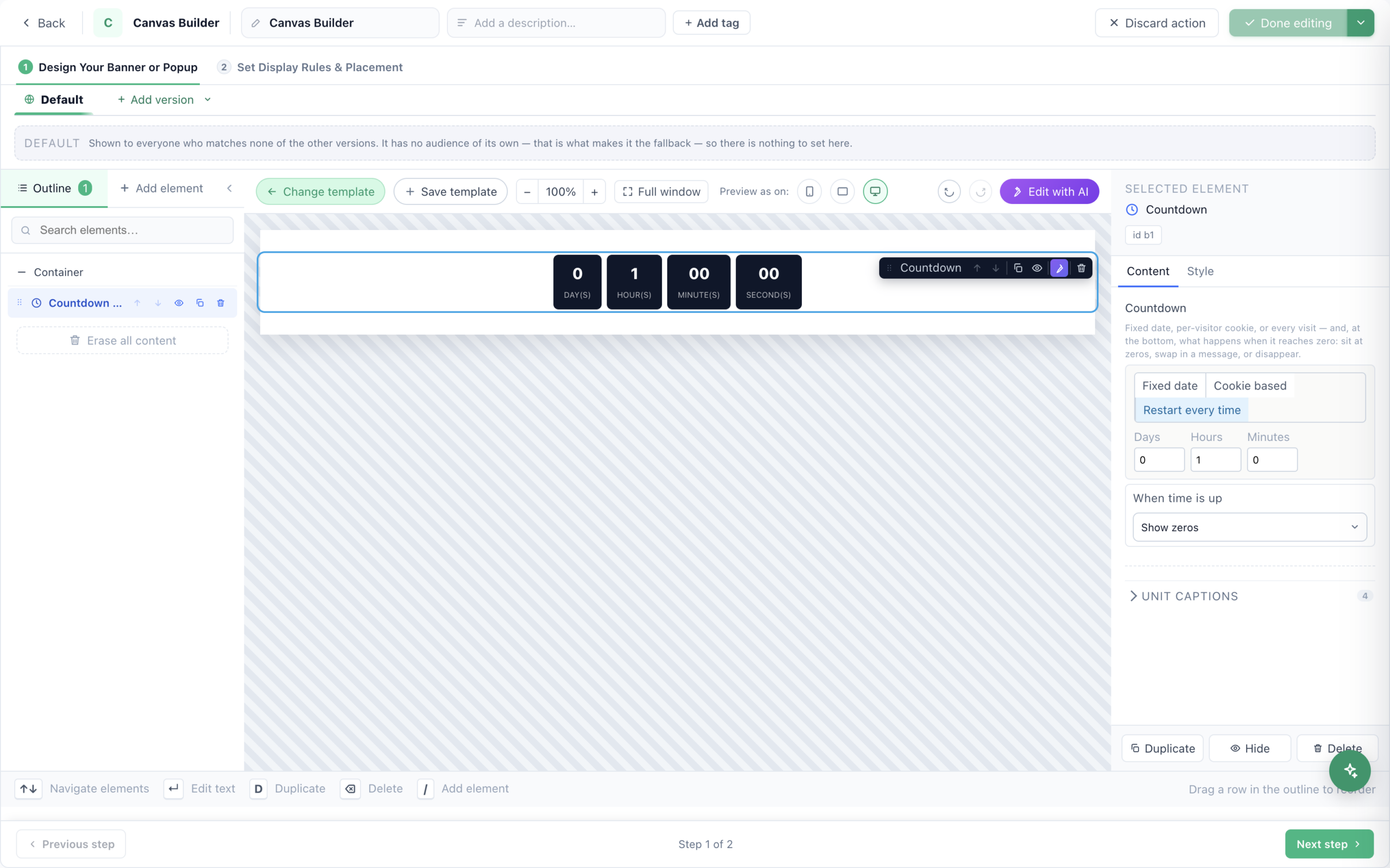
- Countdown — a fixed date, or per-visitor / per-session, in Boxes, Pills or Minimal styling.
- Coupon — a discount code with one-click copy.
- Product Recommendations / Content Recommendations — live per-visitor picks, slider or grid.
- Social Proof — real counters or “recent buyer” lines, never fabricated, hidden below a threshold you set.
- Progress Bar — progress toward a goal from a profile field, such as cart total or points.
- Prize Wheel — a weighted spin-to-win with per-segment prizes and codes.
- HTML / Embed — arbitrary HTML, shipped as written.
- Star Rating — a star row that shows fractions honestly (4.3 looks like 4.3, not 4), optionally read from a catalog column.
- Stock Urgency — an “only 3 left” badge driven by a catalog column or profile field, with a threshold so it appears only when stock is genuinely low.
- Personyze Placeholder — an empty slot that another action fills, so a design can be assembled from several actions instead of one enormous document.
- Custom JavaScript — code that runs when the popup is shown; renders nothing visible.
statistics fill them in on the real site. A Social Proof element with no history behind it simply does not render for
that visitor.
More in the Dynamic group
- AI Chat and AI Search — the assistant’s chat window and ask box, inside the design, with the assistant’s latest settings.
- AI Product Finder and AI Content Finder — a finder bar inside the design, with the finder’s own words and colours. See AI Product Finder and AI Content Finder.
- Existing action — places one of your own actions (a recommendation widget, an offer, a form, reviews…) inside the design, running as itself. See Existing action.
- AI Promotion and Nearest Store — each visitor’s best promotion, and their nearest store. See AI Promotion and Nearest Store.
- Book a meeting — your booker inside the design: Which meeting, and How it appears — In the design or Behind a button. Its look follows Meetings → Appearance unless you set one here. See the Canvas in Meetings campaigns.
- On a hosted landing page the list adds Survey, Review form, Calendar and Recommendations — parts of the page, each with its own editor, in place of the Book a meeting and Recommendations elements: see Landing page kinds and parts.
AI Promotion and Nearest Store
Part of the Promotions add-on: the element library offers them only on an account that has it.
- AI Promotion — each visitor’s best promotion from your Promotions list, chosen as the AI Promotion actions choose. Promotion type: Coupons, Image banners or Text promotions. How promotions are picked opens the actions’ own Select Promotion Algorithm step in a dialog — see How a visitor is matched to a promotion. Several promotions: Side by side or Slider. Under What the card shows: the picture, the description, and the Copy button’s words.
- Nearest Store — the visitor’s nearest store from your Locations, or the one they chose. Which store opens the Show Store action’s step: how far is still near, what beyond it, only open stores, only some tags. The card can show whether it is open, the distance, the address, the phone number and the store’s picture, with a Directions button and a Store page link.
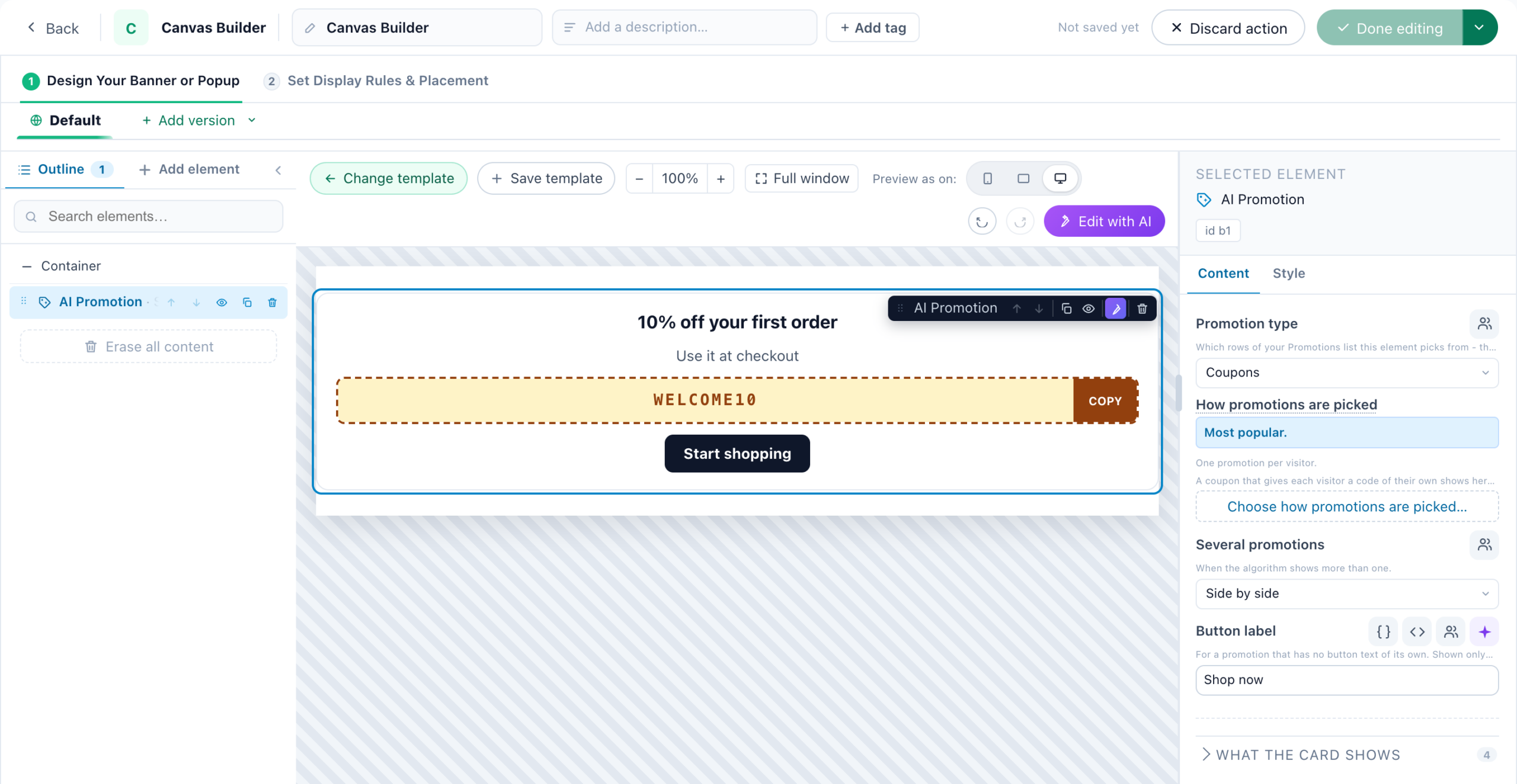
What differs from the AI Promotion actions:
- No holdout. A design always shows something, so there is no share of visitors who see nothing.
- Personal codes. “A coupon that gives each visitor a code of their own shows here only to visitors who already have their code. For the others, use an AI Promotion Coupon action, which hands the code out.” A shared code shows to everyone.
- What is counted. Each promotion’s views count in the Promotions report. In a design with a Form, saved as a lead-capture action, its promotions’ clicks and copied codes are not counted. On a hosted landing page the element picks without the page’s category or the visitor’s history, the Promotions report counts nothing it shows, and Nearest Store shows no distance.
- Without the add-on a design carrying either element is not shown on your site. On a hosted landing page the element is left out and the rest of the page shows.
A different element per device. Every element has Show on, in its Devices group: All devices, Desktop & tablet or Phones only — so a design can hold a desktop and a phone version side by side, and the hidden one stays out of the way.
The Personalized page design in the template gallery assembles your own actions into one page, and replaces the old Personalized Page action type. Pages made with that type keep running and open in their own editor.
Shaping the container
The Container panel controls the frame everything sits in: width (fit the placement,
full width or a fixed maximum), background colour or image, corner radius, padding, and what happens
when it is taller than the screen — run off the screen, or scroll inside the popup.
Split with a photo pane puts a photo down one side, with an adjustable pane width and a
keep in view focal point so faces are not cropped. It stacks automatically on phones.
Fonts are a curated list that downloads nothing — system, Helvetica/Arial, humanist, geometric, Georgia, slab
serif or monospace, plus whatever the page uses. That last one is right for inline blocks and usually wrong
for a floating popup, which needs to look deliberate against an unknown page.
Per-element control
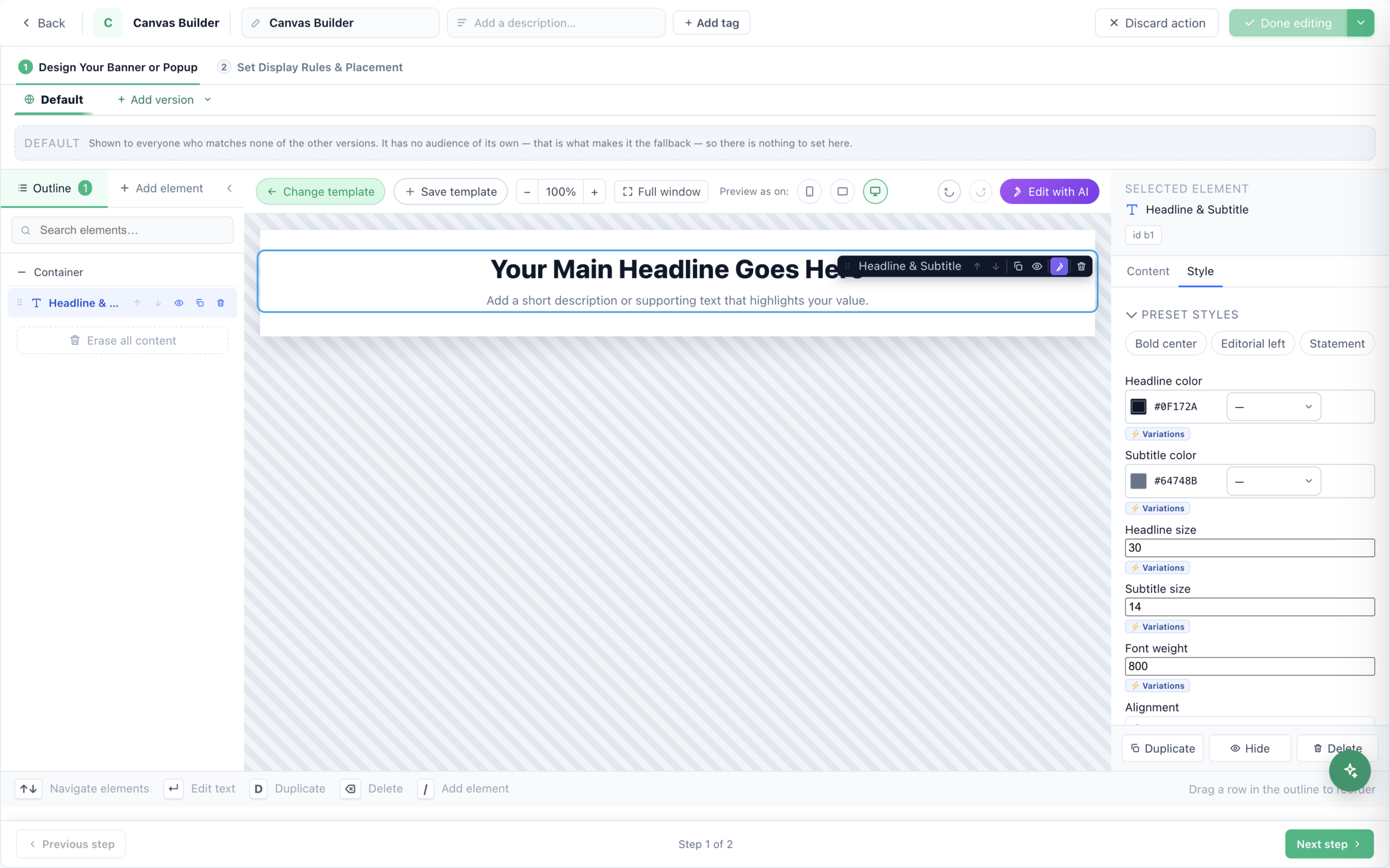
Selecting an element opens its own panel on the right, on two tabs:
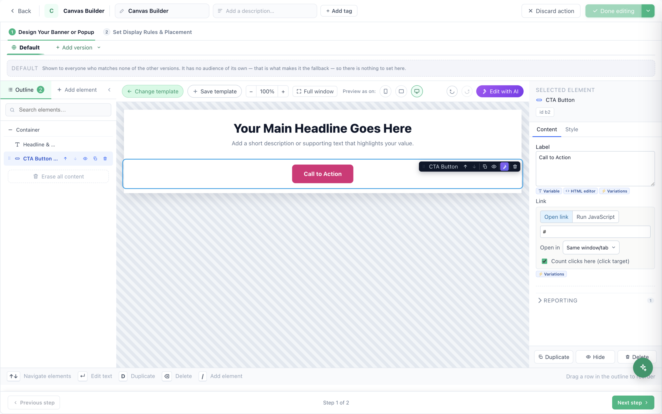
- Content — what it says and does. A countdown counts to a fixed date, a per-visitor cookie or every visit, and chooses what happens at zero; a button carries its label, its link and whether its clicks count. A button’s label, the link it opens or the JavaScript
it runs, and whether its clicks are the ones that count for this action. - Style — preset styles first (a headline offers Bold center,
Editorial left, Statement), then each property on its own: colours, sizes, font weight,
alignment.
audiences — a different headline colour or a different label per segment, on the same element, rather than a
duplicated design to keep in step.
The foot of the panel repeats the three actions the outline also offers: Duplicate,
Hide (it stays in the outline and is skipped when rendering) and Delete.
- Devices — show an element on all devices, desktop & tablet, or phones only.
- Animation — an entrance (fade, rise, zoom, slide) and an optional attention animation
(pulse, occasional shake). Visitors who ask for reduced motion see it still. - Size & position — width, alignment, spacing, and place beside the previous
element to build a row. - Background & border — per-element background, padding, border, radius, shadow, and hover colours.
- Advanced — custom CSS, plus separate phone CSS for screens up to 767px.
The minimize tab
Add a Minimize tab and the popup collapses to a labelled tab instead of closing — always one
click from returning. You control the label and icon in both states, where the tab sits, whether it starts minimized,
and whether that state is remembered across pages.
Variations — one design, several audiences
Almost every field in both tabs carries a ⚡ Variations button, with a badge counting how many
alternatives it holds. It is how one design serves several audiences without a second design to keep in step: a
different headline for returning visitors, a different button label in one country, a different image for people who
already bought.
Opening it gives you a list of cases. Each case is an audience — built with the same rule
builder the targeting step uses, so anything you can target you can vary on — and the content that audience gets.
Under them sits the default: what everyone matching no case sees.
the narrow one dead — it will never be reached, and nothing about the list says so. Put your most specific
audiences first.
Because that is easy to get wrong by reading a stack of editors, the dialog restates the set in plain English:
“what each visitor actually gets”, in the order the engine tries them, derived from the values
themselves. It also flags the four traps:
- A case with no condition is discarded when you press Done — give it one or remove it.
- A case with empty content means that audience sees nothing. Correct if you meant to hide the
element for them; a mistake otherwise. - An empty default means everyone who matches no case sees nothing.
- A condition written as raw SQL cannot be checked here. It still runs exactly as written.
blank. The alternatives live behind the button, and the badge is the only sign they are there — worth a glance
before wondering why a change you made did not reach somebody.
Versions and AI editing
The versions bar builds audience-specific designs in one action: a Default everyone sees,
plus named versions evaluated first-match-wins against your full audience vocabulary — visitor traits, geography,
behaviour, CRM fields, the current page.
Edit this popup with AI rewrites or restyles the design from a plain-English instruction. Click an
element on the canvas first to focus the AI on it, then Apply AI changes.
Every text element has Write with AI, three options for that text; every picture has Create with AI; and Edit with AI opens on Make this banner with AI — see Write and draw with AI.
Things worth knowing
- A button only counts clicks if it is a real call to action. Buttons added from the designs are
wired for reporting; if you build a link by hand and its clicks never appear, this is why. - Reporting is decided by the action type, not by what you put in it. A Form element inside a
plain Canvas Builder popup reports submissions as clicks. Form-specific reporting — the Forms report,
“submitted a form” audiences, follow-up emails — comes from the dedicated lead-form action type. - Video embeds YouTube and Vimeo. Other hosts are not embedded.
- Custom CSS is sanitized. Declarations containing quotes, angle brackets, braces or
javascript:are dropped. A rule that “does nothing” is usually this. - Hidden is not deleted. The eye icon keeps an element in your design but skips it for visitors.
- Erase all content asks twice, and undo can still bring it back.
Related
- Popup & Banner action guide — the template-based builder.
- Inserting dynamic variables — personalize the text inside any element.
- A/B testing — compare two designs.
- Promotions Campaign — the AI Promotion actions the element follows.
- Show Store — the nearest store, as an action.
- Book a Meeting — the booker, its meeting types and its look.