
The Countdown Timer action puts a live, ticking timer in front of the visitor — for flash sales, launch dates, webinar starts, shipping cut-offs. It supports a fixed end date or a per-visitor countdown with auto-restart, and every setting can vary by audience, so one action can speak every language your site does.
Adding a countdown
- In a Targeting & Personalization campaign, open the Content step and click Add action.
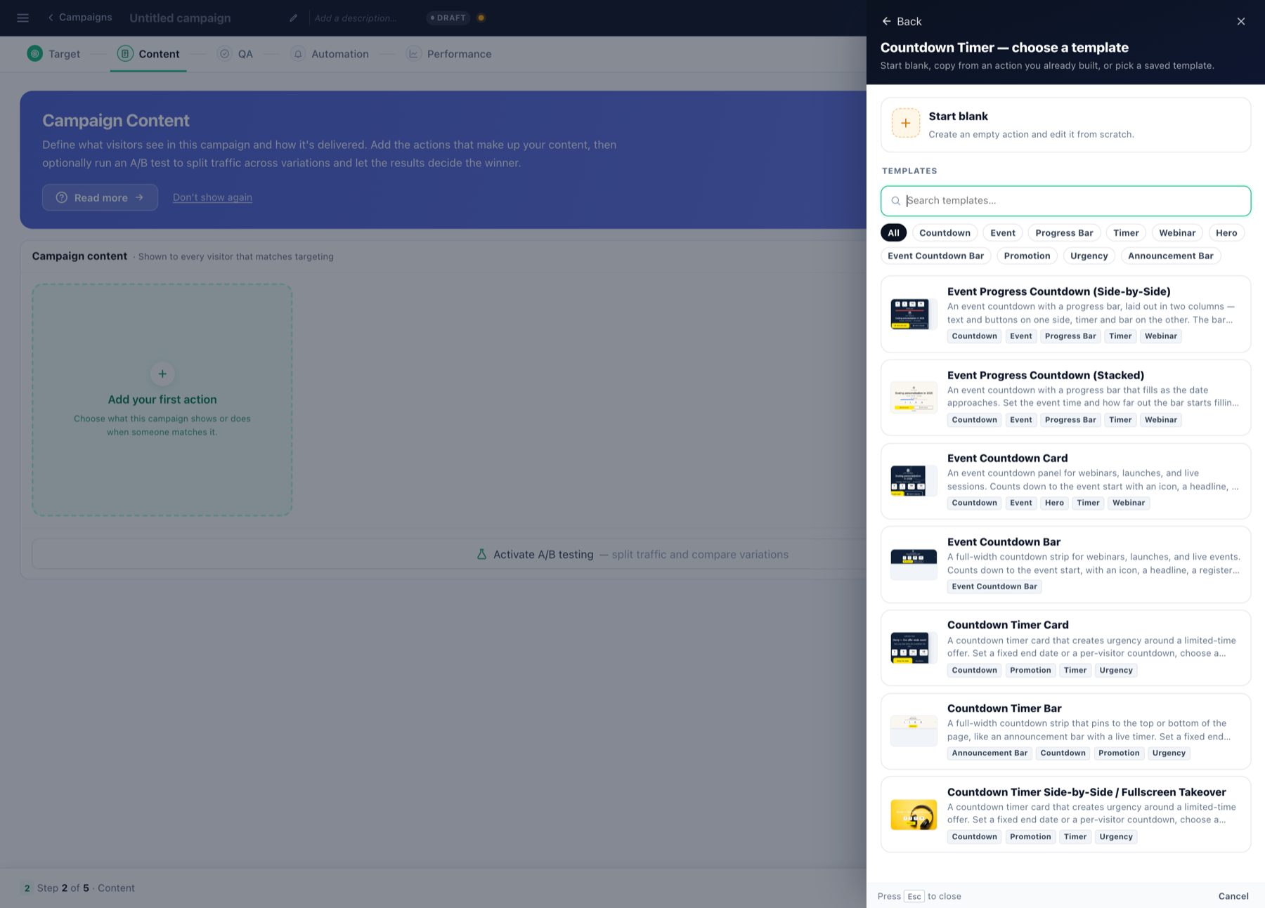
- Pick Countdown Timer. A template gallery opens — event countdowns with progress bars, countdown cards, and full-width countdown bars, each in stacked and side-by-side variants. You can also Start blank or copy from an action you already built.
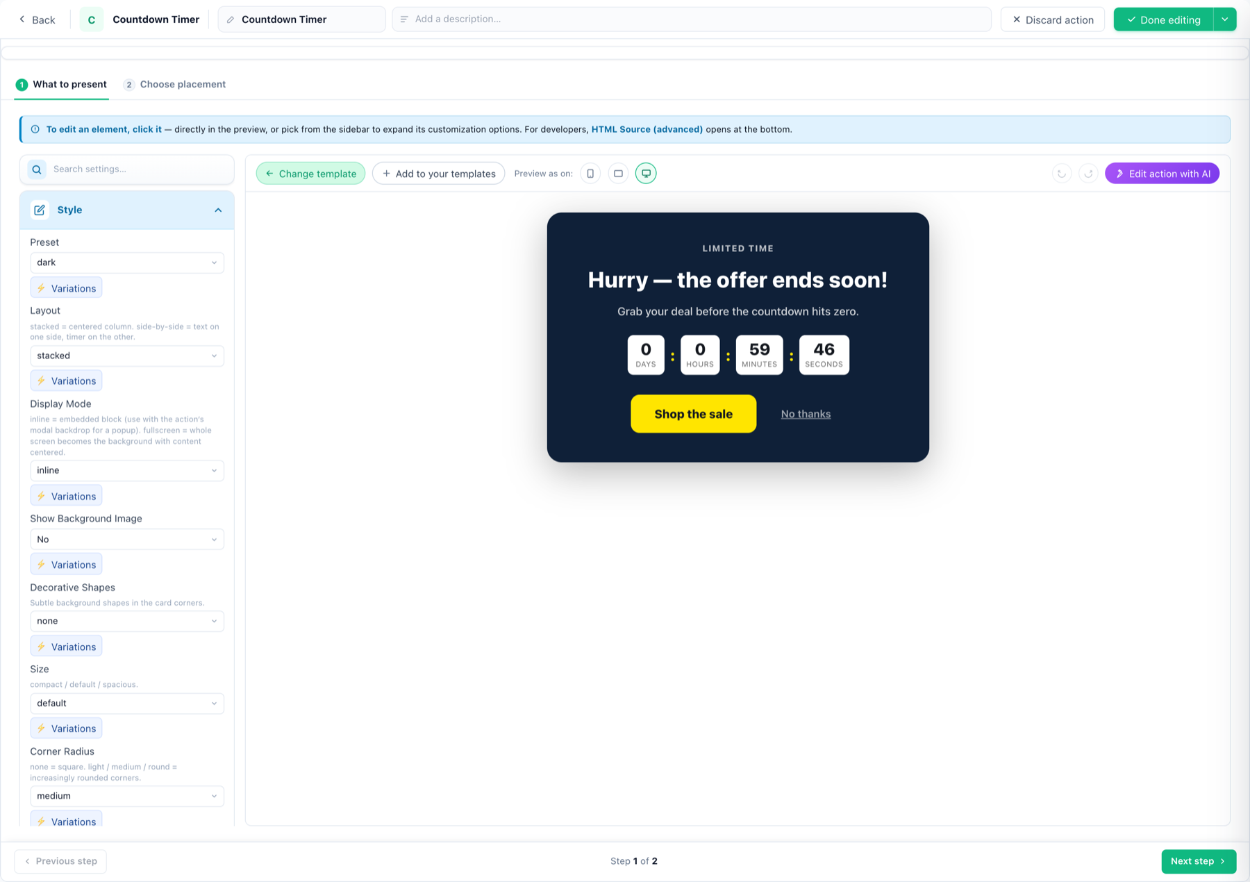
- Click Use on a template. The action editor opens with the live preview in the middle and every setting in the left sidebar.
Setting the countdown — days, hours, minutes
Open the Timer section in the sidebar. Countdown logic has three modes:
| Mode | What it does | Use it for |
|---|---|---|
| Fixed date | Counts down to one date and time, the same for everyone. Optional UTC offset — leave it blank to end at each visitor’s local time. | A sale that ends Friday midnight; a webinar start. |
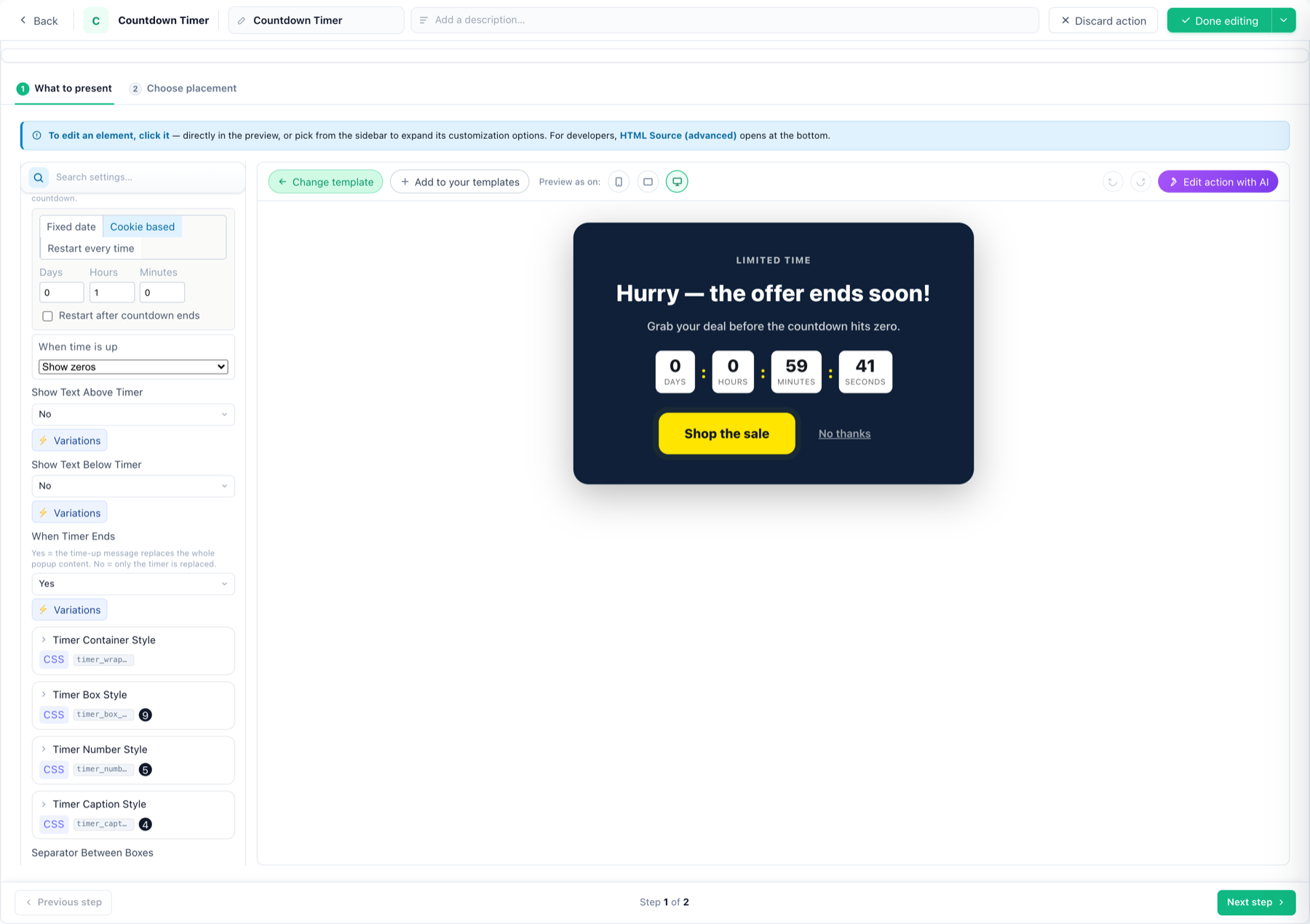
| Cookie based | Counts down a duration (days / hours / minutes) from each visitor’s first view. Tick Restart after countdown ends to restart it after a number of hours, or on a chosen weekday. | Per-visitor urgency: “your 24-hour discount”, restarting weekly. |
| Restart every time | Counts down a duration that resets on every session. | Session-scoped offers that should always look fresh. |
When time is up
Choose what happens at zero: Show zeros, Show a message (opens an HTML editor — dynamic variables allowed), or Hide the widget. The separate When Timer Ends switch decides how much gets replaced by the message: Yes swaps the whole popup content, No swaps only the timer.
Showing or hiding days, hours, minutes, seconds
Each unit has a caption field — Days Label, Hours Label, Minutes Label, Seconds Label. Two jobs in one field:
- Rename it — type “Tage”, “Std.”, whatever your copy needs.
- Hide the unit entirely — leave the label blank and that box disappears. A short flash sale that never spans a day? Blank the Days label and the timer starts at hours.
Separator Between Boxes sets the character between units (: by default) — blank for none. Container, box, number, caption and separator each have their own CSS hook for styling.
Vertical or horizontal
In the Style section, Layout switches the whole card between stacked (a centered column — text above, timer below) and side-by-side (text on one side, timer on the other). Pair it with Size (compact / default / spacious) and Timer Position (top / middle / bottom) to fit tight slots. Bar-style templates run horizontal by design and pin to the top or bottom of the page.
Different variations per language (or any audience)
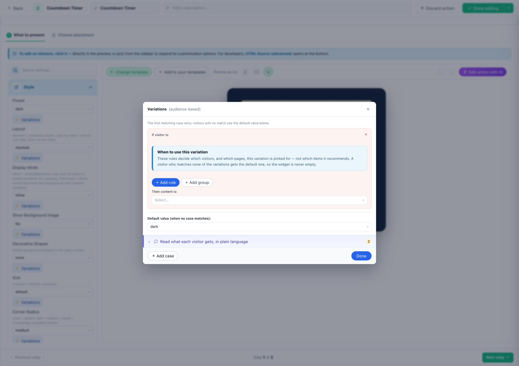
Every setting in the sidebar — the labels, the layout, the texts, the preset — carries a ⚡ Variations button. It opens the audience-based variations dialog:
- + Add case, then + Add rule — e.g. Browser language is Spanish.
- Set the value this case should get — e.g. Days label
DÍAS. - Repeat per language. The first matching case wins; everyone else gets the default value, so the widget is never empty.
The same mechanism handles any audience split — returning vs new visitors, mobile vs desktop, country, CRM fields. The “Read what each visitor gets, in plain language” row restates your cases as sentences so you can sanity-check them.
Where it shows, when it opens, how often
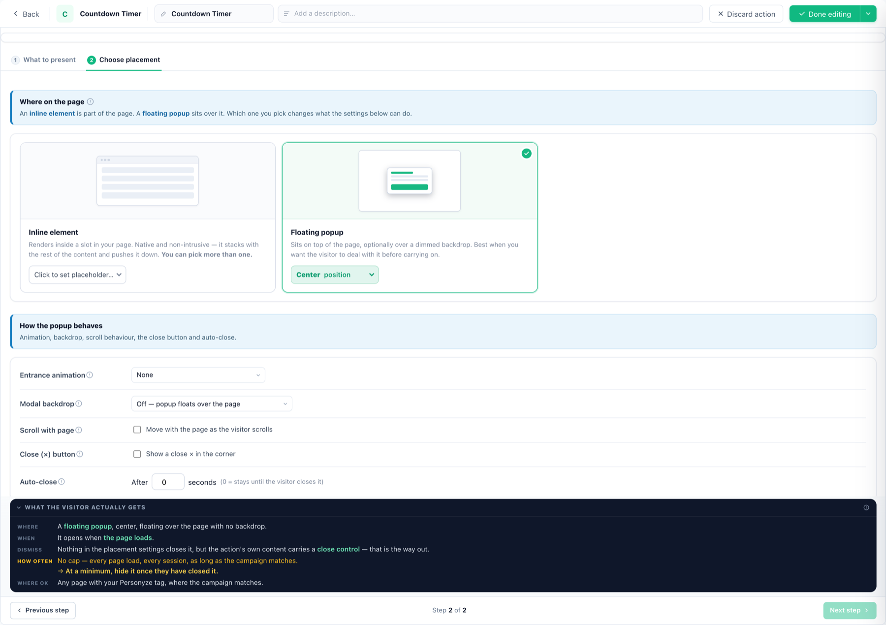
Step 2 — Choose placement — decides delivery:
- Inline element — renders inside a slot in your page (pick one or more placeholders); it stacks with your content. With Display Mode: fullscreen the card becomes a full-screen takeover instead.
- Floating popup — sits over the page in a chosen position, with entrance animation, optional dimmed modal backdrop, scroll behaviour, close × button and auto-close.
- Triggers — stack as many as you want; the first match opens it: on page enter / after delay / when idle; after scrolling to a % / rescrolled to top / text copied; on predicted exit intent (cursor heading away — desktop only); or opened by your own click/hover trigger.
- Frequency caps — plain-sentence rules: stop after they close it / click it / have seen it N times, show it in bursts, or wait after another popup. Each restates itself in your numbers so it can’t be set backwards.
Good to know
- Edit action with AI — the purple button above the preview rewrites or restyles the action from a plain-language prompt: “make it match a dark-blue brand and translate the texts to French”.
- Preview as on — phone / tablet / desktop preview from the toolbar; in full-page mode the real overlay shows on the live preview, not inside the editor.
- A/B testing — back on the Content step, activate A/B testing to split traffic between timer variants and let conversions pick the winner.
- Templates — the gallery’s countdown family is documented in detail under countdown templates and event progress countdown.