The Popup, Banner & HTML Builder is the workhorse action for showing content: promos, announcements, coupon popups, spin-the-wheel games, hero sliders, floating chat buttons, progress trackers — anything built from a template or your own HTML, shown as a popup, a bar, a full-screen takeover, or inline in the page.
Adding one
- In a Targeting & Personalization campaign, open the Content step and click Add action.
- Pick Popup, Banner & HTML Builder. The template gallery opens. You can also Start blank and paste your own HTML, or copy from an action you already built.
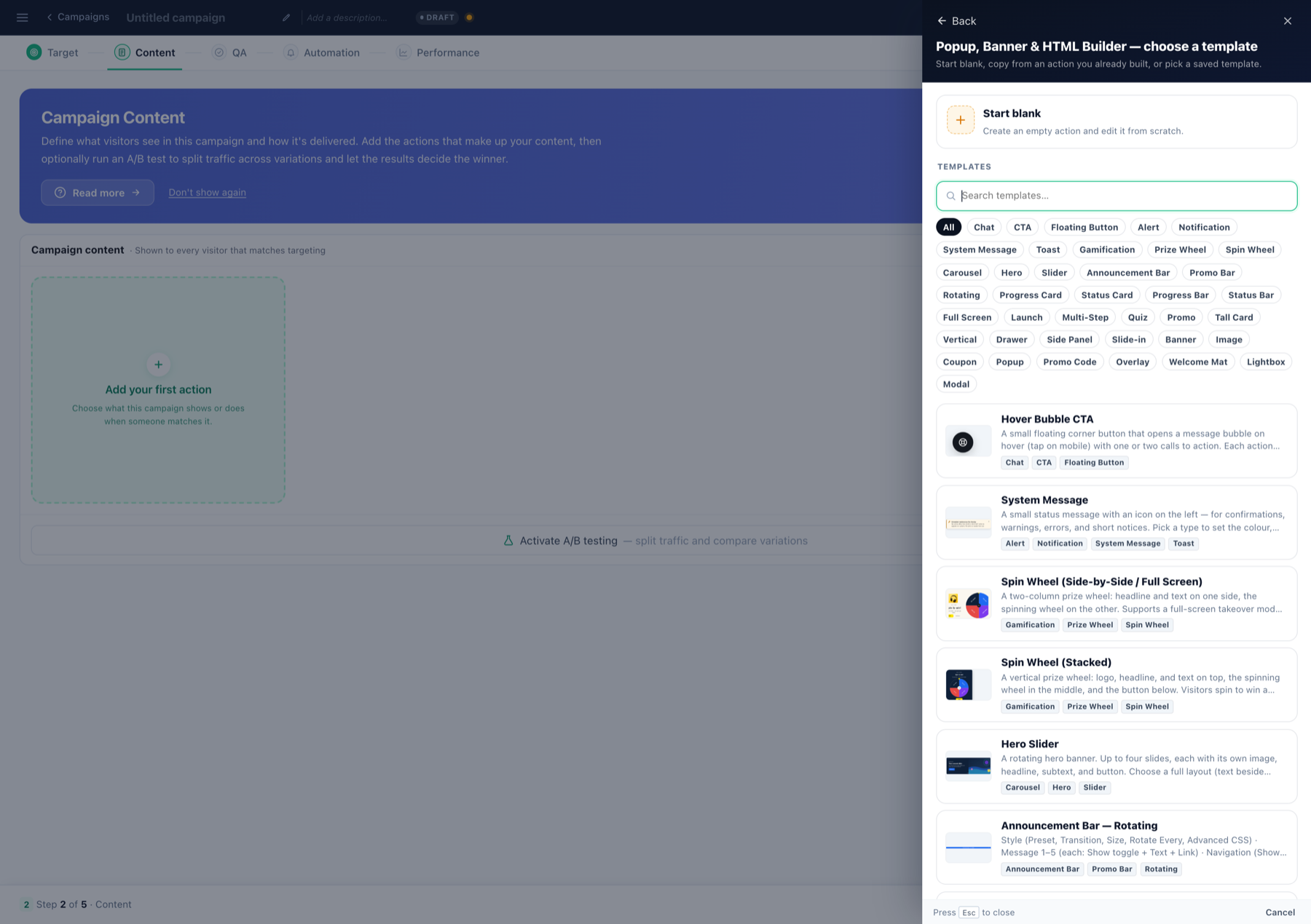
The families in the gallery (each links to its own detailed article):
- Coupon Popup — promo code with click-to-copy / blur-reveal.
- Spin Wheel (stacked and side-by-side/full-screen) — gamified prize wheel.
- Hero Slider — up to four rotating slides.
- Announcement Bar and Rotating Announcement Bar — top/bottom strips.
- Status Tracker and tiered progress bars — live goal / loyalty progress from profile values.
- Hover Bubble CTA — floating corner button that opens a message bubble (start a chat, book a call).
- Center Modal, Full-Screen Overlay, Corner Toast, System Message, vertical drawers and banners.
- Multi-Step Quiz — guided-selling questionnaire.
The editor
Step 1 — Design Your Banner or Popup. Click any element directly in the live preview, or expand its group in the sidebar. Every setting has a ⚡ Variations button — audience-based cases (language, country, returning visitor, CRM field…) with a default fallback, exactly as described in the countdown guide.
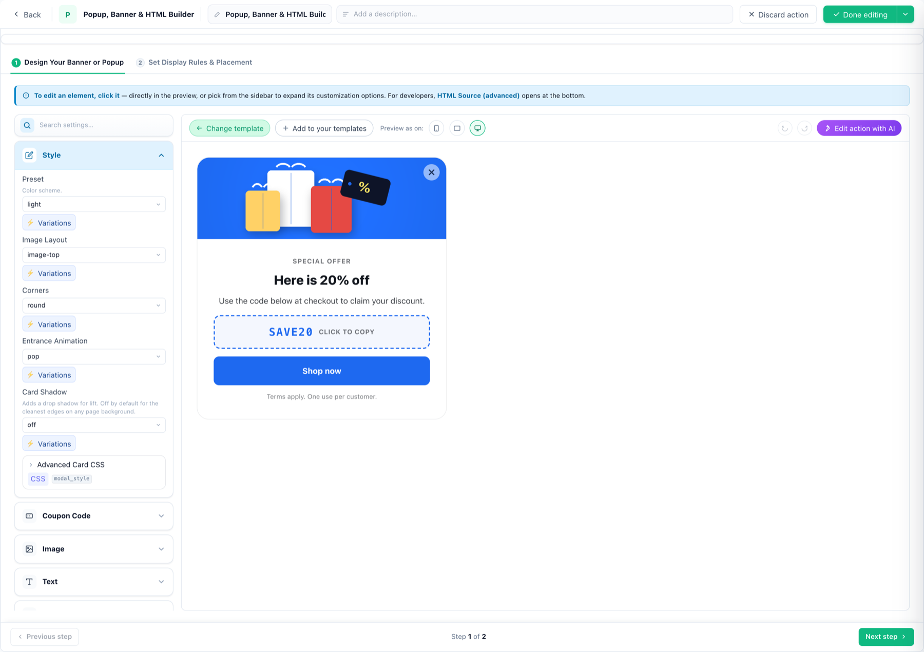
What the groups hold (Coupon Popup shown; other templates vary):
- Style — color preset, image layout, corners, entrance animation (pop…), card shadow, advanced card CSS.
- Coupon Code — the code itself and its Reveal Style: copy (click to copy to clipboard), reveal (blurred until clicked), display (always shown).
- Text — eyebrow, title, body, fine print; each with a show/hide toggle, its own CSS hook and Variations.
- Button — text, then Open link (same/new window) or Run JavaScript; Count clicks here (click target) marks it as the CTR click target; optional animation.
- Close — keep the built-in ×, or pick from the icon library (24 icons) or a custom image. Don’t show again for N sessions: after a visitor closes it, it stays hidden that many sessions — 0 lets it return next visit, 999 effectively never shows it again.
- HTML Source (advanced) — the full markup, for developers.
Toolbar: Preview as on phone / tablet / desktop, Change template, Add to your templates (saves your customized version for reuse), and Edit action with AI — describe the change in plain language and the AI restyles or rewrites the action.
Display rules & placement
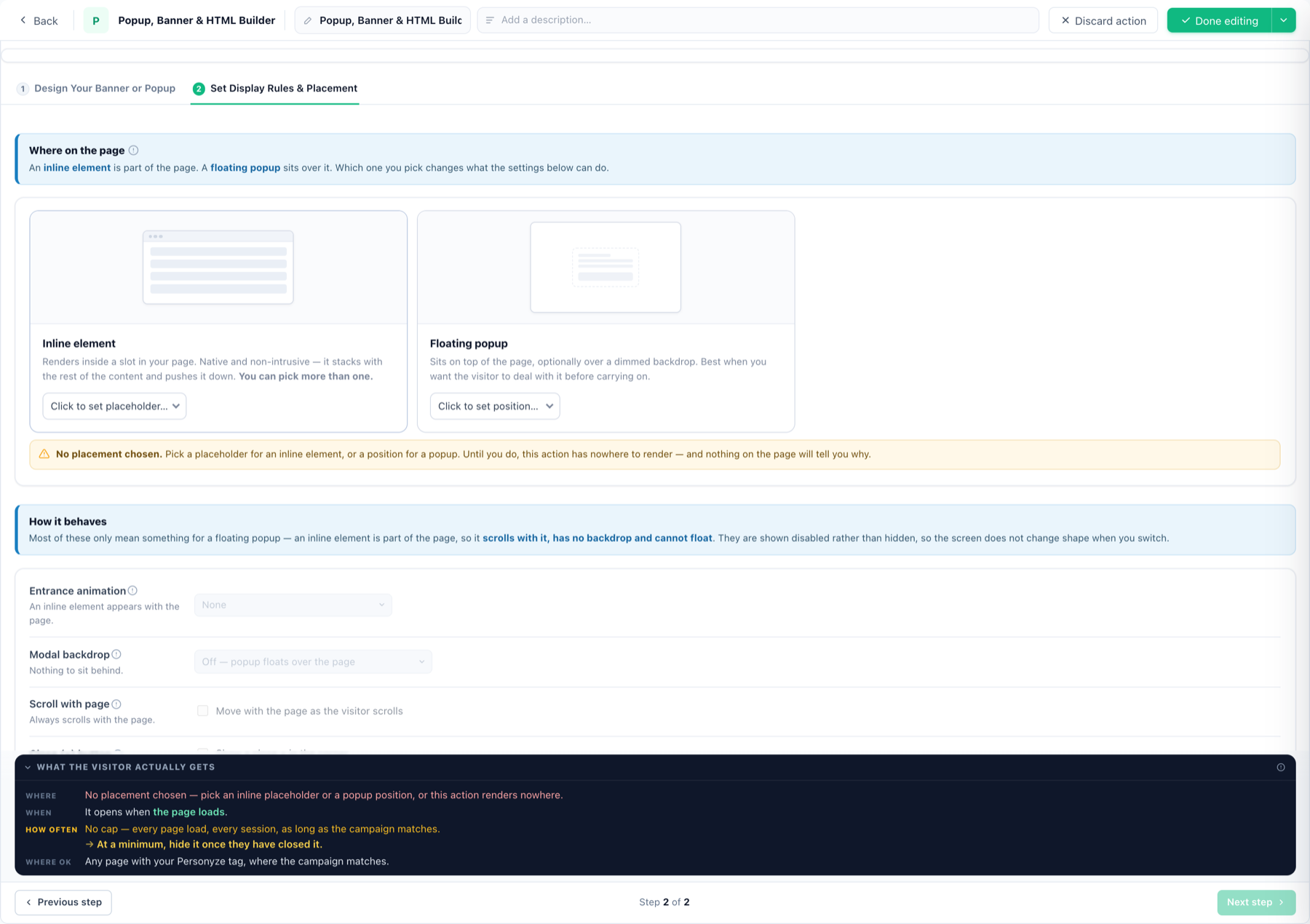
Step 2 — Set Display Rules & Placement:
- Inline element — renders inside one or more placeholders; stacks with your page content.
- Floating popup — pick a screen position; then entrance animation, optional dimmed modal backdrop, scroll behaviour, close button, auto-close. Settings that only apply to popups show disabled for inline — the screen keeps its shape.
- Until you choose a placement, the action has nowhere to render — the step says so explicitly, so an invisible action is never a mystery.
- Triggers — when the action opens. There are eleven, grouped by what the visitor is doing — see Triggers below.
- Frequency caps — stop after closing / clicking / N impressions, burst mode, spacing after other popups — each rule restated in plain language with your numbers.
Triggers — when the popup opens
A trigger decides the moment an action appears, once the campaign’s audience rules have already decided who sees it. Tick as many as you like: whichever happens first opens it.
On arrival
- On page enter — as soon as the page loads. This is also the fallback: with nothing else ticked, the action opens on load.
- Show after delay — a number of seconds, counted from page load whatever the visitor does.
- When idle for — no mouse movement, no click, no key press. Any one of the three restarts the count, so this fires after a genuine pause rather than at a fixed time.
On engagement
- After scrolling to — a percentage of the whole page height.
- If rescrolled to top — they went down and came back up.
- When text copied — they used Cmd/Ctrl+C.
- When text selected — highlighting a phrase, before they copy it. It waits about half a second after the selection stops changing so a drag finishes first, and needs ten characters or more — a stray double-tap on one word does not count.
- When they stop scrolling for — parked mid-page, reading rather than skimming. Only a real scroll starts the clock, so a page nobody scrolls never fires this; every further scroll restarts it.
On exit intent — now on phones too
Exit intent is two independent detectors, because leaving looks completely different on a mouse and on a touch screen. Tick either, or both.
- Desktop — cursor leaves. Fires when the pointer crosses the top edge of the window, where the close button, the tabs and the address bar are. Leaving by the sides or the bottom does not count, because those are not exits.
- Mobile — Back tap. They tap Back on a touch device. It arms only after the visitor engages — a scroll, a tap or a keystroke — never on a bare page load, so someone who bounces straight out keeps their Back button. Once armed, one press of Back opens the action instead of leaving and the page stays put; the press after that leaves normally. Reloading arms it again.
From your own code
- On an event from your site — call
_S_T.trigger("add_to_cart")from anywhere on your page at the moment the thing happens, or push{event: "add_to_cart"}to your data layer and use the name you already have in your tag manager. Names are matched exactly, capitals included. Firing it before the action has loaded is safe — the action opens as soon as it arrives.
Opening it from something on the page
Separately from the triggers above, an action can be launched by the visitor: on click or hover of an element you point at, on an element Personyze adds for you, or as a minimizable popup that sits collapsed as a tab until it is opened.
Measuring it
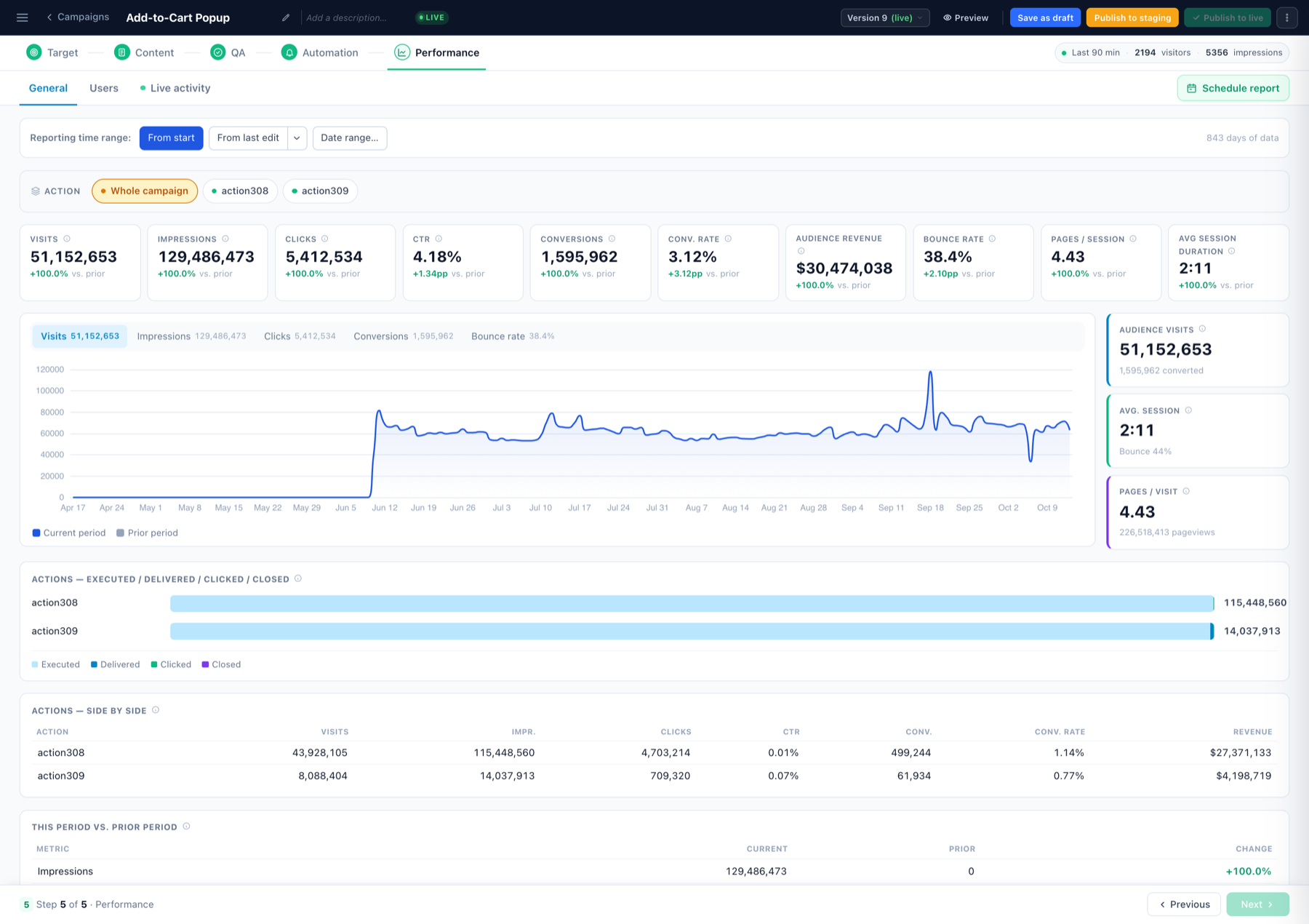
The button marked click target feeds the action’s CTR; impressions, clicks and closes report to the campaign’s Performance step and, if enabled, to Google Analytics. To test designs against each other, activate A/B testing on the Content step.