
A finder turns “search” into “tell me what you need”. The visitor describes a need in their own words — “a lamp for my home office”, “how do I run an A/B test” — and gets a short, reasoned shortlist instead of a list of keyword matches.
On personyze.com: AI Product Finder — the AI shopping assistant for your store →
- AI Product Finder picks from your product catalogue (price, stock, sale price), and can blend in your recommendation rankings — best sellers, trending, most viewed.
- AI Content Finder does the same for reading: it picks from your articles and site pages, and can blend in trending, most read and newest.
A finder is the AI assistant in another shape, so it answers from what you taught the assistant and follows its rules.
Two short videos, one for each finder: setting it up, then a real question on the site.
Writing the bar, the preview, where it picks from, and a shopper getting products with reasons.
The same for reading: a reader asks, and gets the articles to read and why each fits.
What the visitor sees
- The bar — at the foot of the page, at a side, or inside the page in a placeholder. It shows a title, an invitation, a question box, and up to four examples to tap. With Let visitors speak their question, the box has a microphone.
- The results page — it opens over the page: a two-to-four sentence summary of what fits and why; a card per pick with its picture, price, one line on why it fits and three reasons; a Your picks list; up to two buttons (for example “Book a demo”); and up to three sections showing your other campaign content. It can also carry the offer that applies to the visitor, a booking calendar, and an Add to cart button on each product — see Offers, meetings and Add to cart.
- Follow-up questions — under the picks, a short chat about them. A new question starts a new results page.
The assistant writes its summaries and reasons in the visitor’s language. The results are kept for the visit, so they survive a page change, and the finder can be minimised to a bar that brings them back (“See your picks”).
Setting one up
A finder is an action inside a campaign; with the defaults it takes about five minutes.
- Create new → AI chat & finders → AI Product Finder (or AI Content Finder). It opens an AI Search & Chat campaign: its first steps — Knowledge, Data and People — are the assistant’s own, shared by every chat and finder. Choose who sees it on the Target step (everyone, by default).
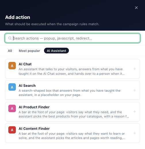
- On the Content step, pick the finder among the pictures. Any other campaign can carry one too: Content → Add action → AI Assistant → AI Product Finder or AI Content Finder.
- In Set Up This Product Finder (or Content Finder), work down the cards — see below. Any field left empty uses the finder’s own wording.
- Check it in the Preview, under Preview as.
- Set Display Rules & Placement: a popup position (a wide bar on the bottom centre line, a compact one at a side), or a placeholder, to draw the bar inside the page.
- Publish to staging and open your site with the preview link to see it as a visitor; then Publish to live.
With no products on the account yet, the AI Product Finder card says Needs a product catalog, and opens on the catalog first.
The design step, card by card
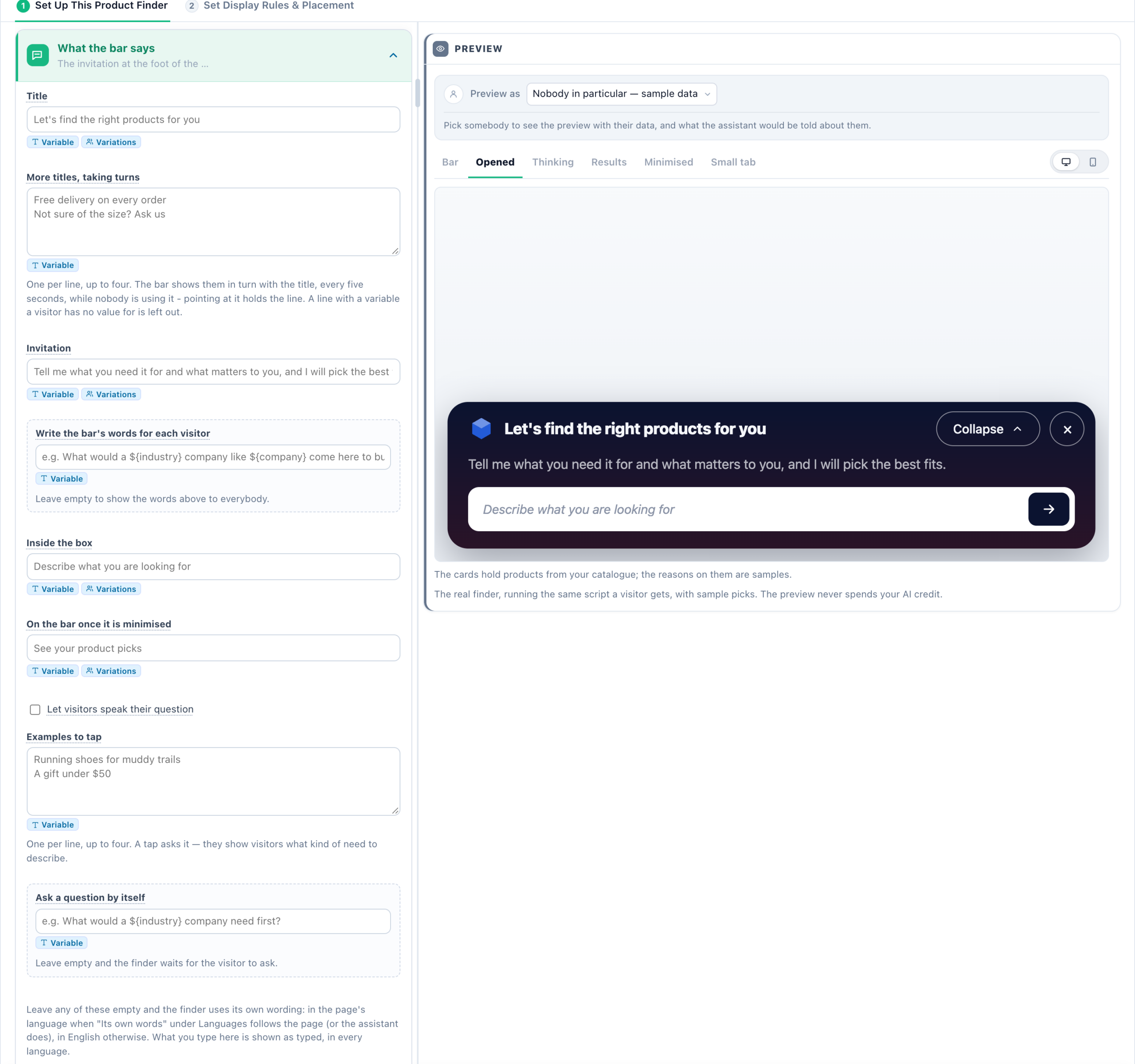
The cards, in order. A choice that changes how it looks is drawn as a small picture, and pointing at a setting’s name explains it.
- Languages — your wording for pages in other languages (see words in other languages), and Its own words: the buttons and messages the finder writes itself, such as “Take a look” and “Start over” — As the assistant is set, English — on every page, or The page’s language. Answers and the reasons beside each pick are always in the visitor’s language.
- Look — ready looks, the theme, a colour map of the finder, box edges, corners, font and motion. See the look.
- What the bar says — Title (and More titles, taking turns), Invitation, Inside the box (the question box’s placeholder), On the bar once it is minimised and Examples to tap (one per line, up to four). Also Write the bar’s words for each visitor and Ask a question by itself — see words for each visitor.
- Closing and the small tab — what the × does, when a closed finder comes back, and a logo. See closing and the small tab.
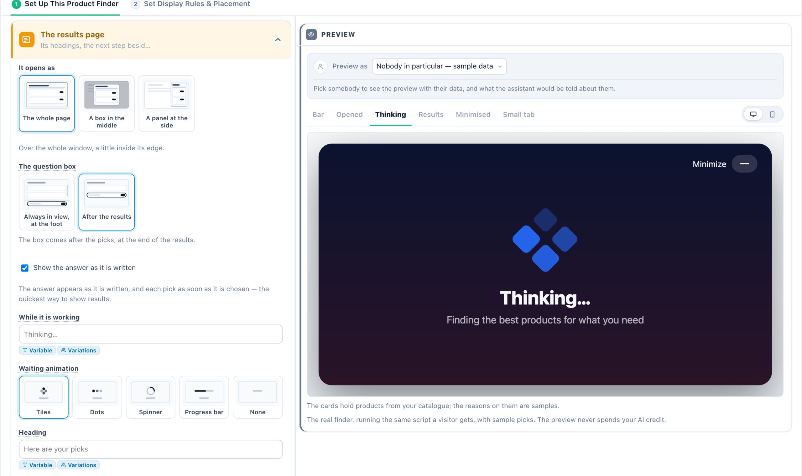
- The results page — It opens as (The whole page, A box in the middle, A panel at the side), The question box (Always in view, at the foot, or After the results), how the results appear and the waiting screen (below), its Heading, Show review stars, the line Over the follow-up questions, up to two buttons (Next step and Second button, each with a Link — a button without a link is not shown), and More on the results page: up to three sections that show your other actions, each with an optional heading.
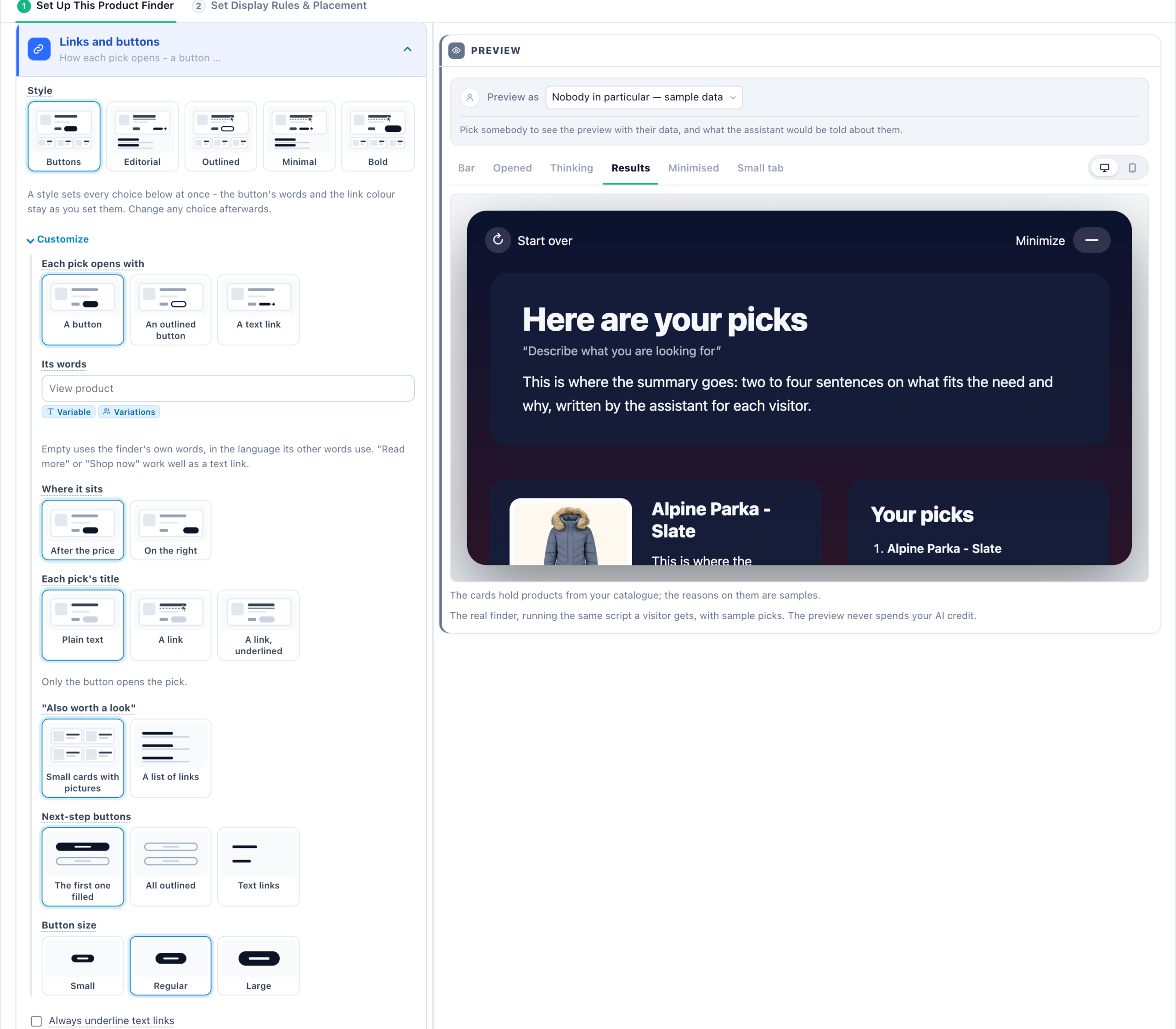
- Links and buttons — a Style (Buttons, Editorial, Outlined, Minimal, Bold) sets the six choices under Customize at once: Each pick opens with (A button, An outlined button, A text link), Its words, Where it sits (After the price, On the left, On the right), Each pick’s title (Plain text, A link, A link, underlined), “Also worth a look” (Small cards with pictures, A list of links), Next-step buttons (The first one filled, All outlined, Text links) and Button size (Small, Regular, Large). Also Always underline text links, where Start over sits, and Open picks and links in a new tab.
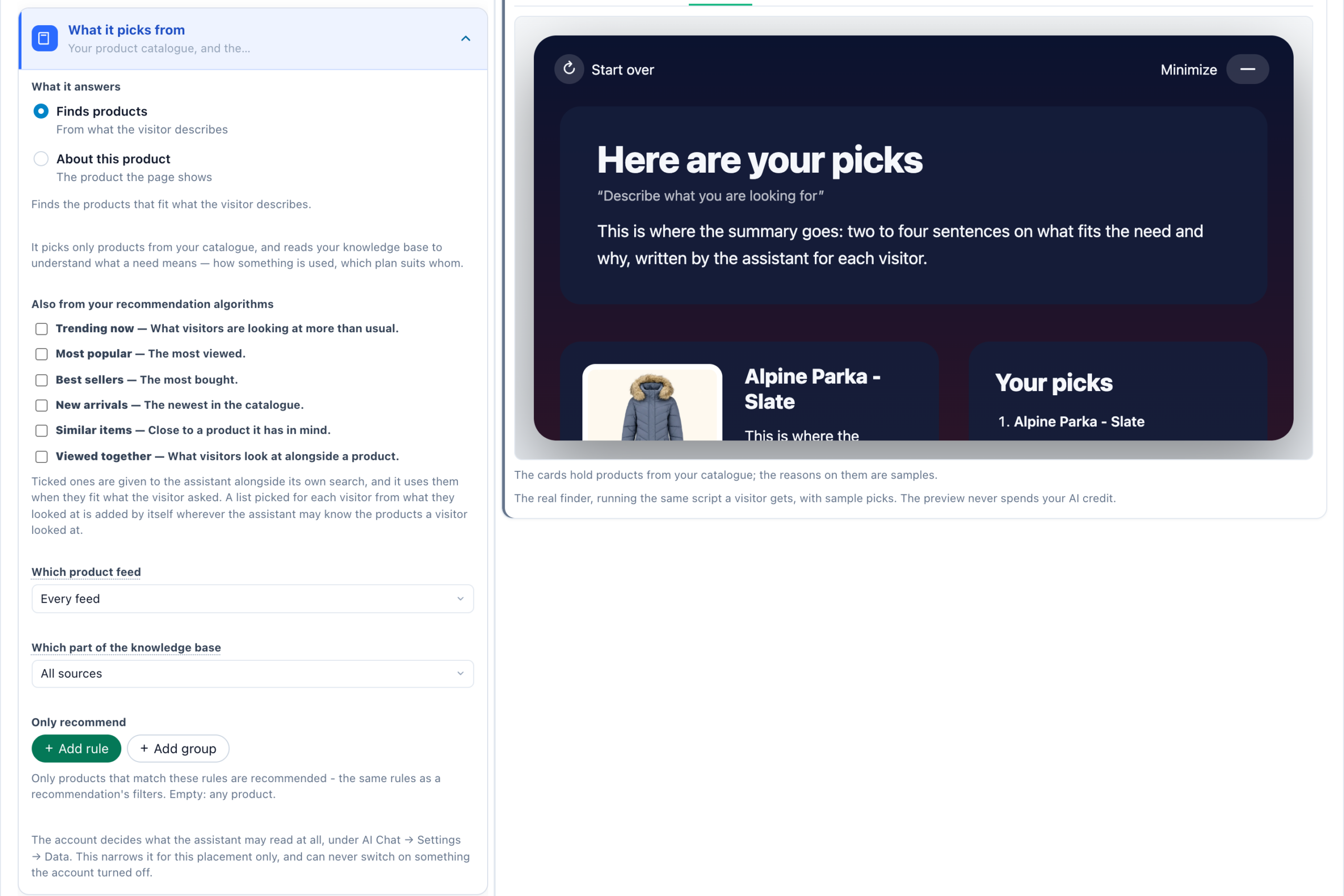
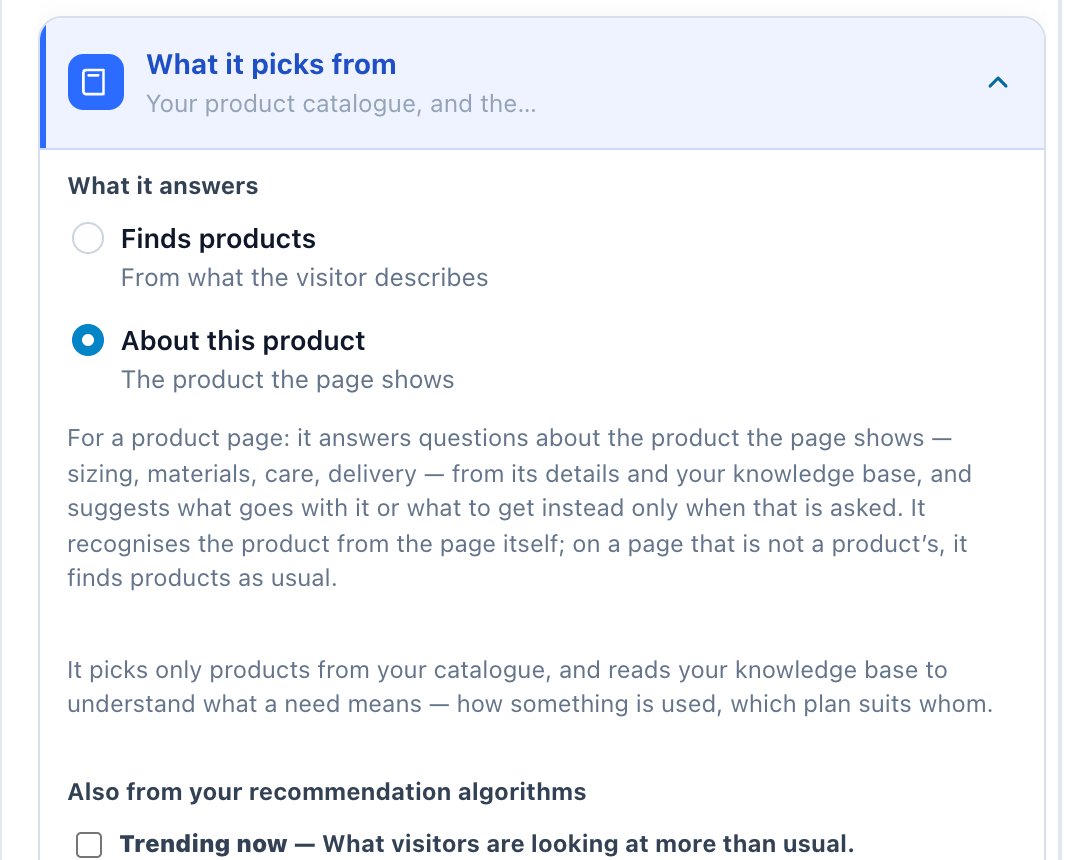
- What it picks from — for a product finder, first What it answers: Finds products — from what the visitor describes, or About this product — the product the page shows (below). Then your catalogue (or articles and pages), plus Also from your recommendation algorithms: Trending now, Most popular, Best sellers, New arrivals, Similar items and Viewed together for products; Trending now, Most read, Newest and Similar reading for content. Which product feed (when there is more than one) and Which part of the knowledge base narrow it further.
- Its own rules — Can it hand over to a person?, Extra instructions and It must never, on top of the assistant’s own rules; then May mention your offers and May offer a meeting (below).
- More settings — the Small print and Show the small print, Hide on small screens, Extra CSS, and the Events it sends when somebody asks and when somebody opens a pick.
Let visitors speak their question, beside Inside the box, puts a microphone in the bar and in the box under the picks. What the visitor says fills the box and is asked only when they press the arrow, so a misheard word can be fixed first. In Chrome and Edge the recording is sent to Google to be transcribed; Firefox cannot listen, and there no microphone shows. It does not depend on the AI Chat’s own voice setting.
Sections on the results page
A section shows one of your own actions under the picks: a product or content recommendation widget, an image, a Popup Builder design, a booking widget, Show Reviews, Customer Logos, a review request, an HTML form or a Review Form. It must be in a running campaign. Personal rankings — recently viewed, picks for you — belong here rather than under What it picks from.
How the results appear, and the waiting screen
Under The results page:
- Show the answer as it is written — on, the default, the answer appears as it is written and each pick as soon as it is chosen: the quickest way to show results. Off, the waiting screen stays until the answer and every pick are ready, then the finished page appears at once.
- While it is working — the words shown while it searches (“Thinking…” when left empty). Each language can have its own.
- Waiting animation — Tiles, Dots, Spinner, Progress bar or None. Visitors whose device asks for less motion see none of it.
Choosing a line or an animation shows the waiting screen in the preview.
About this product: a finder for product pages
An AI Product Finder set to What it answers → About this product — the product the page shows answers questions about the product on the page — sizing, materials, care, delivery — from its details in your catalogue and from your knowledge base. It suggests what goes with it, or what to get instead, only when that is what was asked.
- It recognises the product from the page itself: the product data your platform writes for search engines (its id or SKU), else the page’s address, matched against your catalogue.
- On a page that is not a product’s, it finds products as usual.
- Put it on product pages with the campaign’s targeting, and word the bar for it — “Questions about this product? Ask us”.
Offers, meetings and Add to cart
Under Its own rules, both off unless you tick them:
- May mention your offers — your discounts and coupons from AI Chat → Offers and, when none fits, the visitor’s promotion from Promotions. One that applies to the visitor ends the summary in one sentence and shows as a card between the summary and the picks: a banner, a coupon with its code and a Copy button, or a text promotion. A follow-up question may ask for it. It never invents one. See Offers in the AI finders.
- May offer a meeting — asked for a meeting, the finder offers one in its own answer, with the booking calendar under the summary, and a follow-up question under the picks can book one too. A section you added to the results page, such as a demo booker, shows when the visitor asks for it, even without picks. It needs your AI Chat to offer meetings at all: AI Chat → Behaviour → Offering a meeting.
Add to cart — each product card in a finder’s results, and in AI Chat answers, carries an Add to cart button that runs your account’s own add-to-cart code. Only an account with Quick add to cart set up (Settings → Recommendation setup → Product Tracking → Product Added to cart) gets the button.
The preview
The preview runs the real finder, the same script a visitor gets, with sample picks. Its screens: Bar, Opened, Thinking, Results, Minimised and Small tab. Preview as shows it to Nobody in particular — sample data, or to a real recent visitor, with their values and their variation. The preview never spends AI credit, except the one per-visitor line written for a visitor you pick.
Pick the person from the full picker — a search, a sample, New visitor or Nadia — and What the finder is told about them, under the preview, lists what the finder would be given about them; see Preview as a Visitor.
Good to know
- It needs the AI Chat add-on (or a trial) with conversations left. When the conversations or the AI budget run out, finders switch themselves off like the chat: visitors see nothing rather than a finder that cannot answer. The designer says so above its preview, with a link to Add-ons, and the finder comes back by itself when the allowance renews.
- It needs something to pick from: a product catalogue feed for the Product Finder; articles or site pages for the Content Finder.
- It searches like the chat — in your catalogue’s own language, by category names and by other forms of a word. See How it searches your catalogue.
- One open chat per page works best. An AI Chat window open on the same page can cover the right end of a finder bar at the foot of the page. Place one of them inside the page, or keep the chat as its button.
- Staging takes a few minutes to reach every server, so the first page loads after publishing may still show the previous version.
- Prices on product cards use the account’s own price format, the same as its recommendation widgets.
- In a Canvas design: both finders are also elements of the Canvas Builder.
Related
- AI finders: words for each visitor, the look, and closing
- AI Chat — the assistant a finder is built on
- AI Search — the ask box that answers instead of picking
- What the assistant may see — visitor data and catalogues