
The Multi-Recommendation Widget puts several recommendations in one place on the page — For you, Best sellers and New in side by side, or Similar beside Bought together — each with its own algorithm and its own look. As tabs, the visitor switches between them on a strip; as sections, they see them all at once, each under its heading.
A tab can hold products, articles, an AI Promotion or a design of your own, so one widget can also put a deal or a coupon beside the recommendations.
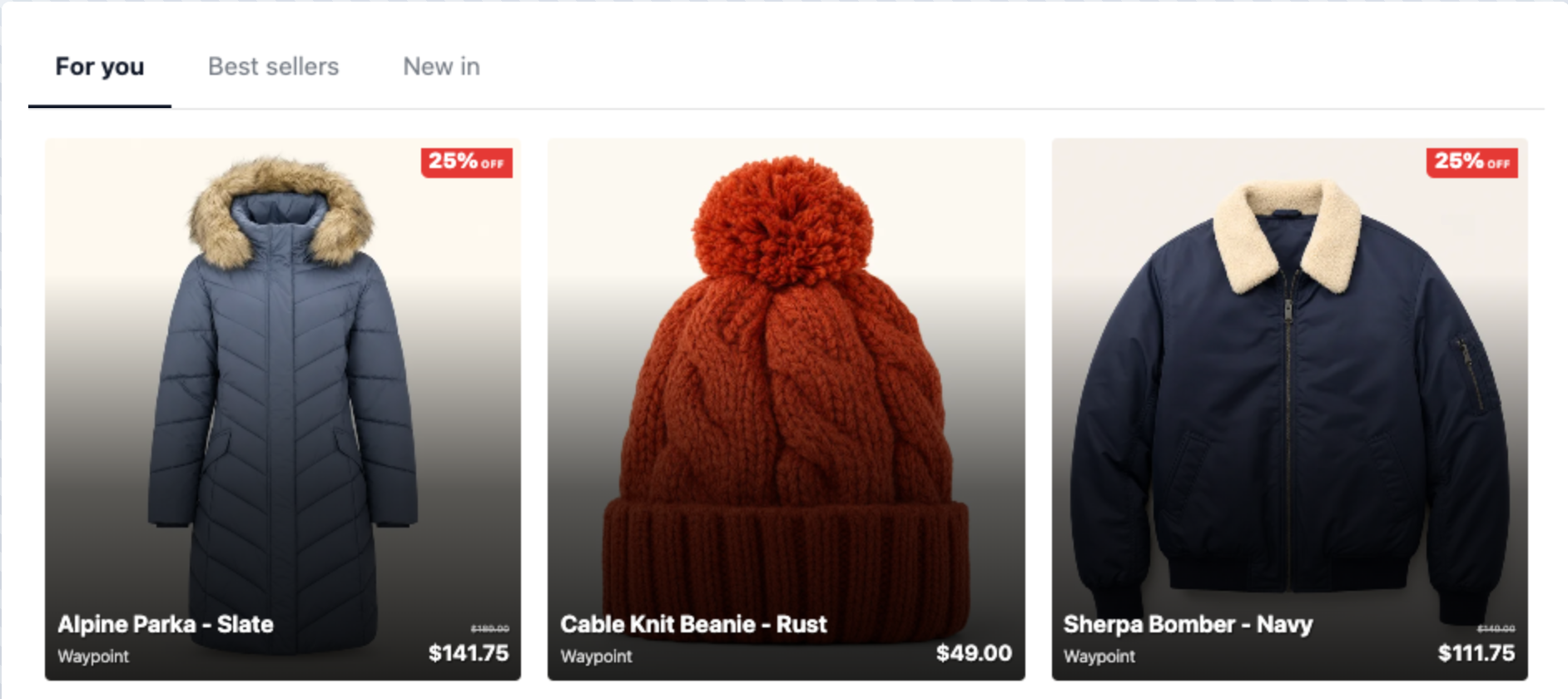
Tabs or sections
| Layout | What the visitor sees | How many | What loads when |
|---|---|---|---|
| Tabs | One recommendation at a time, with a strip of names to switch between them. | 2 to 6 tabs | The first tab comes with the page. Every other tab is asked for the first time a visitor opens it — one request, then it stays. |
| Sections | All of them at once, in a grid, each under its own heading. | 2 to 4 sections | The first section comes with the page; the others load as the visitor scrolls near them. |
Load all tabs at once (Load all sections at once) brings both with the page, so the second opens without a wait. It is offered for a widget of two only: every tab loaded with the page is built on every page view, whether anybody opens it or not. It is off while the second tab is an AI Promotion, which loaded with the page would count as shown — and hand out its coupon code — to visitors who never open it.
Add one
In a Product Recommendations or Content Recommendations campaign, the empty Content step shows it as a picture under What should it show?; in other on-site campaigns, it is in Add action. Its gallery opens: a ready-made set, a design to start from, Start blank or Use existing.
The campaign decides what the widget recommends: a Product Recommendations campaign offers product tabs, a Content Recommendations campaign article tabs, and any other campaign both. A widget started blank begins with two tabs — two product grids, or, in a Content Recommendations campaign, the articles For you and Trending Now.
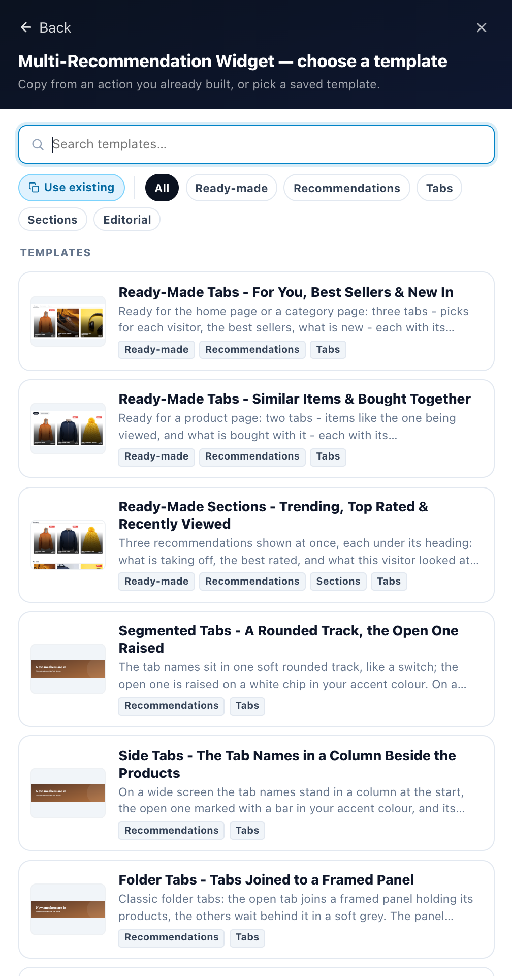
Ready-made sets
A set builds the whole widget: its layout, its tabs, their names, each tab’s algorithm and one shared look. Rename, reorder or change any tab afterwards.
| Set | Tabs or sections | For |
|---|---|---|
| Ready-Made Tabs – For You, Best Sellers & New In | For you (Personalized Recommendations), Best sellers, New in (new in the last 30 days) | The home page or a category page |
| Ready-Made Tabs – Similar Items & Bought Together | Similar (Similar Items (AI)), Bought together (Cross-Sells) — both come with the page | A product page |
| Ready-Made Sections – Trending, Top Rated & Recently Viewed | Three sections: Trending, Top rated, Recently viewed. A section with nothing for the visitor hides itself. | Any page |
| Ready-Made Tabs – For You, Trending & Latest | Articles: For you, Trending, Latest (published in the last 30 days) | A home page or a blog’s front page |
| Ready-Made Tabs – Related & Most Read | Articles: Related (Similar Content (AI)), Most read — both come with the page | An article page |
The product sets are offered where the widget recommends products, the article sets where it recommends articles.
Designs
The other gallery entries are looks for the strip or the grid, each keeping the tabs you have:
- Underline Tabs — a strip with the open tab underlined.
- Pill Tabs — rounded buttons, the open one filled.
- Segmented Tabs — a rounded track, the open one raised.
- Side Tabs — the tab names in a column beside the items.
- Folder Tabs — tabs joined to a framed panel.
- Headline Tabs — large names, the open one in full colour.
- Sections Grid — every recommendation under its own heading.
- Sections Rows — each recommendation a row, its name at the start.
- Sections Panels — each recommendation in its own tinted panel.
Change template on a widget you have set up asks first when the template you pick is a set: its tabs replace yours. Save template saves the whole widget as a set of your own — layout, tabs, names, algorithms and looks — without its placements or audience rules.
The editor
The widget’s editor has two steps: Design and Set Display Rules & Placement. Design is the whole widget:
- Preview as, at the top, stays in view: pick somebody and every preview in the editor shows what they would really get in each tab.
- Under it, a row: The widget, one entry per tab or section — its name and the small icon of what it holds — and + Add tab (+ Add section).
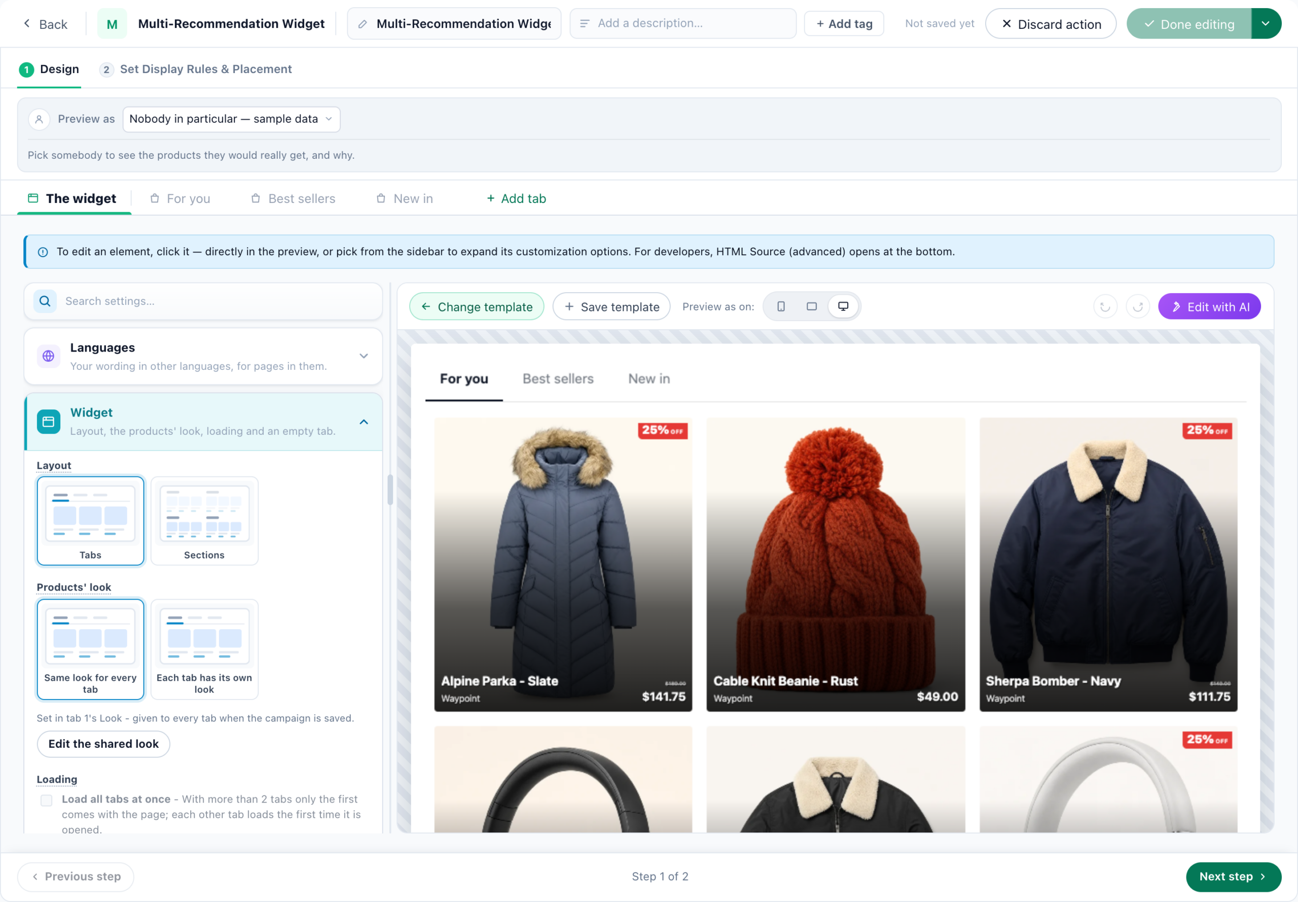
The widget
The widget, where the editor opens, is the widget’s own design editor, with Change template, Save template, the device switch, undo and redo, and AI editing. Its preview is the whole widget — the strip or the grid, with every tab’s real items for the person picked under Preview as. The sidebar starts with a Widget group:
| Setting | What it does |
|---|---|
| Layout | Tabs or Sections, as pictures. |
| Products’ look (Articles’ look) | Same look for every tab: every product tab shows its products the way the first product tab does — set once, in that tab’s Look, with Edit the shared look — and each still shows its own products. Each tab has its own look: each tab’s look is set in its own Look. Article tabs share the first article tab’s look in the same way; a promotion or a banner always keeps its own. |
| Loading | Load all tabs at once — see Tabs or sections. |
| An empty tab (tabs only) | What a tab says when it loaded on its first click and found nothing for this visitor. Left empty, it says Nothing here right now – check back soon. Shown to visitors as you write it. |
A Languages card in the same sidebar holds every tab’s name and the empty-tab message in each language — see Tab names.
Adding and changing a tab
+ Add tab asks What goes in this tab?:
| Card | What the tab holds | Its page |
|---|---|---|
| Products | A product recommendation with an algorithm of its own. | What it recommends | Look |
| Articles | A content recommendation from your articles, with an algorithm of its own. | What it recommends | Look |
| AI Promotion – banners | Your promotion banners, picked for each visitor. | Which promotions | Look |
| AI Promotion – text | A line of text — free shipping, a sale, an offer — picked for each visitor. | Which promotions | Look |
| AI Promotion – coupons | The codes each visitor qualifies for, with a button that copies them. | Which promotions | Look |
| Popup, banner or HTML | A design of your own — a banner, a card, a message — or your own HTML, from the Popup, Banner & HTML Builder. | Its design |
The three AI Promotion cards come with the Promotions add-on and pick from your Promotions list. Only the kinds the campaign offers are shown.
A kind the widget already has starts as a copy of its last tab of that kind, look and all. A kind it does not have yet starts from a fixed design — the product grid with the text on the picture, for products — with that design’s own heading switched off, since the tab’s name is its heading.
Each tab’s ⋯ menu: Rename, Change what’s in it… (it keeps its name and its place; what it shows now goes when the campaign is saved), Move left, Move right and Remove, which asks first. A widget has two tabs at least.
A tab’s page
Click a tab in the row to open its page. A small switch at the top flips between What it recommends — the same algorithm picker, Match the visitor, filters and fallbacks as a single product recommendation — and Look, its design. Pills beside the tab’s name say how it is delivered: With the page, On first click (When scrolled to for a section), and Not shown to this visitor when its name hides it from the person you picked.
With Same look for every tab, a tab that takes the shared look shows it on its own items, read only, with Edit the shared look to open the tab it comes from.
Each tab’s versions
On the right of a tab’s header, This tab’s versions lists the tab’s saved versions, newest first, the one you are editing marked current. Choosing another brings it back into the tab as an unsaved change, and the header says Restored, not saved yet: save to keep it — saving makes it a new version, and every earlier version stays — or discard it.
With Same look for every tab, restoring the tab whose look the others share brings its look back for all of them; restoring a tab that takes the shared look brings back only what it shows.

Tab names: variables, variations and languages
⋯ → Rename opens the name editor:
- Variable puts something you know about the visitor in the name — “Picked for you, Anna”, “New in Boston”.
- Variations give an audience another name. Leave a variation’s name empty and that audience does not see the tab at all — the widget is served to them without it.
- Languages give the name a version per language, with Translate with AI. Visitors whose language has a version see the name in it; with nothing there, the main name. A language added here is the widget’s: every tab and the empty-tab message get a box for it in the Languages card.
A plain name is up to 80 characters; a name that is too long with its variations cannot be saved, and the editor says so.
What visitors see
- A tab with nothing for the visitor hides when it came with the page. A tab that loaded on its first click and found nothing shows the empty-tab message, and is gone once they leave it.
- A section with nothing hides.
- An AI Promotion with nothing for the visitor hides its tab. A coupon tab hands out its code only when it loads: with the page in the first tab or section, otherwise when the visitor opens the tab — or scrolls near the section.
- A Popup, banner or HTML tab is the same for every visitor unless it uses variables, so it never hides.
- A hidden tab is never delivered to the visitors its name’s variations hide it from.
Checking it before it goes live
- Preview as, in the editor: every tab with the real items the person you pick would get.
- Publishing checks each product or article tab for an algorithm: “The tab … has no algorithm yet” — a tab with no algorithm always comes back empty.
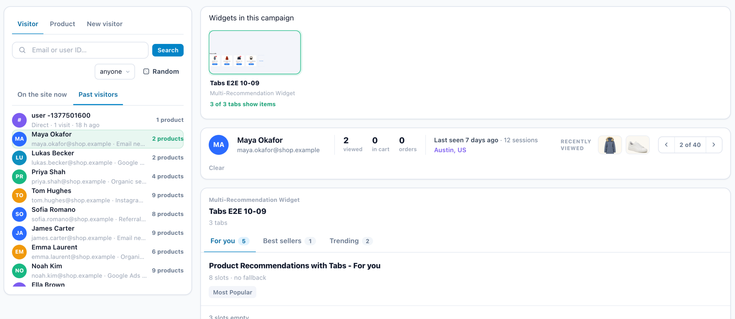
- The Simulator step shows the widget as one Multi-Recommendation Widget card with its strip of tab names, and how many tabs show items. Product and article tabs run for the person you pick; a promotion or a banner tab says that the Simulator covers recommendation tabs only — check it with Preview as instead.
Good to know
- A tab is edited only inside the widget. In the campaign’s Content step the widget is one card, with its number of tabs; its tabs are never cards of their own, and moving, copying or removing the widget takes its tabs with it.
- It is built in the panel. Personyze AI does not build this widget; it can make you a single product or content recommendation instead.
Related
- Recommendations — Start Here — the whole path, from data to the widget
- Product Recommendations Wizard — the campaign around the widget, and the algorithm editor every tab uses
- Content Recommendations Wizard — the same for articles
- Recommendation Algorithms — what each tab can recommend
- Match the Visitor — put what fits each visitor first, in any tab
- Template Gallery — every ready-made design
- Promotions — what an AI Promotion tab picks from