
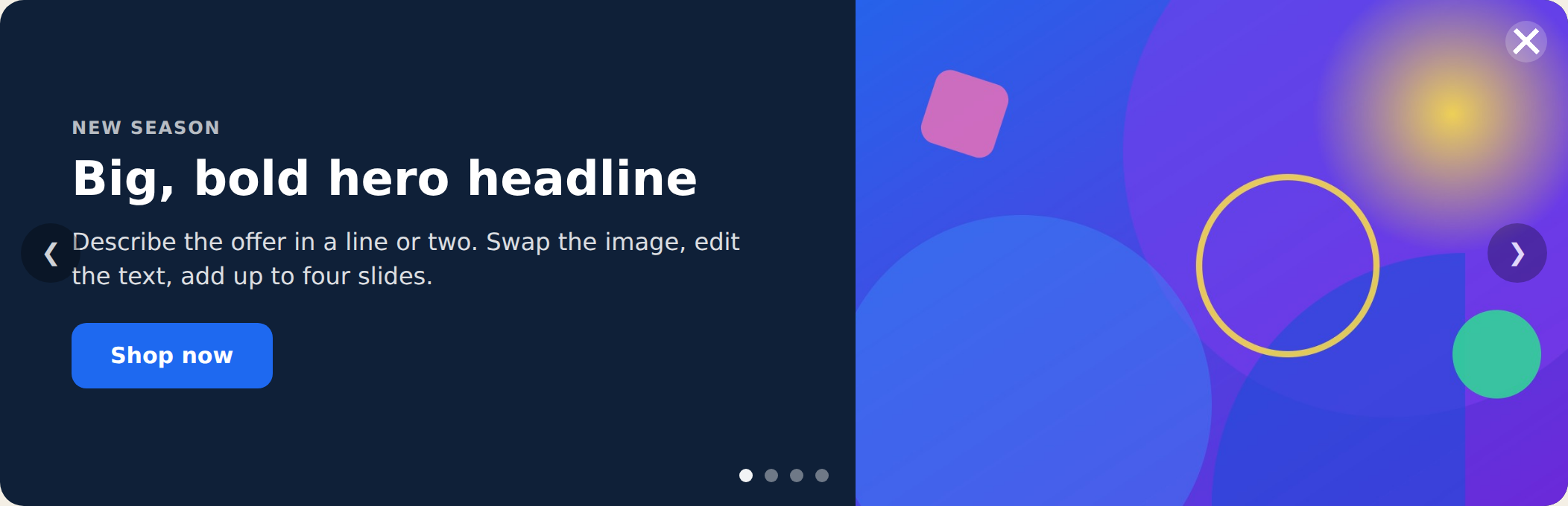
The Hero Slider is a rotating hero banner with up to four slides, each with its own image, headline, subtext, and button. It auto-rotates with arrows and dots, and you choose whether text sits beside the image or overlays a full-bleed image. Use it for a homepage hero, a campaign banner, or a seasonal promo. Placement is set in the action’s Location step.
When to use it
- Homepage hero — rotate several messages or offers in a prominent banner.
- Campaign / seasonal promo — feature multiple products or themes in one slot.
- Announcements with visuals — when a plain text bar isn’t enough and you want imagery.
Add it to an action
In a Popup action, choose Hero Slider. Set the layout and transition, then fill in each slide. Slides 1 and 2 are on by default; turn on Slides 3 and 4 in their sections when you need them.
Full or image layout
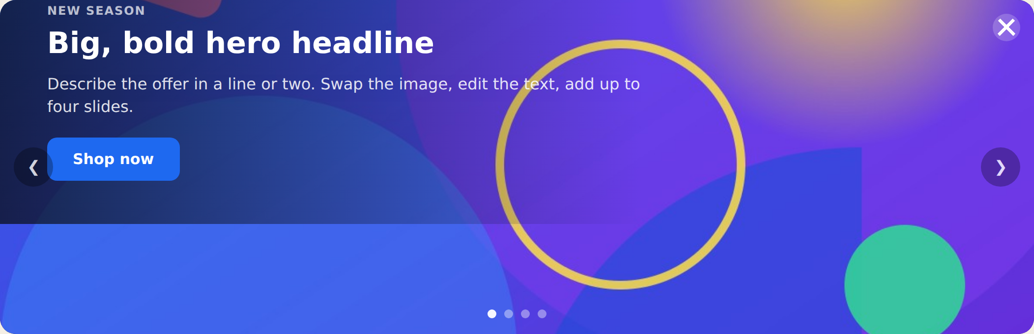
The Layout setting (in Style) switches the look: full puts the text on one side and the image on the other; image uses a full-bleed image with the text overlaid at the bottom-left over a soft gradient. Everything else — slides, rotation, arrows, dots — works the same either way.
Editing slides
Each slide has its own Eyebrow, Title, Subtext, Image, and Button (text + link). Use the Image picker to choose from your media library; the slider ships with clean default graphics so it looks finished before you swap them. Turn slides on or off with the Show Slide toggle in each slide’s section — the slider adapts to however many are active.
Rotation & navigation
Slides rotate automatically every few seconds (set Rotate Every in Style). Visitors can also use the arrows and dots — clicking either resets the timer. The Transition setting picks how slides change: slide (horizontal) or fade. Arrows and dots can each be turned off in the Navigation section.
Settings
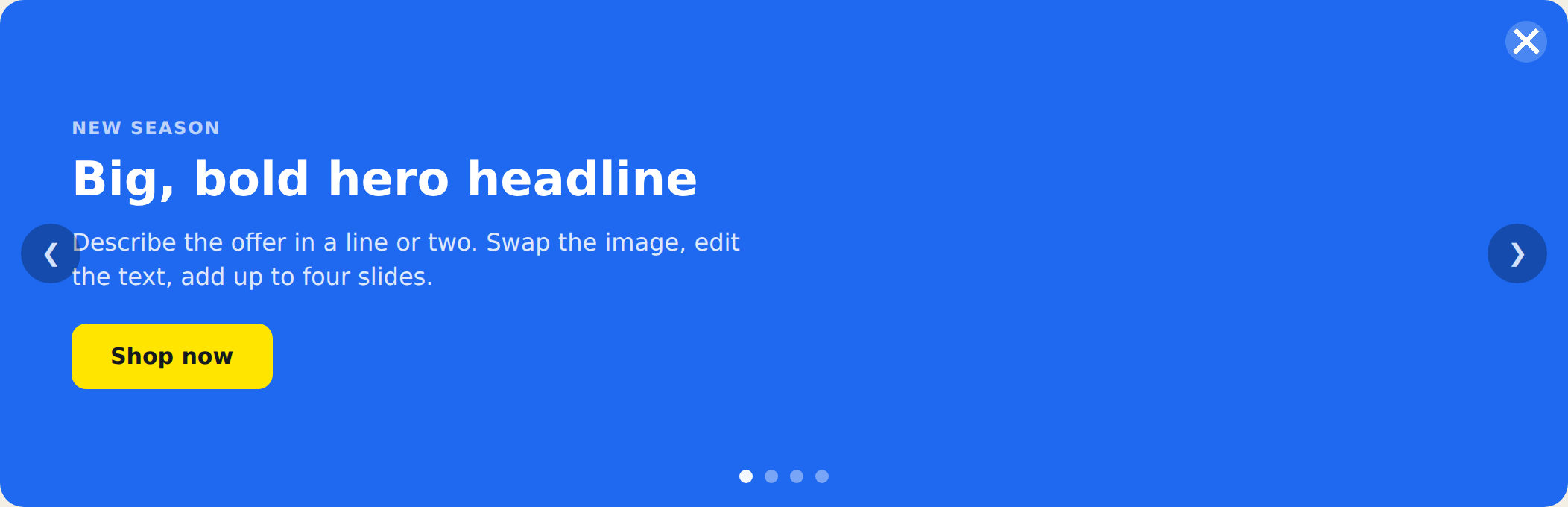
- Preset — dark, light, or brand.
- Layout — full or image.
- Transition — slide or fade.
- Size — compact, default, or spacious (controls the banner height and text size).
- Rotate Every — seconds each slide is shown.
- Navigation — show or hide arrows and dots.
- Close Button — uses the standard Personyze close button; its style and behavior are editable, and visibility can be always or on hover.
Tips
- Keep headlines short — one line reads best across slides.
- Use images with similar dimensions so slides don’t jump in height.
- For a slim text-only rotating strip instead of a full banner, use the Rotating Announcement Bar.
Further reading
- Website popup templates — all 16 templates, and how to pick the right format.