
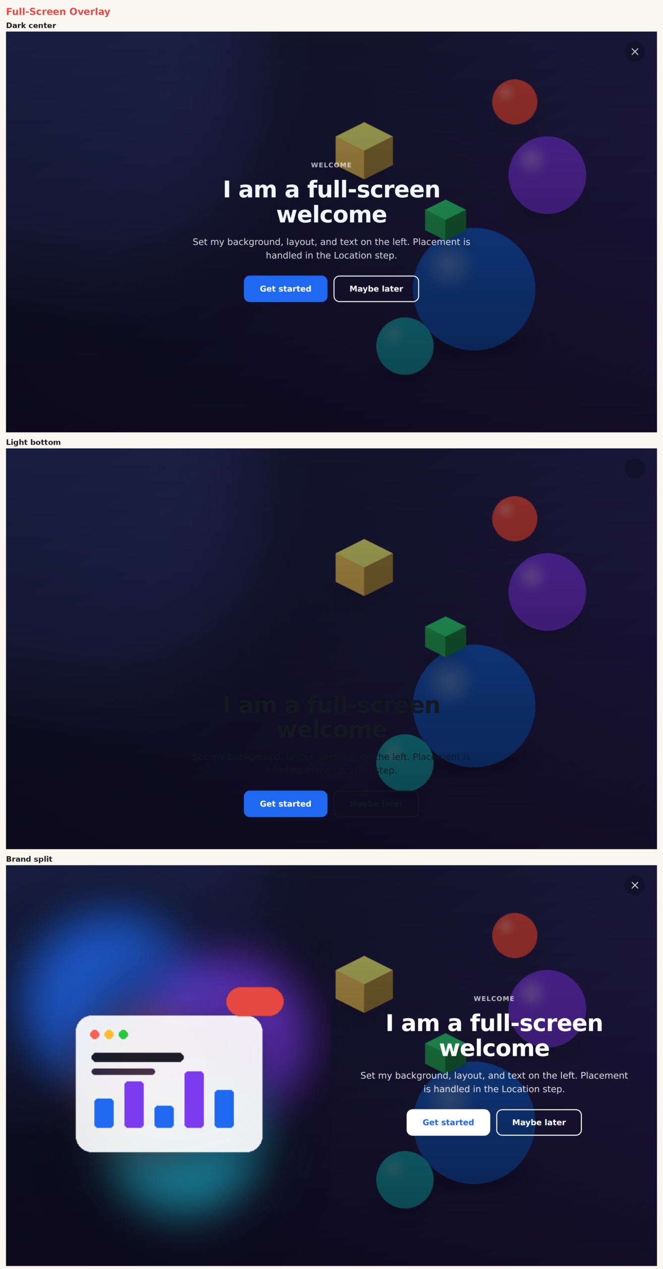
The Full-Screen Overlay (or welcome mat) takes over the whole viewport. Use it for launches, seasonal campaigns, first-visit welcomes, or any moment that deserves the visitor’s full attention. Choose a color, gradient, or full-bleed image background, add an optional CSS shape pattern, and position the content where you want it.
When to use it
- Launches and campaigns — a bold, unmissable message.
- Welcome mats — greet first-time visitors.
- Seasonal or event takeovers.
Add it to an action
In a Popup action, choose Full-Screen Overlay. Show it as a full-screen overlay in the action’s Location step. It covers the full screen on the live site while remaining editable in the builder.
Settings
Background & layout
- Background — image (full-bleed with scrim), gradient, or solid preset color.
- Shape Decoration — subtle CSS patterns: blobs, dots, grid, rings, diagonal, or corner circles.
- Content Position — centered, bottom-anchored, or split beside a side image.
- Text Align — center or left.
Content
- Eyebrow, title, body — each with its own CSS.
- Buttons — primary plus optional secondary, with attention animations.
- Entrance Animation — fade, zoom, or up.
- Side Image — shown in the split layout; toggle off for a plain color panel.
- Close — built-in or library button, always or on hover.
Tips
- For a color or gradient background, switch Background away from image and add a Shape for depth.
- Use the split layout with a side image for a product or lifestyle launch.
Further reading
- Website popup templates — all 16 templates, and how to pick the right format.