
Product Recommendations Slider — Dark Premium Cards
Action type: Product Recommendations. Configured from: the action menu — no code required.
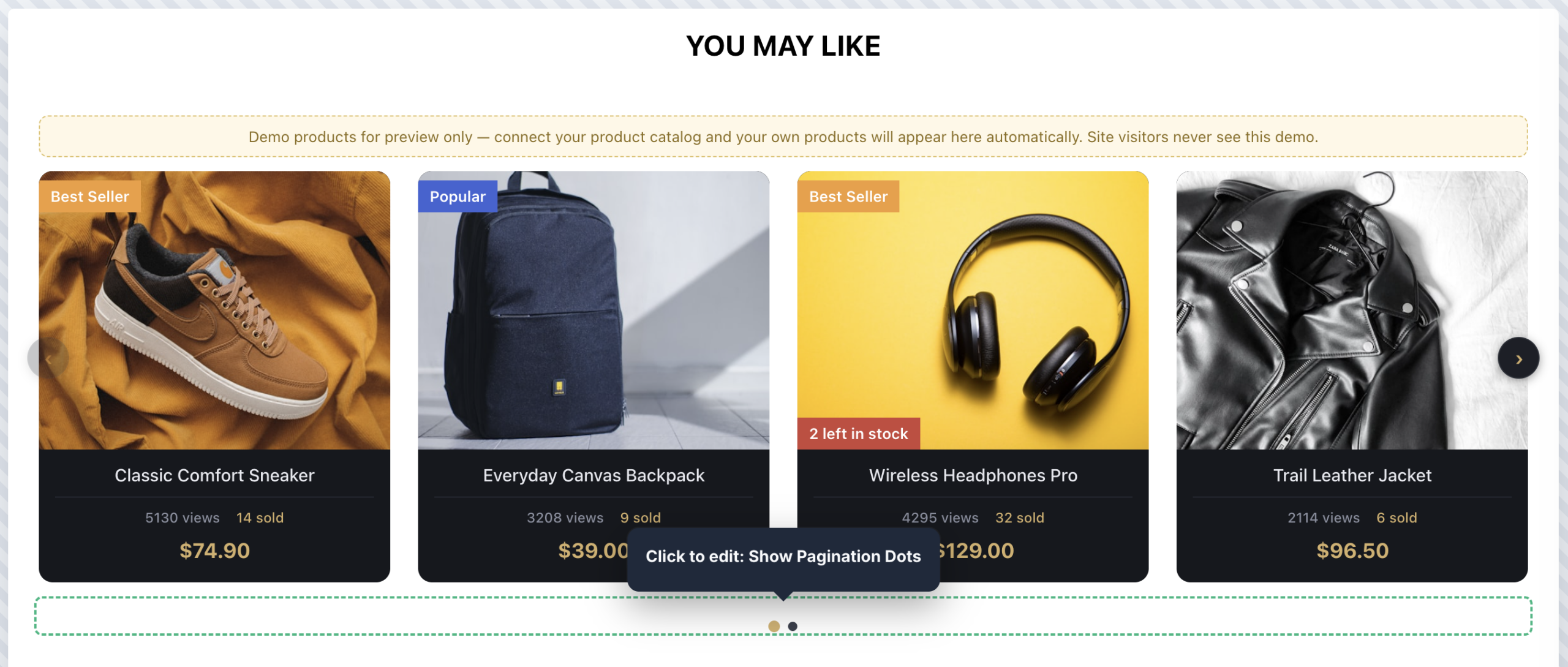
The Dark Premium slider presents recommendations on near-black cards with full-bleed product photos, light text, and gold accents — the price, active pagination dot, and Add to Cart button all pick up the gold. Hovering a card lifts it with a deep glow shadow. It suits electronics, luxury goods, fashion, gaming, and any site with a dark or high-contrast design.
What Defines This Look
- Dark card panels (
#16181d, 12px radius, subtle border) with the photo filling the top edge-to-edge (background-size: cover— works with any photo style, including lifestyle shots). - Light-on-dark text below the image: title in near-white, muted views/sold row with the sold count in gold, and the price in bold gold (
#d4af6a). The Product Title, Site Statistics, and Pricing sections are on by default. - Gold Add to Cart with dark text, on by default, revealed on hover while the card lifts with a glow shadow.
- Vivid badges — the orange Best Seller, blue Popular/New, and red stock/discount badges are kept deliberately bright; they read strongly against the dark cards.
- Dark circle arrows with gold chevrons that invert to solid gold on hover, plus a gold active pagination dot and a dark scrollbar — the whole control set matches the theme.
The Gold Accent
The gold (#d4af6a) appears in five places, each with its own menu field, so rebranding the accent to your color takes a few edits:
- Sale / Regular Price Style — Pricing
- Purchases Icon Style — Site Statistics
- Button Style + Hover — Add to Cart
- Active Dot Style — Pagination Dots
- Side Arrow Custom Style + Hover — Slider Arrows
Replace #d4af6a with your brand color in those fields and the theme follows.
Quick Start
- Add the action and choose the Dark Premium Cards slider template.
- Point the Main Product Image Column (Card Image Style) at your catalog’s image field. With no catalog connected yet, six demo products appear in the editor with a notice banner — visitors never see them, and they disappear once your catalog loads.
- Set the visible item counts for desktop / tablet / mobile in Slider & Items Per View.
- Check the widget against your page background: the dark cards work on both light and dark pages, but on a dark page you may want to lighten the Card Border Color or add a Container Style background for separation.
- Preview on all three device sizes and publish.
Working in the Editor
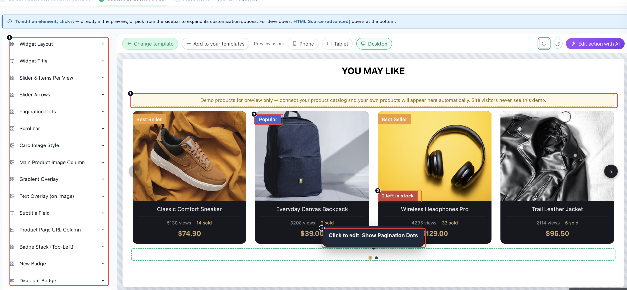
2 The demo products notice, shown only while no catalog is connected. Real visitors never see the demo cards or this banner.
3 Click to edit — clicking any element in the preview jumps straight to its option, so you don’t have to hunt the sidebar.
4 and 5 Badges auto-stack into corner slots without overlapping — here Popular and a red low-stock warning on the same card.
Options are reached two ways: pick a section from the sidebar, or click the element directly in the preview and its settings expand. For developers, HTML Source (advanced) opens at the bottom. Preview as Phone, Tablet, or Desktop to check each breakpoint before publishing.
Switching Styles Without Switching Templates
The three slider templates differ only in defaults, so this one can be reshaped from the menu:
- Recolor the cards white with dark text and you have the Clean Catalog look.
- Enable Show Text on Image plus the Gradient Overlay and disable the below-image blocks for the Overlay look.
Use whichever template starts closest to your target — it’s less work than reshaping one that starts far away.
FAQ
The title text is invisible.
You are likely previewing after changing the card background to a light color — the text defaults are light-on-dark. Recolor Title Text Style, the stats row, and price styles together with the card background.
Photos with white backgrounds look like white boxes on the dark card.
That’s the nature of cutout photography on dark surfaces. Either use lifestyle / ambient photos, or switch Card Box Style to background-size: contain with background-color: #ffffff for a framed-photo look inside the dark card.
Can I use a different accent than gold?
Yes — see The Gold Accent above; it’s five menu fields.
Do the demo products ever show to real visitors?
No. They render only in the editor and on preview links, and only while no catalog is connected.
Related
- Overlay Card Recommendations Slider — the full options reference for the shared engine.
- Clean Catalog Cards — the light-mode sibling.
- All templates
- Setting the Product Feed