
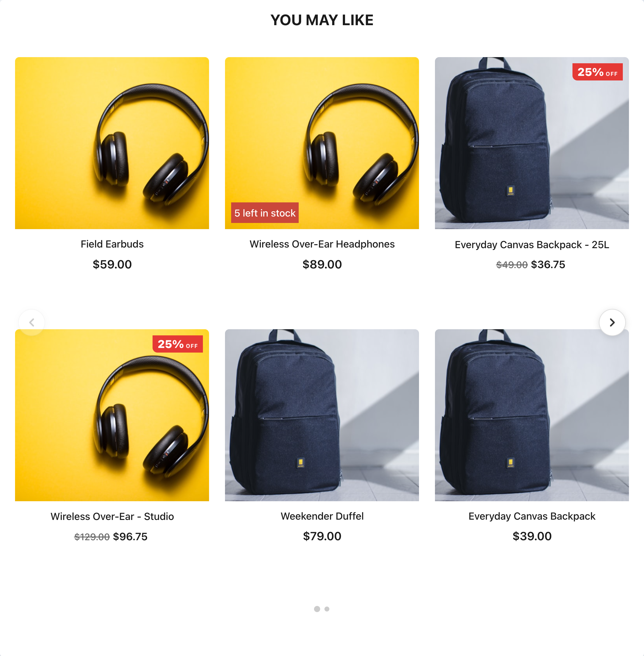
The gallery’s main product carousel: one template that runs as a classic one-row slider or as a scrolling grid of up to four rows, with prices and discounts, star ratings, stock badges and a quick Add to cart button on every card. Pick a Style accent (light, gold, bold, ocean) and every card, badge, button and price recolors in one click.
What’s included
- Slider or grid. Layout — Slider or Grid: 1 is the classic single-row slider, 2 to 4 is a grid that scrolls sideways. Side or title-bar arrows, pagination dots, a scrollbar, autoplay that pauses on hover, drag-to-scroll and snap control — see Slider options.
- Density. One control (Compact, Standard, Roomy) resizes the picture, the gaps and the button padding together. It overrides the individual size controls; set it back to Standard and they are in charge again.
- Badges. Corner badges (discount / sale percent, price drop, low stock), a movable badge stack (New, Back in Stock, Popular, Best Seller, a time-limited offer with a countdown, custom data from your feed), and three free badges with your own text under More Badges.
- Social proof. Star ratings with review counts, weekly and daily view and sales statistics in three looks (divided, plain, pill), a social-proof scroller, and a countdown timer.
- Hover effects. Card shadow, image zoom, a second image on hover, a hover overlay with buttons, a bottom slide-up panel, and an action button that slides in on hover (always visible on touch screens).
- Product text. Title, brand or subtitle line, description, a custom data column, per-unit price, payments line, savings badge, options link, link button and wishlist heart. Card Info Order (standard, brand-first, price-first) orders the lines under the image; Title Style Preset (plain, accent-bar, underline, boxed, eyebrow) styles the widget heading, and a View-All link can sit in the title bar.
How this template works
This template and the Overlay Slider & Grid are built around four ideas:
- Style accents. Style accent (light, gold, bold, ocean), in the first section of the menu, recolors cards, badges, buttons, prices and dots together in one click. Light and ocean suit light sites; gold and bold are the dark premium looks — the dark cards with gold prices and buttons are simply the gold accent. Every color can still be changed in its own style field afterwards.
- Catalog Fields in one place. The Catalog Fields section (second in the menu) maps every product column the template uses — images, URL, title, brand, both price columns, rating, review count, description, inventory, discount percent, category, offer end date and custom fields. Setting a column there updates every element that uses it, so a store with a fully custom feed can rewire the whole widget from this one section.
- Live demo mode. While you design, six demo products appear (visitors never see them). The first demo card is a live showcase: click any element on it to style it, and every toggle — badges, the action button, overlays, statistics, description, per-unit price — visibly responds on it. See Demo products.
- Central pricing. The Pricing section has one Price Format select (standard, european, rounded, rounded-european) and one pair of currency-symbol fields that apply everywhere a price appears, including the on-image overlay. A product without a price shows nothing — no orphan currency symbol.
Slider options
These live in the Slider & Navigation section, except Space Between Cards, which is in Widget Layout.
| Option | What it does | Default |
|---|---|---|
| Layout — Slider or Grid | 1 = the classic single-row slider. 2, 3 or 4 = a grid: products fill each column top to bottom (with 2 rows, products 1 and 2 form the first column), and the columns scroll sideways. | 1 |
| Items Visible — Desktop / Tablet / Mobile | How many cards (in a grid, columns) show at once. Decimals work: 1.15 on mobile shows a sliver of the next card as a swipe hint. |
4 / 3 / 1 |
| Tablet Breakpoint (px) / Mobile Breakpoint (px) | Below these widths the tablet and the mobile count take over. | 1024 / 640 |
| Swipe Strip — Minimum Card Width | A floor for the card width. When the row is too narrow to fit the chosen count at this width, cards keep it and the row scrolls instead of squeezing them. | 120px |
| Space Between Cards | The gap between cards. Use a plain length such as 24px, not sel(): the gap is applied at first paint, before responsive values are worked out. |
24px |
| Swipe Strip — Scroll Behavior | x mandatory always settles on a card edge; x proximity snaps only when the row stops near an edge; none scrolls freely. |
x mandatory |
| Swipe Strip — Items Per Arrow Click | How far each arrow click and each autoplay step moves: 1 to 4 cards, or full, which moves exactly the visible set at the current screen size (2 on a phone showing 2, 4 on a desktop showing 4). |
1 |
| Arrows on Sides (Classic) | Large arrows centered on the row’s left and right edges. Arrows — Side Arrow Offset moves them outside the row (negative, e.g. -10px) or over the cards (positive). |
On, 6px |
| Swipe Strip — Title-Bar Arrows | Compact ‹ › buttons at the right of the widget title. Needs the title bar to be shown. | Off |
| Arrows — Arrow Style | Ready-made looks, each with its own hover: circle (light circle), dark, pill, outline, soft. none lets your site’s theme style the arrows. To adjust a preset, add CSS in Arrows — Side Arrow Custom Style with !important on each property you want to win. |
circle |
| Swipe Strip — Fade Arrows at Ends Hide Arrows on Touch Devices |
Dim and disable the back arrow at the start of the row and the forward arrow at the end. Hide every arrow on phones and tablets, where swiping is natural. | On / On |
| Swipe Strip — Pagination Dots | Clickable dots under the row. They appear only when there is more than one page to scroll, and rebuild when the widget is resized. | On |
| Swipe Strip — Scrollbar | A slim scrollbar under the row, with its own height and thumb and track colors. | Off |
| Drag to Scroll with Mouse | Desktop visitors can grab the row and pull it, as on a touch screen. A drag never counts as a click on a product. | On |
| Swipe Strip — Autoplay Interval (ms) | Advance every N milliseconds, e.g. 4000; 0 or empty is off. It pauses while the visitor hovers or touches the slider. Swipe Strip — Autoplay Loops to Start decides what happens at the last card: jump back to the first (on) or stop (off). |
Off; loops on |
How cards are sized
You don’t set a card width. It is worked out from how many cards you want visible:
card width = (row width − (items visible − 1) × gap) ÷ items visibleand it never drops below Swipe Strip — Minimum Card Width. Card height, corners and how the photo fills the card are set in Card & Image → Card Box Style (Height, Corners, Image Fit) — the default height: sel(280px, 220px) gives desktop and mobile their own height.
How many products the widget gets is set by the recommendation itself: Recommendations to show in its Output card, up to 12. With 2 rows and 12 products, the grid has six columns to scroll through.
Demo products
Six sample products let you design before a catalog is connected. They show only in the Personyze editor and on preview links, and only while the widget has at most one real product card; the moment your catalog returns more, your products take over. Visitors never see them. The switch is Widget Layout → Demo Products (Preview Only), and it is safe to leave on.
The Add to cart button
In Add to Cart & View Buttons, Button Action decides what the card’s button does. Add to cart (uses your cart integration), the default, puts the product in the visitor’s cart without leaving the page; Open the product page is an ordinary link, for a catalog with no cart integration. Add to cart runs the Quick add to cart code saved for your account, and Quick Add to Cart — Cart Integration Argument is handed to that code as its second argument. On Success and On Error — Custom JavaScript replace the default “Added to cart” toast with your own code.
Good to know
- Items per device follow the widget, not only the screen. On a desktop, a slider placed in a narrow sidebar drops to the tablet or mobile count by itself, because the counts are applied from the widget’s own width.
- Text on Image removes duplicates automatically. While Show Text on Image is on, the title, brand line and price below the photo hide by themselves.
- Hover styles are separate fields. If you change a button’s base color, mirror it in the matching Hover Style field for a consistent hover.
- Saved template cards freeze their code. If you keep your own copy in My Templates, actions created from it use the code as it was when saved — re-save the card after major updates.
Related
- Overlay Slider & Grid — the same engine with the name and price on the photo.
- Vertical Product List — a stacked list for sidebars and narrow columns.
- Quick Add to Cart Button — the code the Add to cart button runs.
- Product Recommendations Wizard — choosing what the widget recommends.
- Template Gallery — every ready-made design.