
A magazine front page for products: one lead product with a large picture, a label and its description, and the rest beside it as compact rows or two columns of cards — or under it as a grid. It is the Product Slider & Grid with one more section, Lead Product and Layout, so every setting of that template is here too: prices and discounts, ratings, stock, badges, add to cart, countdown and social proof.
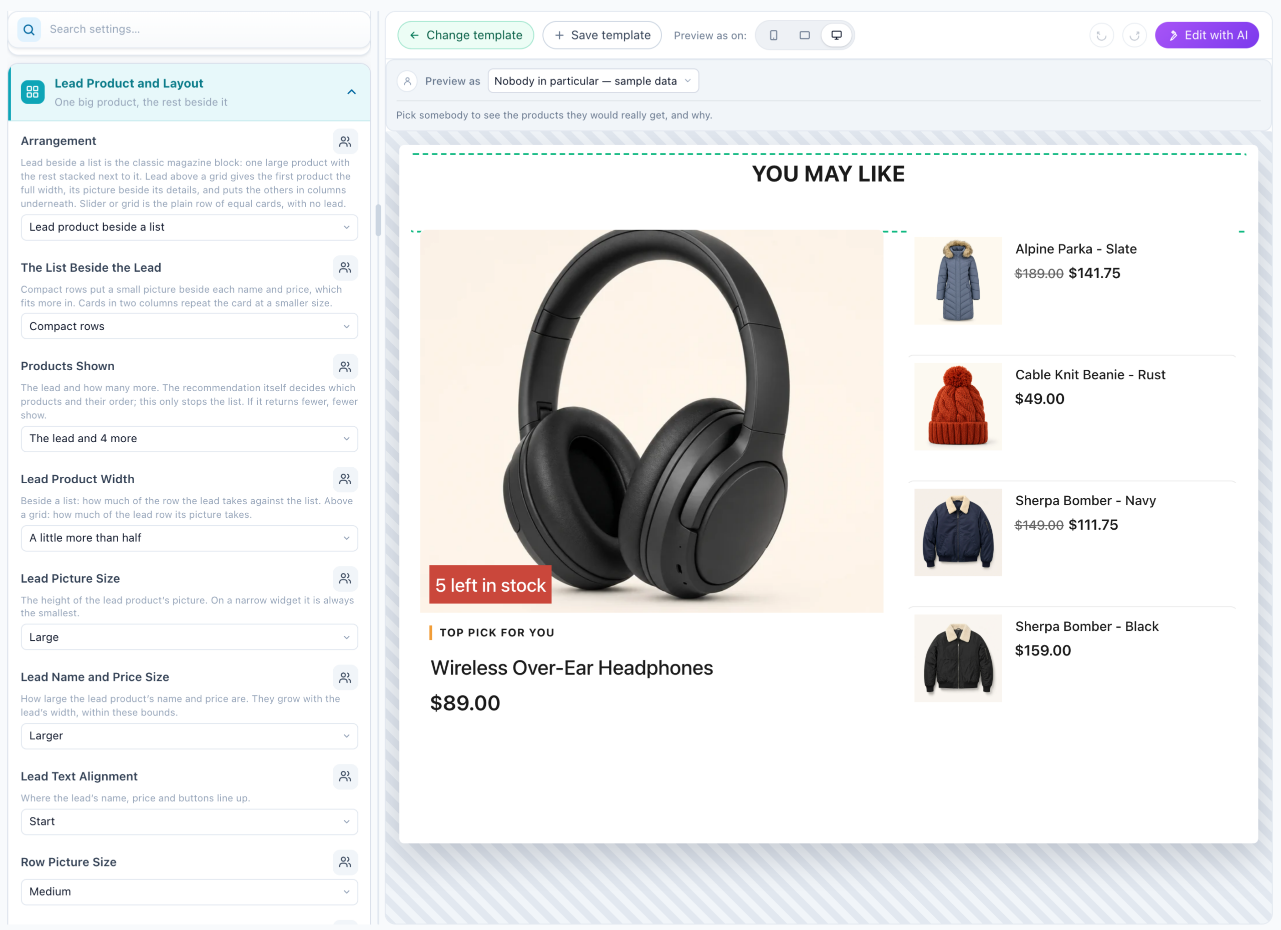
Find it in a product recommendation’s gallery — or with Change template on one you have — as Product Magazine — Lead Product, Grid or List.
Three arrangements
| Arrangement | What it looks like |
|---|---|
| Lead product beside a list (the default) | The classic magazine block: one large product, the rest stacked beside it — as Compact rows, a small picture beside each name and price, or as Cards in two columns. |
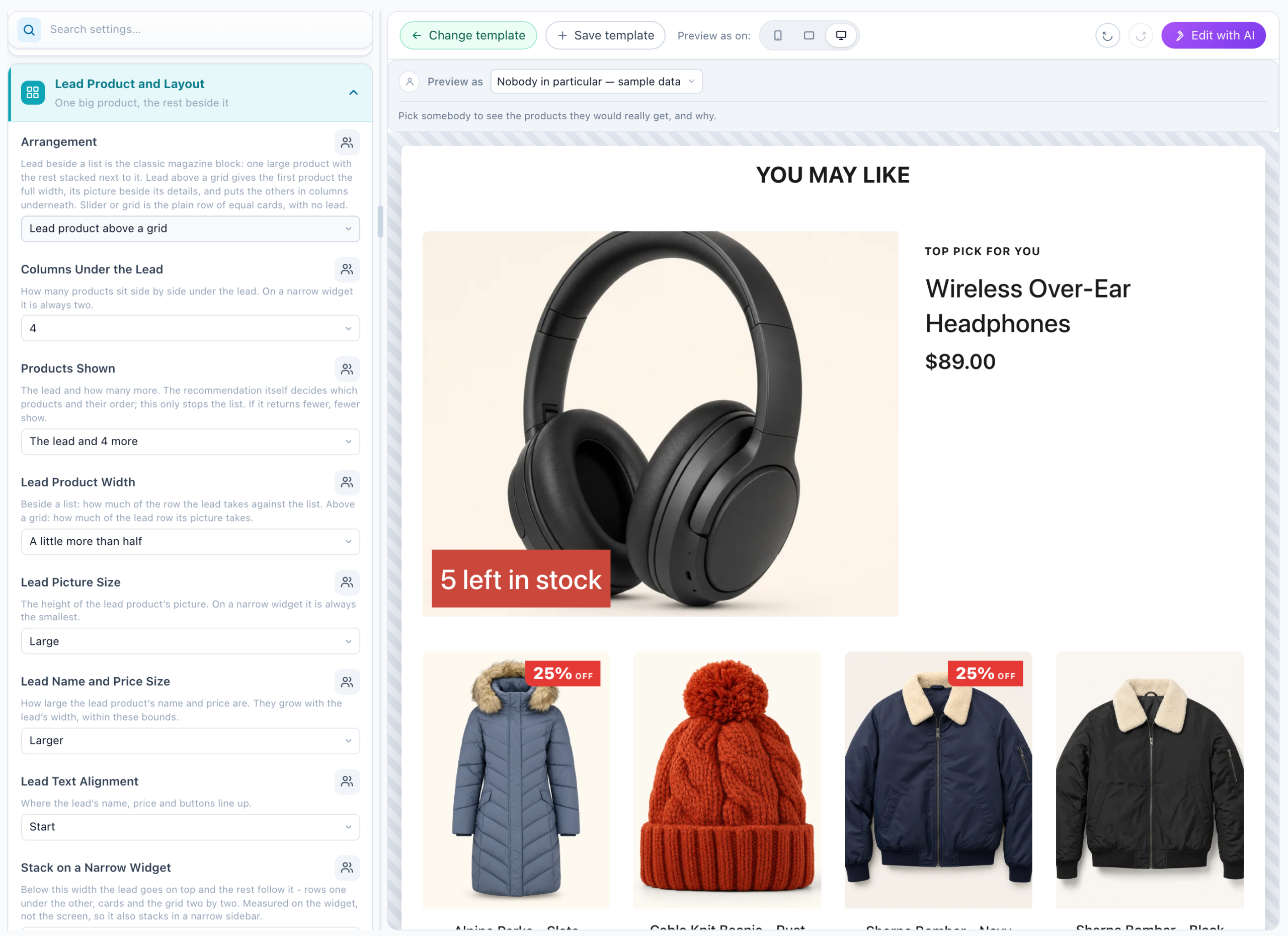
| Lead product above a grid | The lead takes the full width, its picture beside its details, and the others sit in columns under it. |
| Slider or grid, no lead | The plain row of equal cards, as in the Product Slider & Grid. |
Lead Product and Layout
The first section of the design’s menu. Each setting shows only where its arrangement uses it.
| Setting | Choices |
|---|---|
| Arrangement | Lead product beside a list, Lead product above a grid, Slider or grid, no lead. |
| The List Beside the Lead | Compact rows (the default), which fit more in, or Cards in two columns. |
| Columns Under the Lead | 2 to 5. On a narrow widget it is always two. |
| Products Shown | The lead and 3, 4 (the default), 6 or 8 more, or Every product it returns. The recommendation decides which products and their order; this only stops the list. If it returns fewer, fewer show. |
| Lead Product Width | Half, A little more than half, Two thirds — of the row beside a list, or of the lead’s row above a grid. |
| Lead Picture Size | Medium, Large, Extra large. On a narrow widget it is always the smallest. |
| Lead Name and Price Size | Standard, Larger, Much larger. They grow with the lead’s width, within these bounds. |
| Lead Text Alignment | Start, Centre, or As the cards are set. |
| Row Picture Size and What the Rows Show | For compact rows: a small, medium or large picture, and Name, price and rating — or Everything the cards show, which makes the rows taller. |
| Stack on a Narrow Widget | Under 520, 640 or 800 px wide, the lead goes on top and the rest follow it. Measured on the widget, not the screen, so it also stacks in a narrow sidebar. |
| Lead Label | A short line above the lead’s name in the accent colour, on by default as Top pick for you; Lead Label Text and Lead Label Style change it. |
| Lead Description | The product’s description under the lead’s name, cut after 2, 3 (the default) or 5 lines, or Off. The other cards show theirs only if Product Text has it on. |
How the rest works
Style accents, Catalog Fields, the demo products while you design and the central price format work exactly as in the Product Slider & Grid — see How this template works there.
Good to know
- The lead is the first product the recommendation returns. To change who leads, change the algorithm, its sort or Match the visitor — not the design.
- Card Info Order orders the lines on the cards; the compact rows and the lead above a grid keep their own order.
- Drag-to-scroll is off in the two lead arrangements.
Related
- Template Gallery — every ready-made design
- Product Slider & Grid — the template this one is built on
- Overlay Slider & Grid — the same engine with the text on the picture
- Product Recommendations Wizard — the campaign and the algorithm
- Multi-Recommendation Widget — several recommendations in tabs or sections