
Every content action (excluding WYSIWYG edits and custom JavaScript) ends with the same question: where does it render, when does it open, and how often may it come back? This page is the reference for that step — it appears in each action as Choose placement / Set Display Rules & Placement.
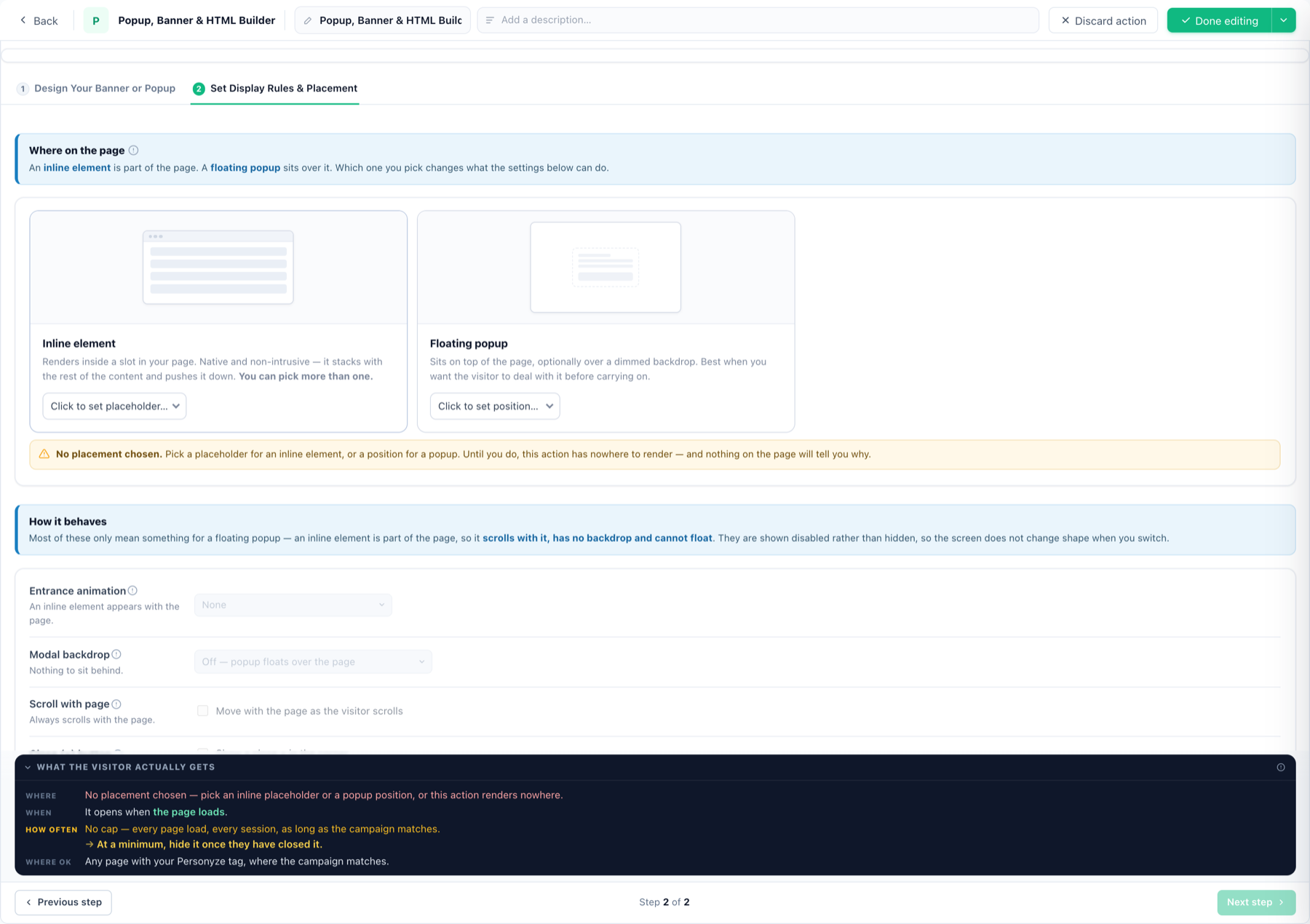
Inline element or floating popup
- Inline element — renders inside a slot in your page. Native and non-intrusive: it stacks with your content and pushes it down. Pick one or more placeholders.
- Floating popup — sits over the page in a chosen position, optionally over a dimmed modal backdrop. Bar-style templates pin full-width to the top or bottom and push content instead of covering it; some widgets also offer a fullscreen display mode that turns the whole screen into the background.
Placeholders
A placeholder anchors inline content to a spot in your layout — “under the product title”, “above the footer”. Create one from the placement step (Click to set placeholder) by pointing at your page, or manage them centrally; the “Find on pages” AI can locate the anchor from a plain-language description. Details, selectors and priorities: placeholders.
How a popup behaves
Entrance animation · modal backdrop · scroll with page · close (×) button · auto-close after N seconds (0 = stays until closed). Inline elements are part of the page, so these show disabled rather than hidden.
When it opens — triggers
Stack as many as you want; the first match opens it:
- On arrival — on page enter · after a delay · when idle for N seconds.
- On engagement — after scrolling to a % of the page · rescrolled back to top · text copied (Cmd/Ctrl+C).
- On exit intent — predicted leave (cursor heading for the close button or address bar — desktop only, it watches the cursor).
- Opened by you — your own click/hover popup trigger, or start collapsed.
How often — frequency caps
Each rule reads as a sentence and restates itself in your numbers, because these are easy to set backwards:
- Stop showing after they close it N time(s) — hide for N session(s).
- Stop after they click it · stop after N impressions.
- Bursts — visible for a period, hidden for a period, repeating.
- Spacing — wait a while after another popup was shown.
The close button itself carries don’t show again for N sessions — 0 lets it return next visit, 999 effectively never (see the popup guide).
Page scope
Placement decides where on the page; which pages is the campaign’s targeting plus the action’s Restrict to — page groups of URLs reusable across campaigns.
Priorities
When several actions could occupy the same placeholder, priority decides who wins; audience-level conflicts are surfaced by overlap detection.