
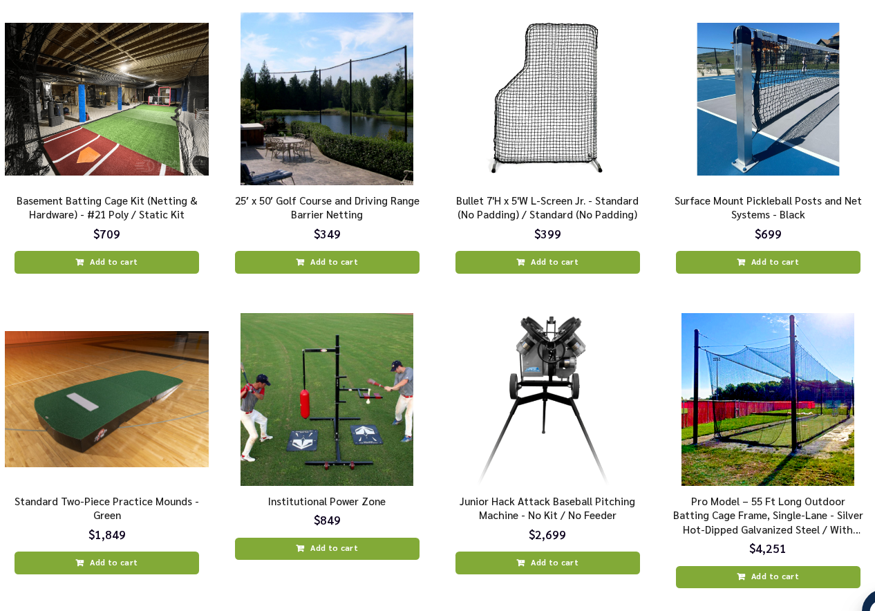
A horizontally scrolling product grid: instead of a single row of cards, the widget shows two or more rows, and each column of cards scrolls sideways as one unit. It packs far more products into the same screen real estate — ideal for “You may like” sections on category pages, home pages, and anywhere a flat slider feels too sparse. Cards use the Clean Catalog look: white cards with the product photo, title, price, badges, and an always-visible Add to Cart button, with round arrow buttons in the title bar.
Quick Start
- Add the action and choose the Product Grid Slider template.
- Point the Main Product Image Column (Item Image) at your catalog’s image field. With no catalog connected yet, six demo products appear in the editor with a notice banner — visitors never see them, and they disappear once your catalog loads.
- Set the number of rows in Slider & Items Per View → Rows (see below).
- Choose how many columns are visible per device (Items Visible — Desktop / Tablet / Mobile).
- Preview on all device sizes and publish.
The Rows Setting
The Rows field takes one word per row:
auto auto— two rows (the default)auto— one row: the classic single-row sliderauto auto auto— three rows
auto means each row is as tall as its content. Advanced: replace auto with fixed heights to force uniform rows — for example 260px 260px gives two rows of exactly 260px. You can mix values.
Products fill each column top to bottom, then continue in the next column — so with 2 rows, products 1 and 2 form the first column, 3 and 4 the second, and so on. The widget requests up to 24 products to keep multiple rows filled.
How Scrolling Works
The grid scrolls horizontally by columns. Arrow clicks and dots step one full view at a time, and each column step moves a whole column of products past — with 2 rows, one column step advances 2 products. Touch and drag scrolling, snap alignment, optional autoplay, and the optional scrollbar all work exactly as in the single-row sliders. By default this template shows round arrow buttons in the title bar (next to the widget title); classic side arrows are available as a toggle.
Card Width and the Minimum Floor
Column width is calculated automatically from Items Visible per breakpoint, with a Minimum Card Width floor (default 200px) so cards never get crushed on narrow screens — when the calculated width would fall below the floor, the widget shows fewer columns and scrolls instead.
Demo Products — the Default Set
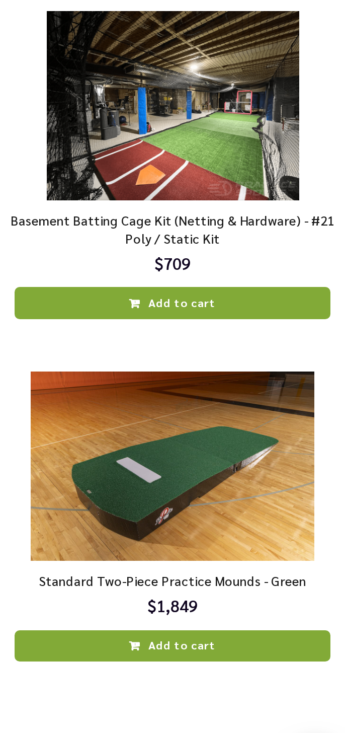
Same logic as the other recommendation templates: six demo products render only in preview contexts (the Personyze editor and preview links) when no catalog is connected, together with a notice banner. Real visitors never see them, and real products take over automatically the moment your catalog returns results. One toggle controls it: Widget Layout → Demo Products (Preview Only).
What’s Shared With the Other Sliders
Badges with the auto-stacking corner system, sale pricing with strikethrough, star ratings, the wishlist heart, stats rows, and Add to Cart with toast confirmations are the same proven sections as the other recommendation sliders, configured identically. The full reference lives in the main slider guide: Recommendations Slider — full guide. In this template the Add to Cart button is always visible on the card (rather than revealed on hover), matching the denser grid layout.
FAQ
The grid shows only one row. Check Slider & Items Per View → Rows: it must contain one word per row, e.g. auto auto for two rows. If the field was edited previously, the saved value overrides the template default.
Can rows have different heights? By default each row sizes to its content. For uniform rows, use fixed heights in the Rows field, e.g. 260px 260px.
How many products should my algorithm return? The widget requests up to 24. For a full-looking 2-row grid, make sure your algorithm and fallback can supply at least 8–12 products.
Can I use this as a normal single-row slider? Yes — set Rows to auto and it behaves exactly like the single-row Clean Catalog slider.