
Analytics opens on Account Overview — and that screen is now one
dashboard among however many you build. A dashboard is a set of cards you choose, sized and ordered how you like,
pointed at the whole account or at particular campaigns, and optionally emailed to you every week.
to it at any time. Pressing Customize on it does not edit it — it offers
“Keep it — customize this dashboard”, which makes your own copy to change.
Making one
Your dashboards → New dashboard. Name it, then pick a starting layout:
| Starter | What it opens with |
|---|---|
| The standard layout | What Account Overview shows today. The one to pick if you only want to add a single card. |
| E-commerce | Revenue, purchases, and what the recommendation widgets earned. |
| Lead generation | Form submissions, conversions, and the campaigns driving them. |
| Chat and support | Conversations, what the assistant could not answer, and who is on site now. |
| One campaign | Everything about a single campaign. This one arrives already scoped — it will ask which campaign. |
| Blank | Nothing. Add the cards yourself. |
Starting from a layout and deleting two cards is faster than starting from nothing and hunting for seven, which is
why Blank is last rather than first.
The cards
Add a card opens a searchable list, grouped. Every card explains what it is before you add it.
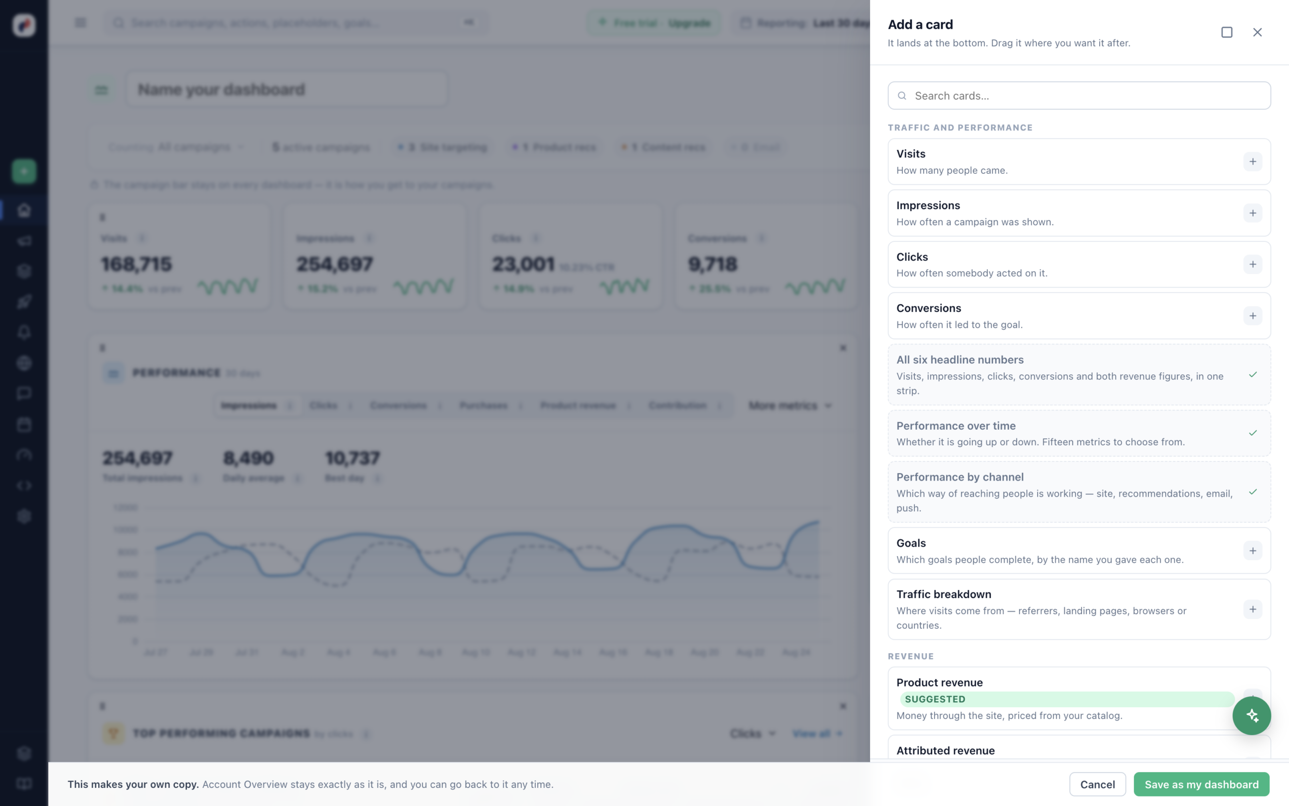
| Group | Cards |
|---|---|
| Traffic and performance | Visits · Impressions · Clicks · Conversions · All six headline numbers in one strip · Performance over time (fifteen metrics to choose from) · Performance by channel · Goals · Traffic breakdown |
| Revenue | Product revenue · Attributed revenue · Recommendations — what each widget earned |
| Campaigns | Top campaigns · Recently launched · Needs attention · A/B test result · Form submissions |
| Live | Live now · On site now |
| AI Chat | Conversations · Could not answer |
| Meetings | Next meetings · Meetings booked |
| Health and account | Feed health · AI credits |
A new card lands at the bottom; drag it where you want it. Drag a card to move it, and use
S · M · L to resize — each card offers only the widths it actually reads well at, so a
headline number will not stretch to full width and a chart will not squeeze to a quarter.
dashboard, which is what keeps a five-card dashboard from paying for a twelve-card one.
The AI Chat and Meetings cards appear only if your account has those features.
Pointing a dashboard at something
Dashboard settings carries the scope, and it is what makes a second dashboard worth having:
- All campaigns — site-wide. The default.
- Particular campaigns — pick them. Every number below then counts only those.
- By tag — every campaign carrying a tag. New campaigns join the dashboard as they are tagged,
with nothing to update here.
A scoped dashboard marks each affected card SCOPED so nobody reads a filtered figure as a site-wide
one. Cards that are always site-wide say so instead — On site now, Feed health and
Next meetings are about the account, not a campaign, and do not narrow.
“This dashboard has no campaigns selected yet” or “No campaign carries the tags this
dashboard is scoped to” — but if you scope by tag and later rename the tag, the dashboard empties
quietly.
Which one opens first
Make default on any dashboard: “Analytics opens on it instead of the standard layout, for
you.” The choice is yours alone — it changes nothing for your colleagues.
Sharing
Share with the account makes a dashboard readable by everyone who can log in.
Sharing grants reading, not editing — only you can change it. A colleague who wants their own version
presses Save as my dashboard, which copies it to them.
Shared dashboards appear under Yours · shared with the account, marked
Shared by a colleague.
Wallboard
Wallboard opens the same dashboard with no controls, for a screen on a wall. It refreshes itself,
so nobody has to reload it.
Getting it by email
Email me this dashboard turns any dashboard into a recurring digest:
- Every day, every week (choose the day) or every month (choose the
date). - An hour of the day.
- To you, or to everyone with a login.
The first one goes out at the next matching time — not immediately. Forget this schedule
stops it and keeps the dashboard.
without anyone assembling it.
Deleting one
Delete this dashboard takes its cards and its email schedule with it, and anyone you shared it with
loses it too. The standard layout is untouched — it is not yours to delete.
Related
- Analytics & Reporting —
Overview — which screen answers which question. - Metric
definitions — what each number on a card actually counts. - Conversion tracking — what
feeds the Goals and Conversions cards.