
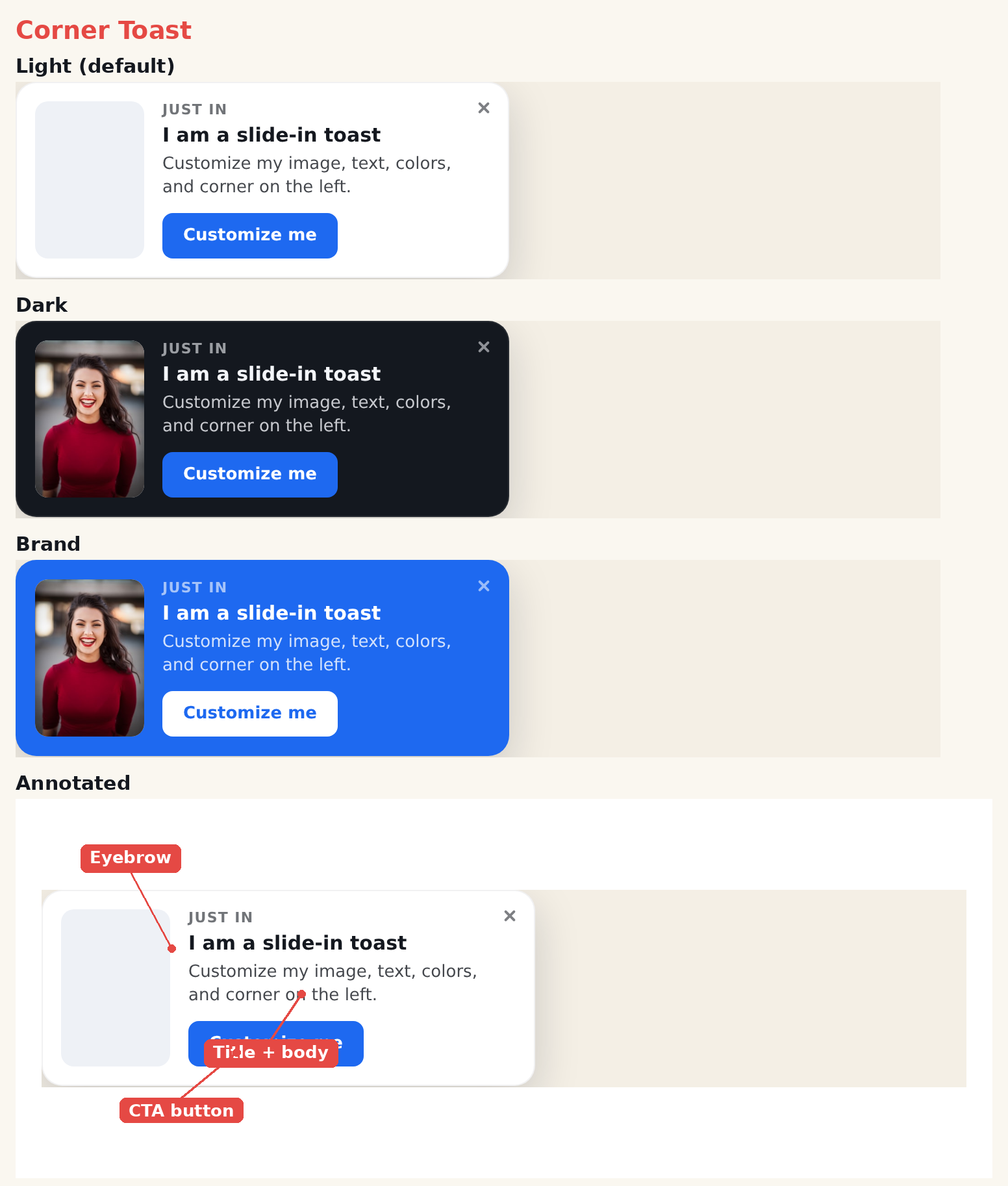
The Corner Toast is a compact notification card that pairs an image with a headline, short message, and a call-to-action. It’s lightweight and non-intrusive — ideal for social proof, soft promos, new-feature nudges, and limited-time offers. Where it appears on screen is set in the action’s Location step.
When to use it
- Social proof — “Someone in London just purchased.”
- Soft nudges — a gentle reminder or tip that shouldn’t block the page.
- Small promos — a quick offer with a single button.
Add it to an action
In a Popup action, open the template picker and choose Corner Toast. Style any element by clicking it in the preview. Use the action’s Location step to place the toast (a corner, top, or bottom).
Settings
Style
- Preset — light, dark, brand, or accent.
- Corners — none, soft, or round.
- Entrance Animation — slide, fade, or pop (plays in the editor and on the live site).
Image
- Show Image — toggle the thumbnail on or off.
- Image Side — left or right of the text.
- Image Fit — cover, contain, or fill.
- Image — pick from the media library.
Text & button
- Eyebrow, title, body — each toggleable with its own CSS.
- Button — a click-tracked CTA with attention animations (pulse, bounce, shake, glow, sheen).
Close
- Close button — built-in X or a library button.
- Close visibility — always, or on hover.
Tips
- Keep the body to one line for the cleanest look.
- Use a friendly image (a person or product) to draw the eye.
Further reading
- Website popup templates — all 16 templates, and how to pick the right format.