
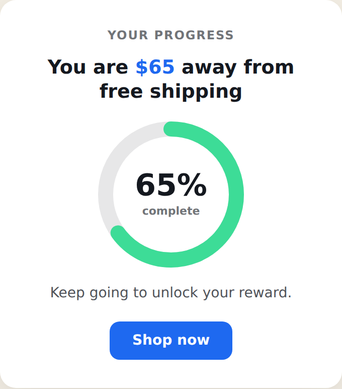
The Status Card shows a visitor how close they are to a goal — like free shipping or a reward — as a centered card or popup, using a live value from their Personyze profile (cart total, points, spend). It reads the number, shows the progress as a circular ring or a horizontal bar, and celebrates when the goal is reached. It’s the card/popup version of the Free Shipping Status Bar. Placement is set in the action’s Location step.
When to use it
- Free-shipping or reward threshold — a prominent card nudging visitors toward a goal.
- Points / loyalty progress — “120 points to your next reward.”
- Spend or order milestones — any single numeric goal, shown as a card rather than a thin bar.
Add it to an action
In a Popup action, choose Status Card. Pick the progress style (ring or bar), the value to read, the goal, and the text. The settings are grouped as Style, Value, Goal, Text, Button, and Close.
Ring or bar
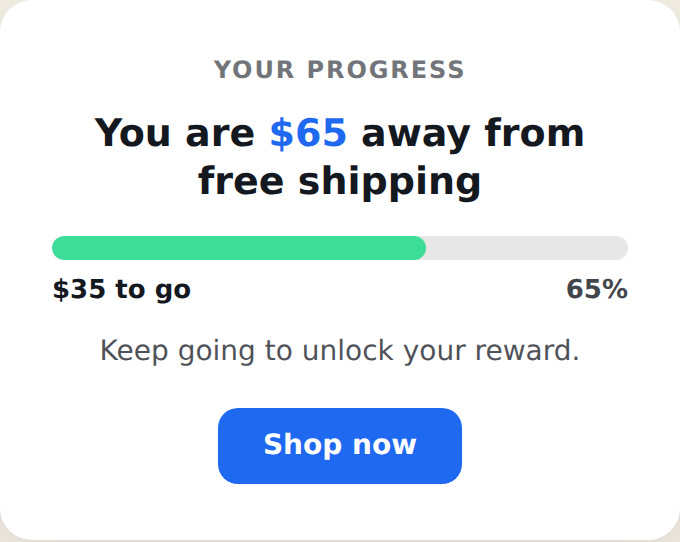
The Progress Style setting (in Style) switches between two looks: ring shows a circular progress indicator with the percent in the middle; bar shows a horizontal progress bar inside the card with the remaining amount and percent beneath it. Everything else — the value, goal, text, and celebration — works the same either way.
Setting the value it reads
The card needs a live number from the visitor’s profile.
- Open the Value section and use the Current Value Field dropdown to pick the profile field that holds the number — for example a cart-total or points field. The card reads that field’s live value at display time.
- Set a Test Value (a plain number) so the card previews correctly in the editor, where the live field may be empty. The Test Value is used only inside the editor — real visitors always see their own value.
- Pick the Unit Prefix (currency symbol) and optional Unit Suffix (e.g. pts).
On the live site an empty value counts as 0, so the card shows from the start unless you raise Show From. For how these profile variables resolve, see Inserting CRM Variables (tags) for Dynamic Content.
Getting the value into the profile
The card reflects a value that already exists on the visitor’s profile, so that field has to be populated — the widget displays and reacts to it, it doesn’t calculate the cart itself.
- Captured from your own site — scrape the value from the page, a cookie, or a URL parameter; it lands on the profile immediately with no key required.
- Imported or synced — brought in from a file, feed, or your CRM, matched to the visitor by a key such as email or CRM ID.
Full instructions are in User Profile Data Setup and Synchronizing in Personyze. Choose the field’s type as number.
Setting the goal
In the Goal section, enter the Goal Amount. The card computes the remaining amount and the percentage. Use Show From to hide the card until the value reaches a minimum (0 = always show). The Ring Label is the small text under the percent in ring mode. The Completed Message shows once the goal is reached.
Settings
- Preset — light, dark, brand, or success.
- Progress Style — ring or bar.
- Size — compact, default, or spacious.
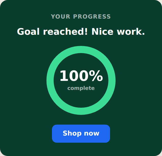
- Completion Effect — confetti, a checkmark, or none, played when the goal is reached.
- Text — eyebrow, title (wrap the amount in
<span class="sc-amt">to color it), and subtext, each with its own style field. - Button — optional call-to-action with its own link and style.
- Completed Message CSS — style the success message independently.
- Close Button and its visibility (always, or on hover).
Completion celebration
When the value reaches the goal, the card shows your completed message and plays the chosen effect — confetti, a checkmark, or nothing. You can style the completed message separately with Completed Message CSS.
Tips
- Ring vs bar is purely visual — both track the same value and goal.
- Set the profile field’s type to number so the card can do the math.
- For a thin site-wide bar instead of a card, use the Free Shipping Status Bar. For loyalty tiers, use the Tiered Status Card.
Further reading
- Free shipping & tiered loyalty bars — the average-order-value play.
- Website popup templates — all 16 templates, and how to pick the right format.