
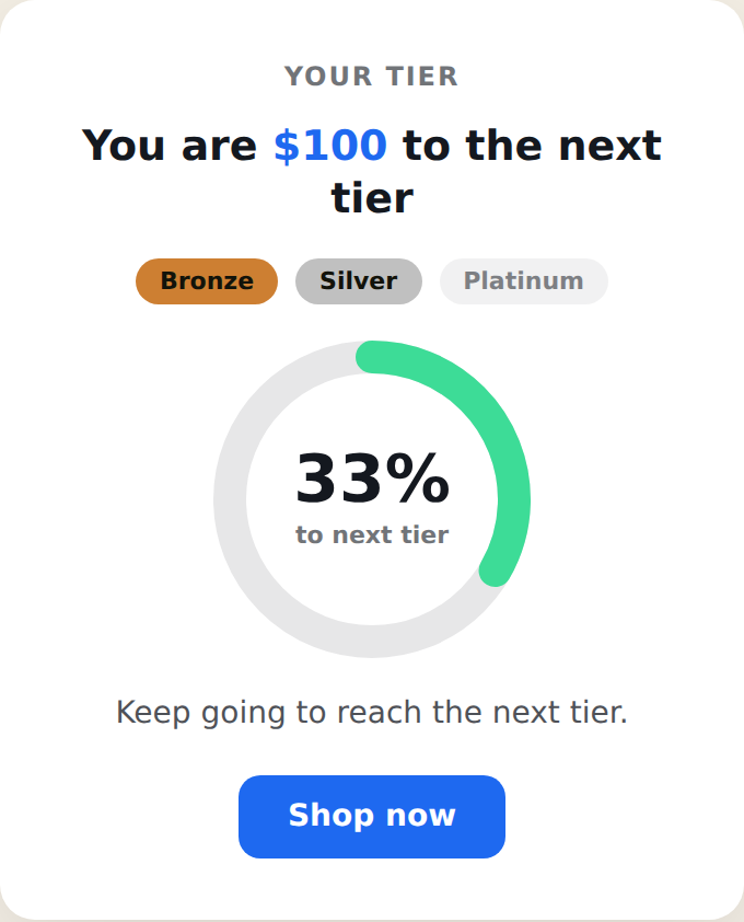
The Tiered Status Card shows a visitor how close they are to their next loyalty tier — Bronze, Silver, Platinum — as a centered card or popup, using a live value from their Personyze profile. It shows progress to the next tier as a ring or bar, lights up the tiers already reached, and celebrates when the visitor hits the top. It combines the tier engine of the Tiered Status Bar with the card form of the Status Card. Placement is set in the action’s Location step.
When to use it
- Loyalty tiers — show progress across Bronze / Silver / Platinum (or your own names) as a prominent card.
- Spend milestones — unlock perks at several levels.
- Gamified goals — any journey with more than one milestone.
Add it to an action
In a Popup action, choose Status Card — Tiered. Pick the progress style (ring or bar), the value to read, the three tier values and labels, and the text. The settings are grouped as Style, Value, Tiers, Text, Button, and Close.
Ring or bar
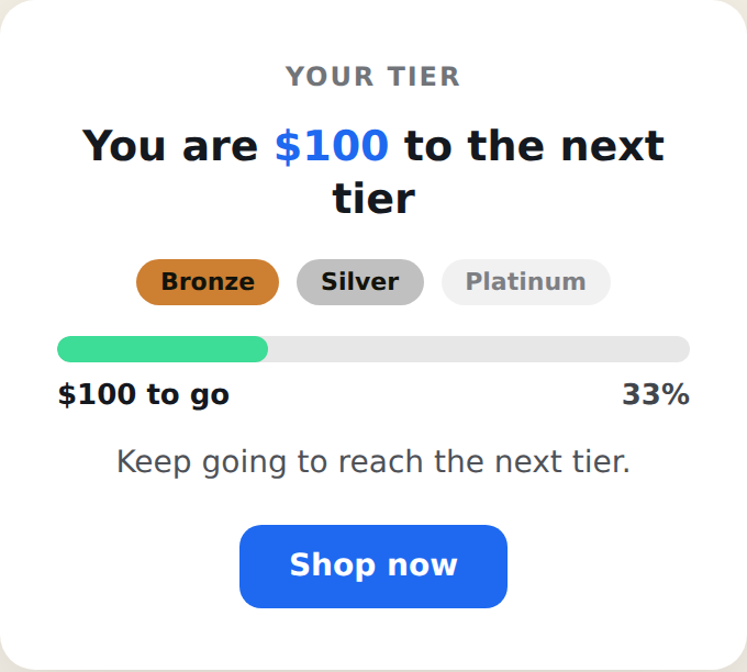
The Progress Style setting switches between a circular ring (with the percent to the next tier in the middle) and a horizontal bar. The tier chips — Bronze, Silver, Platinum — sit above either one and light up as the visitor reaches them.
Setting the value it reads
The card needs a live number from the visitor’s profile.
- Open the Value section and use the Current Value Field dropdown to pick the profile field that holds the number (points, spend, etc.). The card reads its live value at display time.
- Set a Test Value so the card previews in the editor. To see the tier chips light up in the preview, set it at or above one of your tier values.
- Pick the Unit Prefix and optional Unit Suffix.
On the live site an empty value counts as 0. For how profile variables resolve, see Inserting CRM Variables (tags) for Dynamic Content.
Getting the value into the profile
The card reflects a value that already exists on the profile, so that field must be populated — captured from your site (no key needed) or imported/synced with a key. Full instructions are in User Profile Data Setup and Synchronizing in Personyze. Set the field type to number.
Setting the tiers
In the Tiers section, enter the three Tier Values, Labels, and Colors — for example 50 / Bronze, 150 / Silver, 300 / Platinum. The card shows progress toward the next unreached tier and lights each chip in its color once reached. Tier colors appear only once a tier is reached — if nothing lights up in the preview, raise the Test Value above a tier value. The All Tiers Reached Message shows once the visitor passes the highest tier.
Settings
- Preset — light, dark, brand, or success.
- Progress Style — ring or bar.
- Size — compact, default, or spacious.
- Completion Effect — confetti, a checkmark, or none.
- Show From — hide until the value reaches a minimum (0 = always show).
- Ring Label — small text under the percent in ring mode.
- Text / Button — eyebrow, title, subtext, and an optional call-to-action.
- Completed Message CSS and Close Button visibility.
Completion celebration
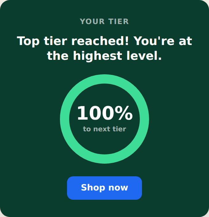
When the visitor passes the highest tier, the card hides the tier chips, shows the “all tiers reached” message, and plays the chosen effect.
Tips
- Set the Test Value at or above a tier value to preview the chips lighting up.
- Order the tier values low to high; the card sorts them and points at the next unreached one.
- For a single goal, use the Status Card. For a thin site-wide tiered bar, use the Tiered Status Bar.
Further reading
- Free shipping & tiered loyalty bars — the average-order-value play.
- Website popup templates — all 16 templates, and how to pick the right format.