
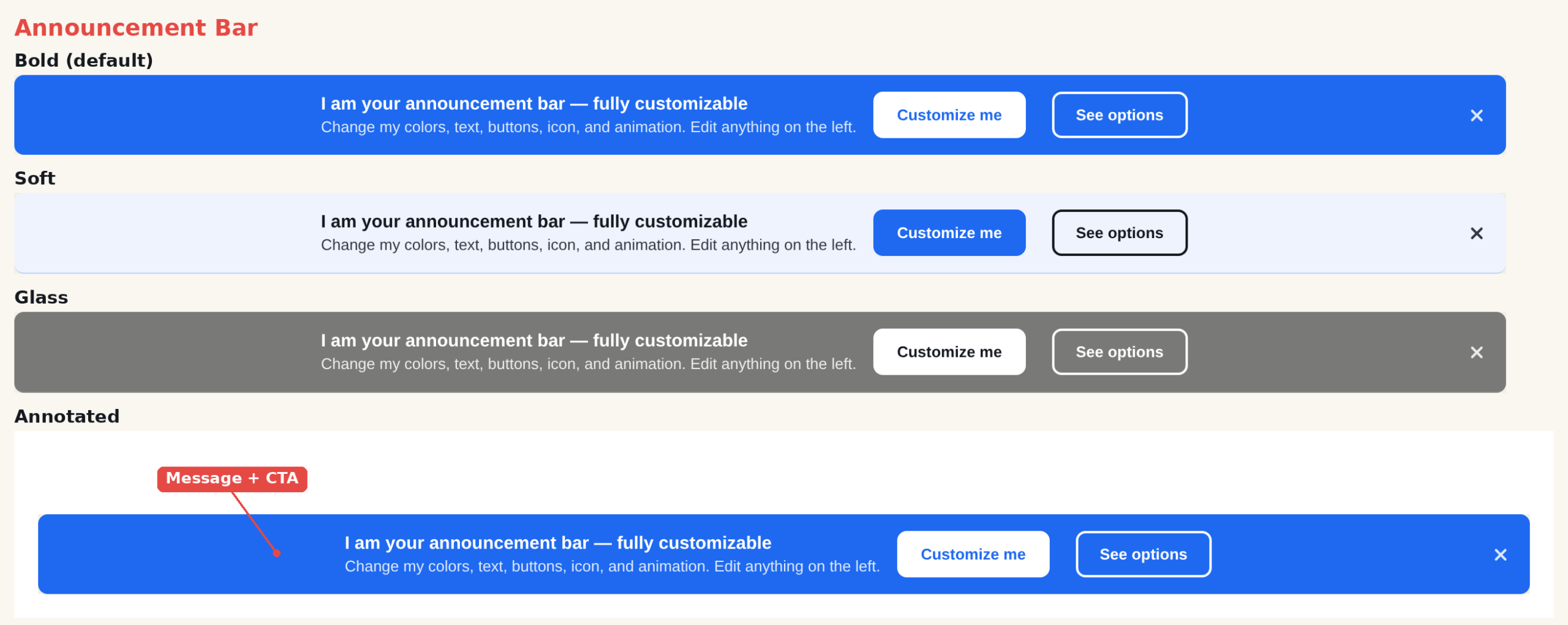
The Announcement Bar is a slim, full-width strip that sits at the top or bottom of the page. Use it for site-wide messages that should stay visible without blocking content — shipping offers, sales, product news, or policy notices. Every part is editable from the action editor: colors, text, buttons, icon, animation, and close behavior.
When to use it
- Promotions — “Summer sale — 20% off everything.”
- Shipping / offer banners — “Free shipping on orders over $50.”
- Announcements — new feature, new collection, or an important notice.
Add it to an action
Create or edit a Popup action, open the template picker, and choose Announcement Bar. The bar appears in the editor preview where you can click any element to style it. Placement (top or bottom of the page) is set in the action’s Location step, not in the template.
Settings
Style
- Preset — six color schemes: clean, bold, soft, dark, glass, contrast.
- Background — solid (uses the preset), a gradient, or an image with a legibility overlay.
- Corners — none, soft, round, or pill.
- Spacing — tight, normal, or wide gaps between elements.
- Alignment — left, center, right, or split.
- Width — boxed (centered, max width) or full (edge to edge).
- Entrance Animation — slide, fade, or drop.
Content
- Icon — choose a font icon or an image from the media library.
- Headline & description — the message text, each with its own CSS field.
- Buttons — a primary button and an optional second button, each a click target for CTR tracking, with attention animations (pulse, bounce, shake, glow, sheen).
Close
- Close button — a built-in X, or pick one from the library.
- Close position — right, left, or center, independent of text alignment.
- Close visibility — always visible, or appears only on hover.
Tips
- Keep the headline short — the bar is one line on desktop and stacks on mobile.
- For a sticky full-width bar, set Width to full; the bar spans the viewport on the live site while staying editable in the builder.
- Mark the button as a click target (on by default) so you can measure click-through in reports.
Further reading
- Website popup templates — all 16 templates, and how to pick the right format.